
New Order – Movement album art
Contributed by Stephen Coles on Sep 2nd, 2015. Artwork published in
.
Source: www.factory-overseas.de License: All Rights Reserved.
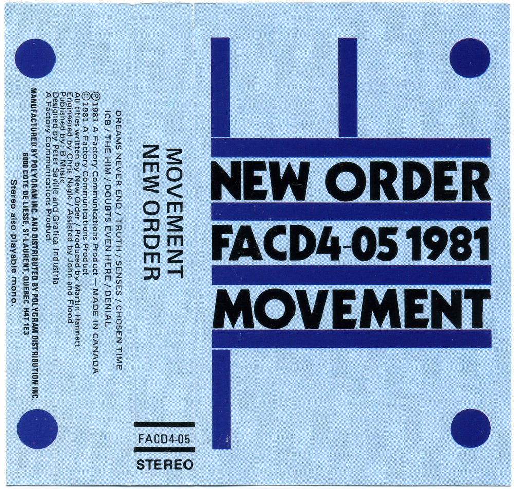
Canadian casette cover from Polygram used Kabel Black and Univers instead of Elegant Grotesk.
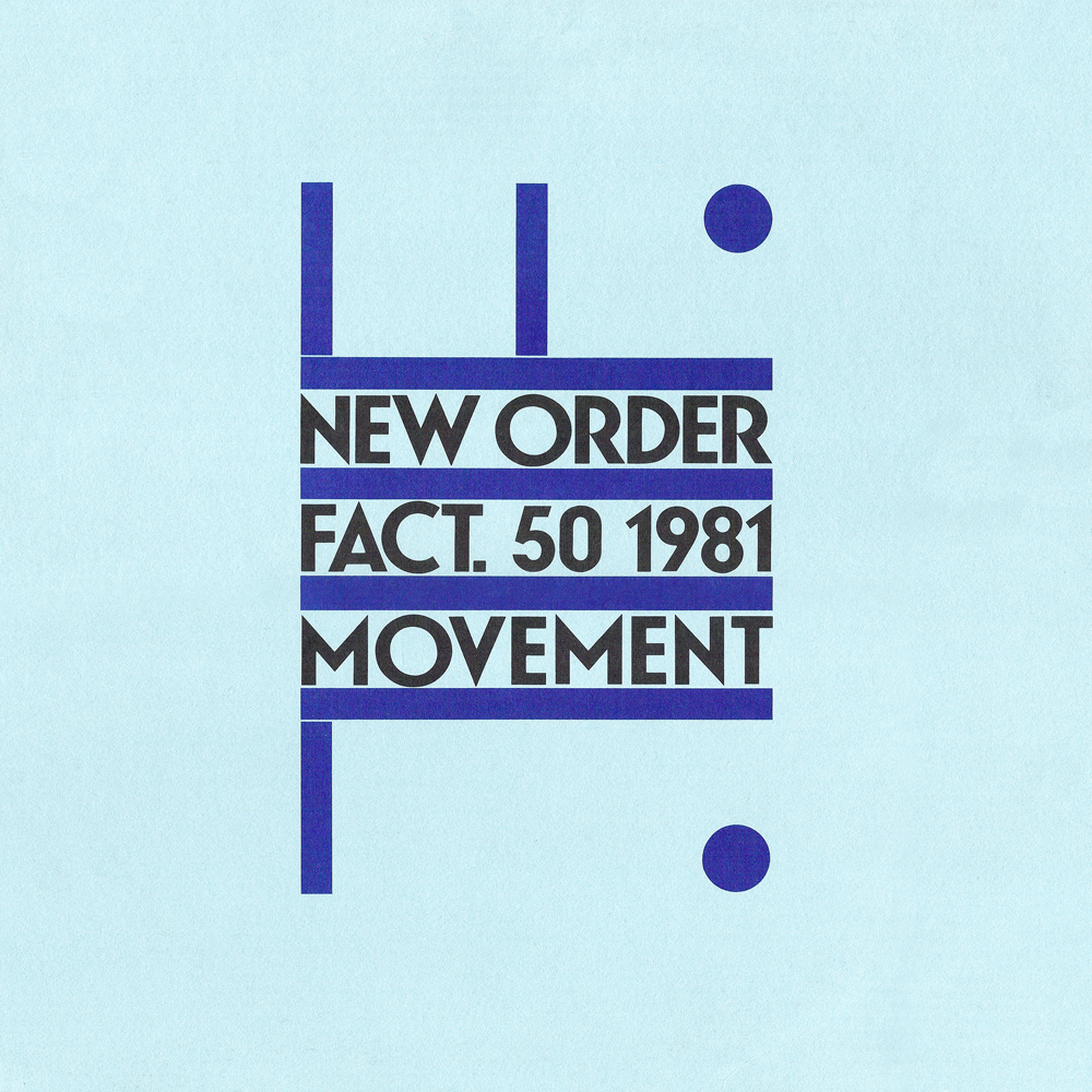
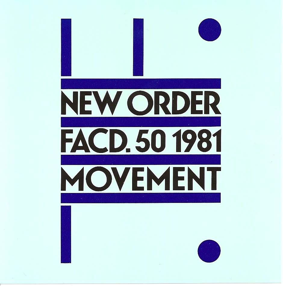
“The artwork, done by Peter Saville, is based on a poster by Italian Futurist Fortunato Depero for the 1932 exposition Futurismo Trentino. Saville adapted it so that the ‘F’ stands for Factory and the ‘L’ (Roman numeral) for 50. The album colour in the UK was blue with blue artwork, while in the US it was white with burgundy artwork.” — Discogs

Source: www.factory-overseas.de License: All Rights Reserved.
Canadian release.
Source: www.factory-overseas.de License: All Rights Reserved.
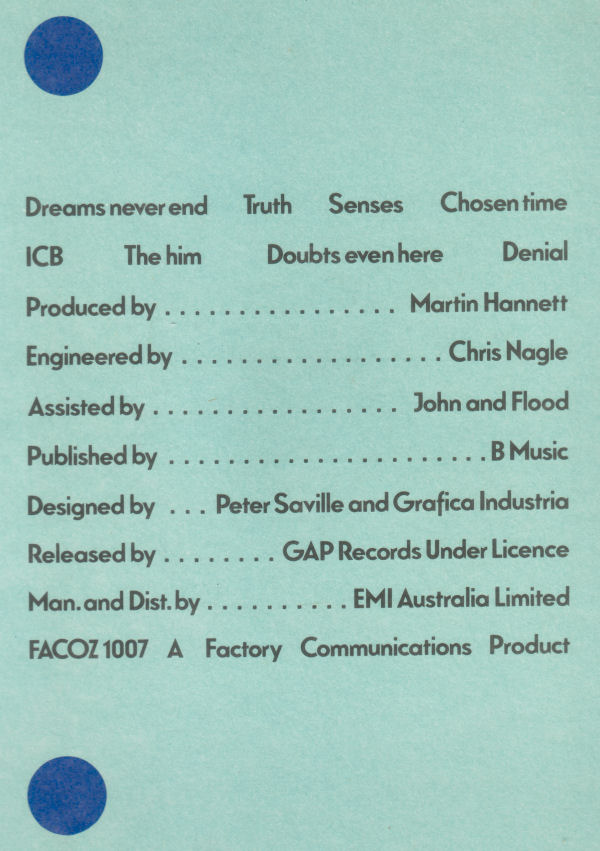
Back cover from EMI Australia release.

License: All Rights Reserved.
Back cover from CBS Records Australia release.
Source: neworder-joydivision.webnode.com.br License: All Rights Reserved.
Source: badinicreateam.blogspot.com License: All Rights Reserved.


")


 album art")
")
")


1 Comment on “New Order – Movement album art”
One of my all-time favorite album covers. I also love the carelessness of a band accused of being neo-Fascist because of their name having a Futurism-inspired cover on their first LP. Glad to finally know what typeface Saville used!