
Black Sabbath – Black Sabbath album art
Contributed by Neil Priddey on Sep 10th, 2015. Artwork published in
.
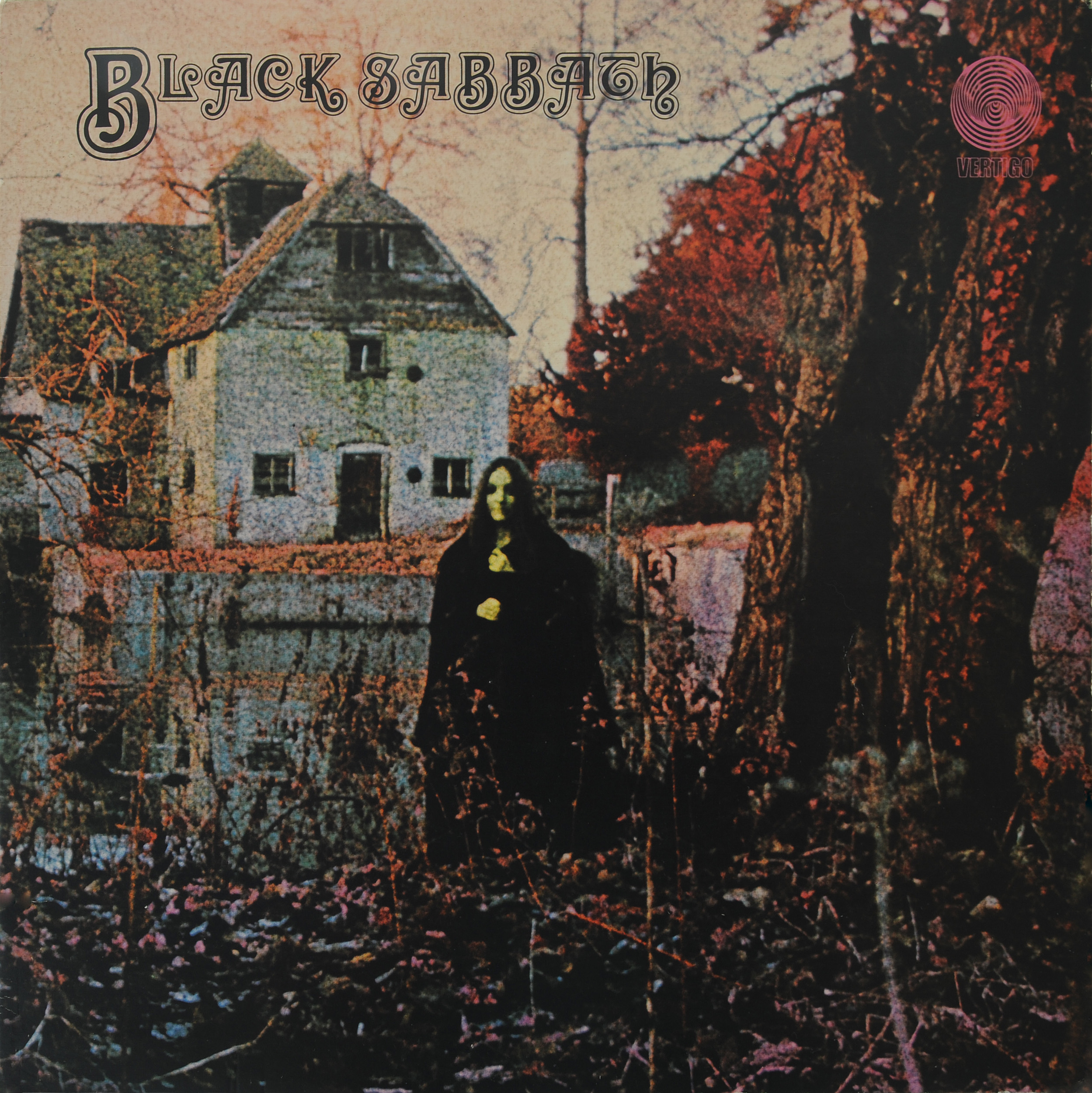
Photo: Neil Priddey. License: All Rights Reserved.
Photography of Mapledurham water mill with false-colour photography by Keef.


")


4 Comments on “Black Sabbath – Black Sabbath album art”
Many sources claim that the typeface used on this album cover is Manuscript Capitals. That’s close, but no cigar. Also, this Letraset typeface was released only in 1972, two years after the album. Mark Simonson answered the question many years ago, on the TYPO-L mailing list:
On WhatTheFont however, forum member Philippe(dada) argues that the Black Sabbath letterforms are based on Daisy Rimmed Fancy, a film type that is shown in the Solotype catalog. Who is right?
The two typefaces are very similar to each other, at least in the swash letters that are used for the cover. It is not clear which came first, Abbey Scroll or Daisy. Maybe there is a common historic precursor – both Formatt and Solotype are known to feature material from various sources, rarely with credits and not always under the original name.
It can be argued that Daisy’s alternate ‘L’ is a little closer to the more open one in ‘BLACK’. So is the bottom terminal of ‘C’. But then, those glyphs are no perfect matches either. If you take a close look at the inner counters of ‘B’, you’ll discover more differences. One may take into account that dry-transfer letters can get distorted or damaged in the process, but my guess is that it is actually handlettering, closely modeled after Daisy Rimmed Fancy.
Neither Daisy nor Abbey Scroll are available in digital form.
Looks like we finally can put this riddle to bed once and for all! While browsing the fathomless One Line Manual of Styles by Photo-Lettering Inc., I stumbled upon Eminence, another rimmed all-caps serif with close similarities to Abbey Scroll, Daisy Rimmed Fancy and Manuscript Capitals.
The sample only includes a few characters, but it is enough to confirm that Eminence indeed is the face used on the Black Sabbath cover, see the ‘C’ with curly top and blunt bottom, the lighter leg in ‘K’, the counters in ‘H’ and ‘S’. ‘T’ (not pictured in the scan) is a match, too. Eminence is listed as “original handlettered design” and appears in Alphabet Thesaurus Vol. 2 from 1965 as Xenotype 3538.
Is there any creepier record art? They really hit all the right spooky notes with this cover.
Unsurprisingly, Eminence, Daisy Rimmed Fancy, Abbey Scroll and Manuscript Capitals have historical precursors. One such face is shown as Harper Rimmed Initials in the 1897 catalog of Day & Collins, a wood type manufacturer in Fann Street, London.
Harper was originally designed by Gustav F. Schroeder for the Central Type Foundry.