
Bob Dylan – The Times They Are A-changin’ album art
Contributed by Stephen Coles on Jan 15th, 2016. Artwork published in
.

Source: vimeo.com License: All Rights Reserved.
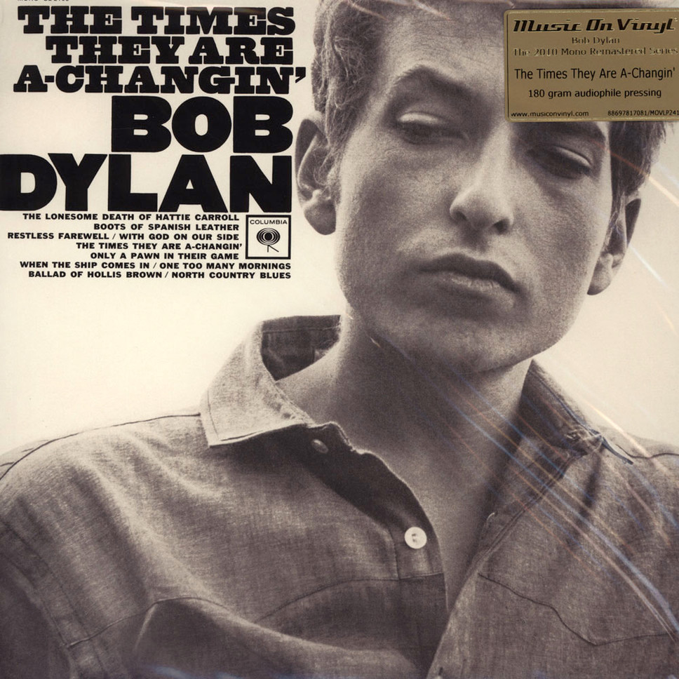
The designer is uncredited, but it is likely Bob Cato who did other Dylan covers, or John Berg who was art director at Columbia at the time and who loved using Nesbitt’s Gothic. The very nice slab seems to be another wood type: Wells’ Antique, shown as Argosy in my 1981 catalog from Haber (who provided phototype versions of Morgan wood type, including Nesbitt’s Gothic, for much of the New York design scene). It’s not quite a match, though: it’s slightly lighter and its ‘G’ beard is square rather than tapered.
Source: www.sowaxrecords.com License: All Rights Reserved.
Source: www.sowaxrecords.com License: All Rights Reserved.

BIEM release. What a script! Only in France.
")
")


")
")


")


")


3 Comments on “Bob Dylan – The Times They Are A-changin’ album art”
Did some research on this cover last year. The slab serif at the top totally threw me for a loop. The photo’s by Barry Feinstein.
Indeed. The ‘M’ reminds me of Scribe (Deberny & Peignot, 1936, digital as Gaulois) and Muriel (Fonderie Typographique Française, 1946).
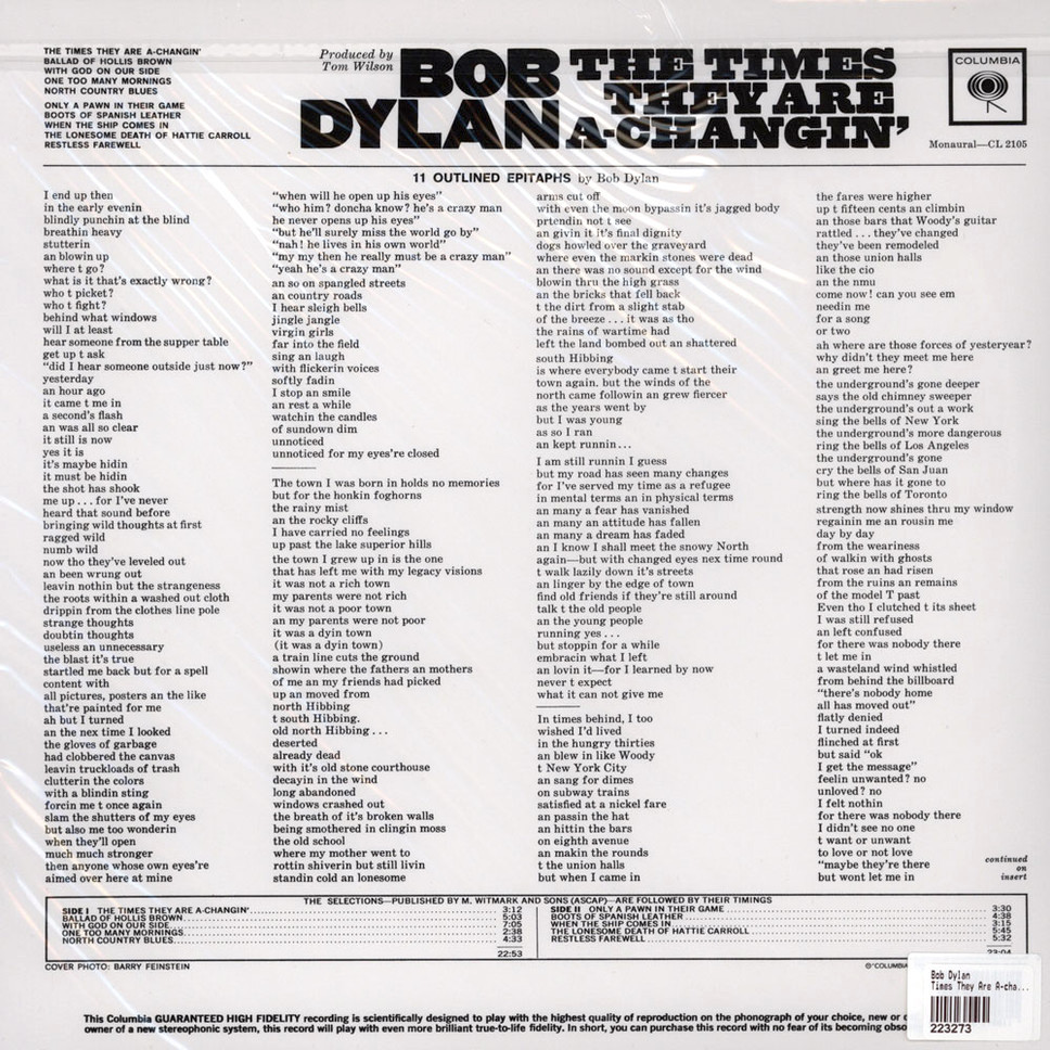
Argosy is different from the wooden Antiques as cut by Page in that it has small serifs on the middle bars of ‘E’ and ‘F’.