
Going Down Swinging magazine, issue 37
Contributed by Gareth Hague on Dec 12th, 2016. Artwork published in
.

The latest edition of Going Down Swinging brings you the fierce talent of forty incredible writers.
Up-and-coming or proven, they’ll sweep you into the studios of Kurdish artists, lose you in the sprawling subway of Mexico City and have you squinting through the ochre dust-haze of Australia’s red centre. Brace for big losses, broken nostalgia, weird romances and clear-eyed discovery.
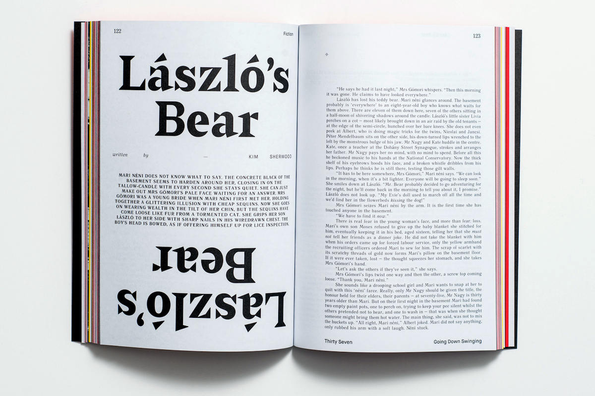
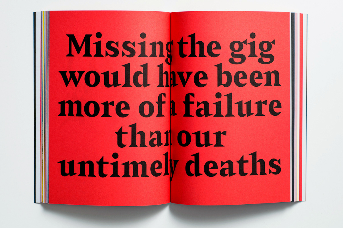
Sabre’s ‘graphic, rather than typographic’ design takes reference from stone-carved lettering, also the idea of letters constructed from a set of component shapes, connected at a sharp point. It is used here at headline and text size, mixed with various serif and sans serif types.


")
")

")


")

")


")


3 Comments on “Going Down Swinging magazine, issue 37”
I wonder what happened to the spacing of the ‘gi’ pair on the cover. This is not how Sabre is kerned, and the “Missing the gig” spread shows proper spacing. If not the typesetter, perhaps Adobe “Optical Spacing” is to blame?
I think the sans serif typeface used on the top and bottom is Maison Neue.
It also appears on this image.
Maison Neue was revised in 2017 and the version used on the magazine was, of course, an older version.
I think you can see a narrower J on the image I showed above. The J in the older version is narrower than the J in the new version.
Impressive – thanks, Akira! Added.