
VGC Photo Typositor 3000/3100 and 3200 logos
The Photo Typositor was a major display phototypesetting machine invented by Murray Friedel in 1959 and marketed by the Visual Graphics Corporation (VGC). [Peter Bain]
The Photo Typositor 3000, which was advertised as new in U&lc, vol. 2, no. 2 from June 1975, and its follow-up, the 3100, have a nameplate in tightly spaced caps from Skin & Bones, a bi-line typeface designed by Douglas F. Jones and released by VGC in circa 1972.
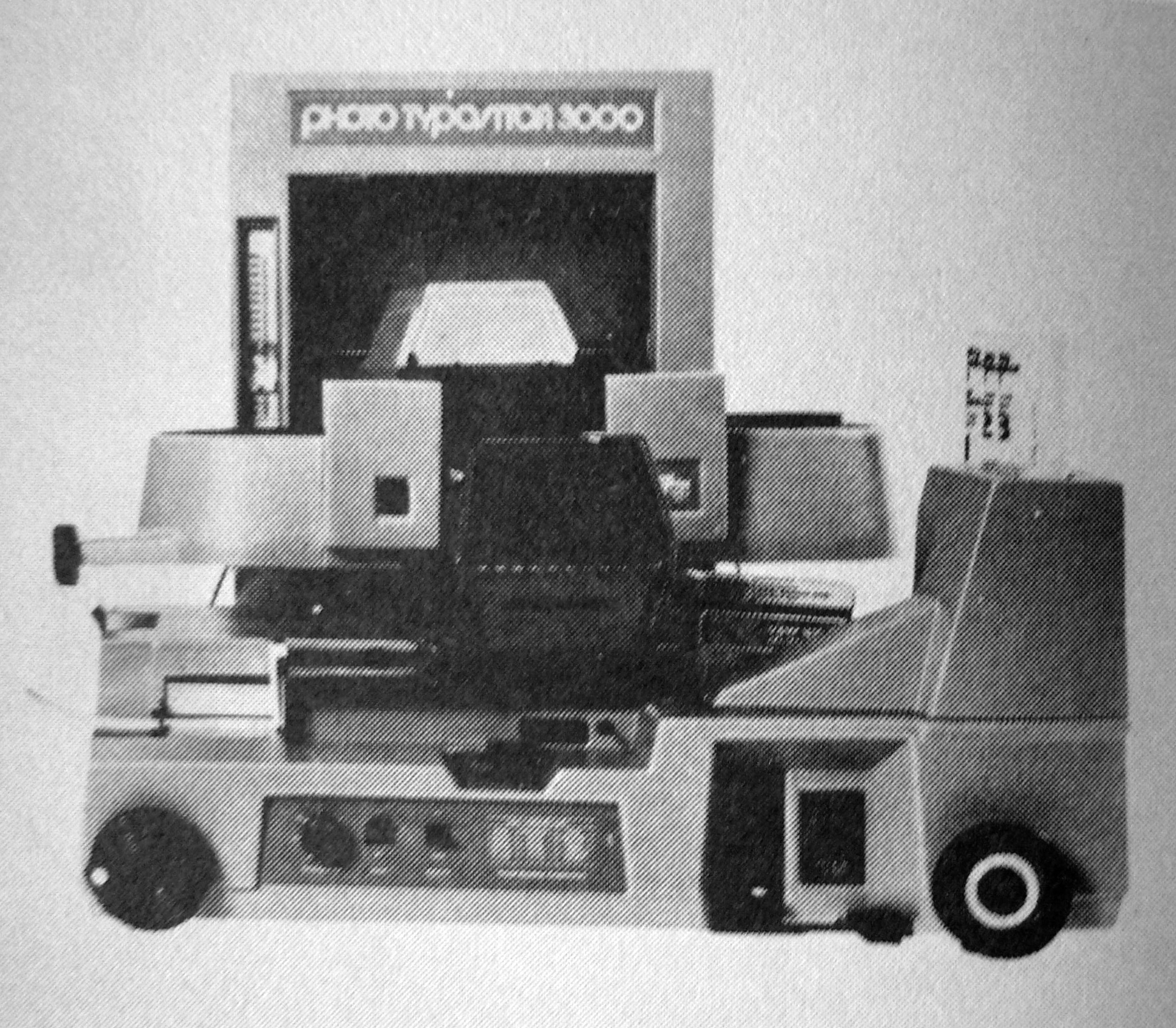
The logo for the 3200 model switches to another variety of Bauhaus-y letterforms [edit: namely Blippo, see the comment by Mark Simonson]. The name is now rendered as “phototypositor”, in all lowercase letters, without space.

“Delicious branding” — the Photo Typositor 3100, found by Tamye Riggs at the Museum of Printing History in North Andover, Mass.
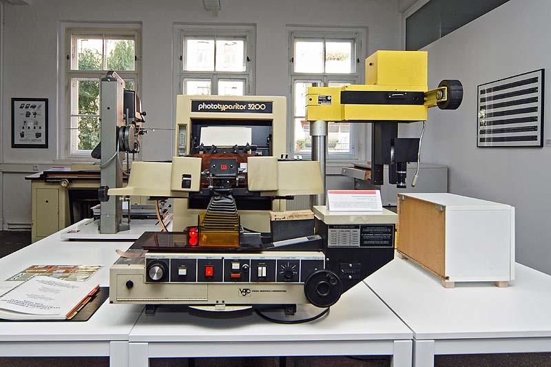
The Museum of the Printing Arts in Leipzig is home to a Photo Typositor 3200.
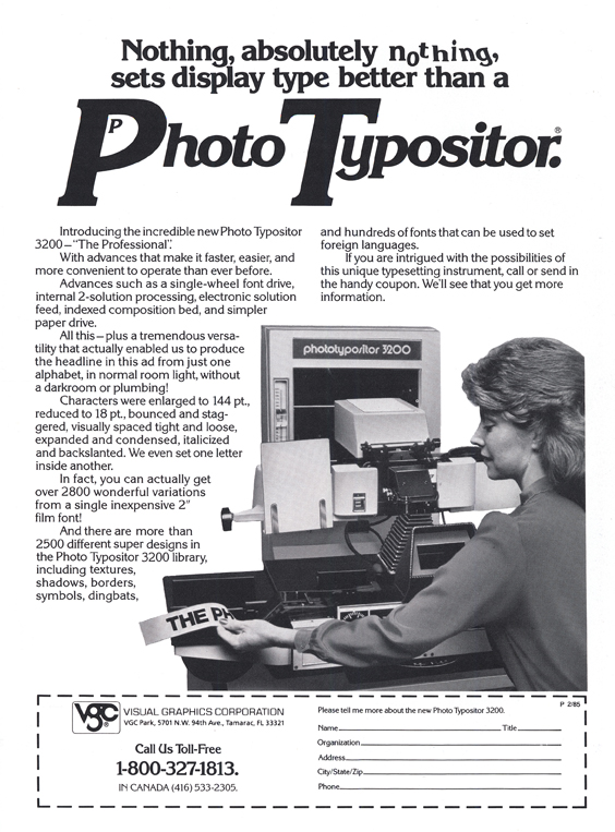
The Photo Typositor 3200 in a magazine ad from 1985. The ad typography is in Korinna.
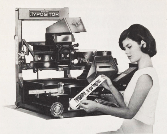
“Typography … at your fingertips!” An earlier version of the Photo Typositor, featuring a logo in custom sans serif caps with an extended ‘T’ bar.


")


")


13 Comments on “VGC Photo Typositor 3000/3100 and 3200 logos”
This is fascinating—thanks for posting this.
It’s a bit hard to see, but I think the later logo was set in Blippo.
Thanks, Mark! I had checked several of the usual suspects, but must have skipped Blippo. With the characteristic ‘2’ and ‘3’, it indeed looks like a match. This (lighter) Bold weight is not available in digital form, is it?
Thank you so much for posting this. Murray Friedel was my grandfather. He was also an amazing photographer.
I used to earn my living working on the typo. Magic days
I was Service Manager for VGC in Chicago from 1969 to 1972 and then in Paramount, Ca. from 1972 to 1974. Their purchase of a huge facility in Tamarac, Florida I believe became their downfall.
I used Typositors, made custom fonts for typositors. I also sold fonts for them. I’ve even set Blippo on them. The first time I saw a Linotype imagesetter setting over 100 pt. sharper than remotely possible on film projection I knew their time was limited.
I worked at VGC in 1976 filling and shipping orders from Paramount CA for all you talented people. It was nice to see the old pictures. PS, I am sorry if I ever sent you the wrong font…
Great to see the old 'typo’ again.
Worked on that in 1978 in London, home of print in UK.
Back in the 80’s I would set all of the story headlines for Hi-Torque publications like ‘Dirt Bike’ and ‘Motocross’, with the Photo Typositor. It was kinda fun…
I have a photo typositor sitting in a building. Can anyone tell me if it is worth anything. Who would be interested in it etc.
thanks, Cari
Does anyone know where I can find a sample book of the PhotoTypositor type styles. I used a PhotoTypositor in the late 1960s and really enjoyed it.
Hi Paul, while VGC catalogs are not exactly rare, it has become increasingly difficult to find one in recent years. If you keep an eye on sellers of used books, you should be able to score one eventually. You’ll want to look for “VGC Alphabet Library”. The catch is that two of these words are pretty generic, and “VGC” is an abbreviation commonly used by antiquarians for “very good condition”.
There’s currently one catalog for sale on eBay: it’s an abridged showing from 1982, with all the typefaces available in that year. This one-liner only has a list of typefaces names, set in said typeface, and no full glyph sets.
Stephen shares a few select scanned pages online. See also VGC-related photos on Flickr.
I ran a photo typesetting dept in Johannesburg SA and was able to make 1300 fonts on two inch film. Invited Tom Carnase out to SA when Herb Lubalin declined to run a typography class for art directors of all the big advertising companies…that machine made the company I worked for a fortune…and a very good life for me. Sadly computers changed all that