
Woody & Cat – How We Grow album art
Contributed by Florian Hardwig on Jun 3rd, 2017. Artwork published in
.
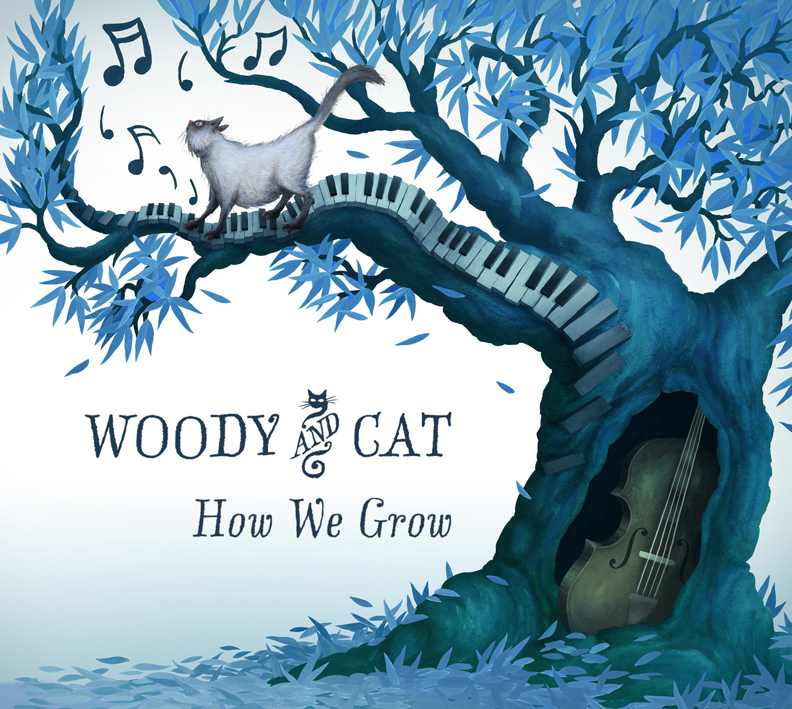
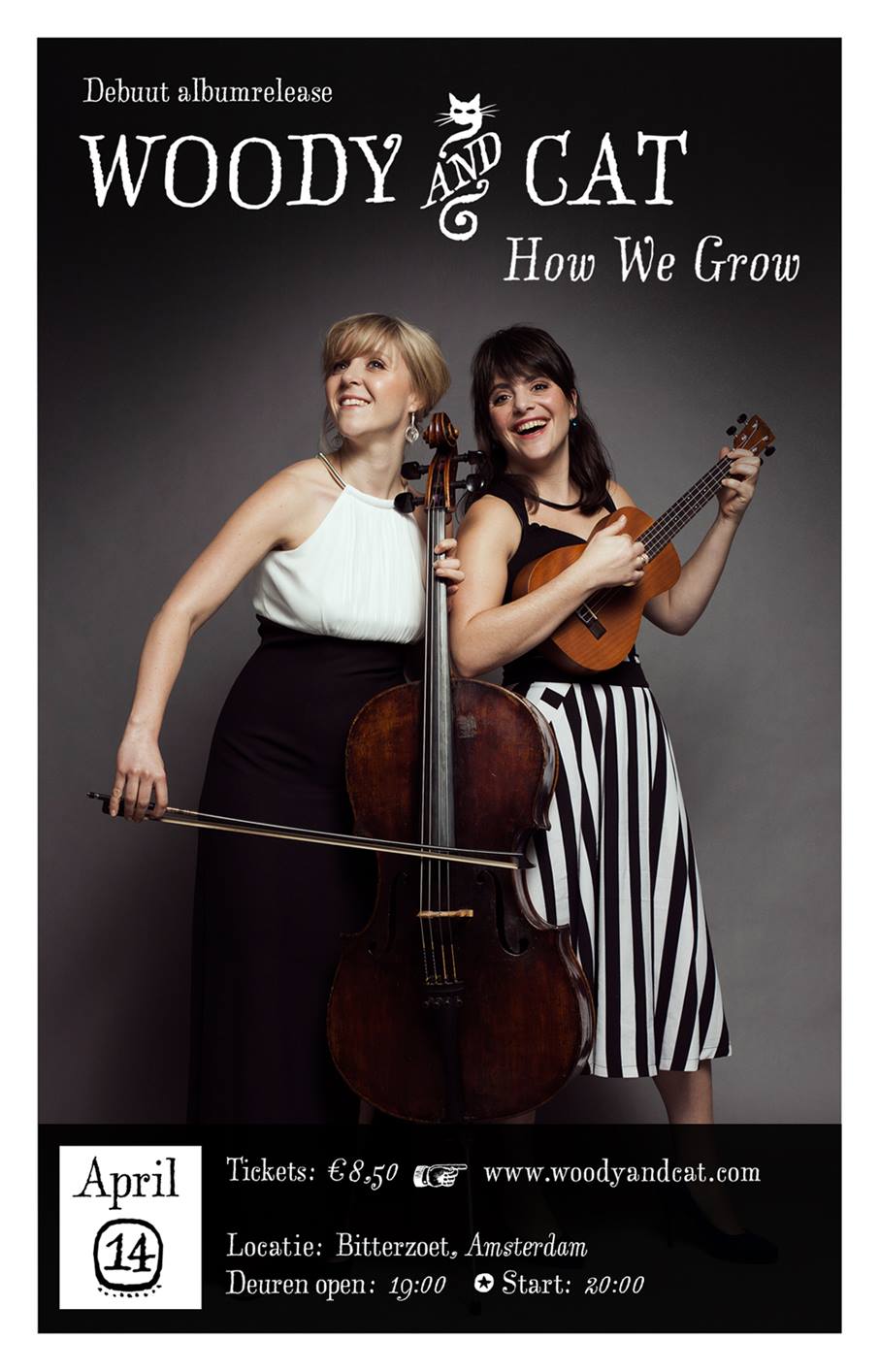
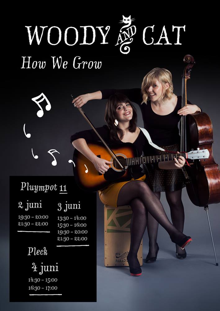
How We Grow is the debut release of Dutch singer-songwriter duo Woody & Cat. The typography for the album art designed by Tim de Groot of Studio Mittens uses LTR Salmiak. The typeface by Erik van Blokland also appears on concert posters and band merchandise.
(via Thom Janssen)
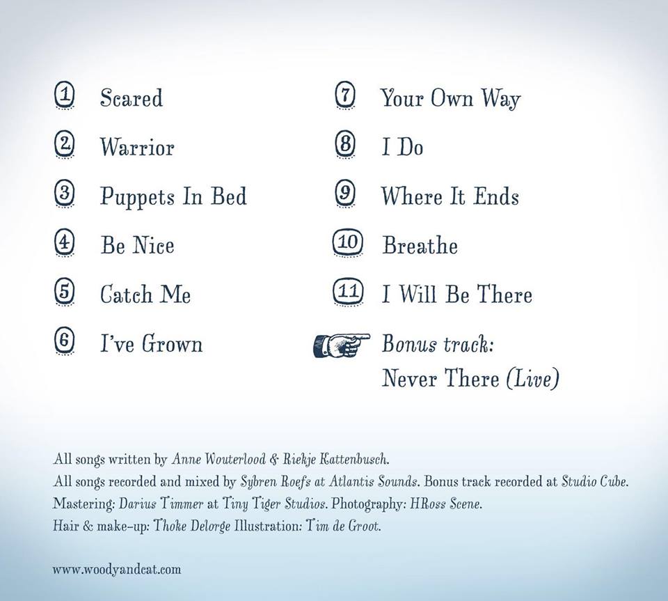
The manicule (☞) is taken from LTR Salmiak Catchwords. This font also includes circled numbers, albeit only for single digits.
Source: www.facebook.com License: All Rights Reserved.
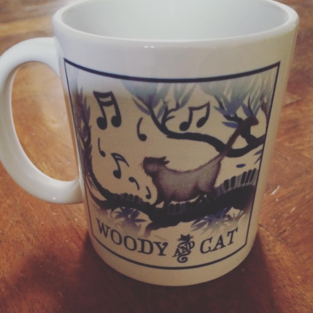
The ampersand in the band logo is a feline customization of one of the many “and” logotypes included in LTR Salmiak — a “CATchword” (S. Coles), so to speak.
Source: nl-be.facebook.com License: All Rights Reserved.
Source: www.facebook.com License: All Rights Reserved.
The Woody & Cat coffee mug features Salmiak, too.

")


")


