“The One Moment” – Morton Salt viral ad
Omnes Pro by Darden Studio is Morton Salt’s corporate typeface. It is also utilized for “The One Moment”, a clever commercial that doubles as spectacular music video by OK Go.
In 2016, Morton Salt launched “Walk Her Walk”, a platform that conveys the brand’s aim to make a positive impact by supporting social initiatives. To kick off the campaign, Ogilvy & Mather devised an ad that would reintroduce the venerable brand in an unexpected way, connect with consumers on a more emotional level, and resonate with millennials. They approached OK Go, with the idea of creating a video around a song. The local Chicago band is known for clever low tech yet elaborate music videos that go viral . “The One Moment” was selected as a good thematic fit for the brand’s new positioning.
The clip starts with a typographic animation in which the band’s name transforms into the song title, artfully taking advantage of the fact that both — like MORTON — include two ‘O’s. Omnes was likewise chosen for intertitles and closing cards. Together with the umbrella girl, the familiar letterforms help to call the viewer’s attention to Morton as the sender without being obtrusive.
As expected, the video became a massive internet hit. Within the first five days of its release, it had been watched over 4.6 million times. By February 2017, it had received 40 million views across YouTube and Facebook.

The opening animation ends with the song title neatly set in two tightly spaced lines of equal length, in yellow caps from Omnes Regular. The compactness of this setting is further accentuated by a dark blue frame that echoes the monolinear strokes of the letterforms.

The video is shot in state-of-the-art slow motion and features fireworks of analog visual effects including explosions of color powder, surges of paint, scattering water balloons, and guitars flying into pieces.
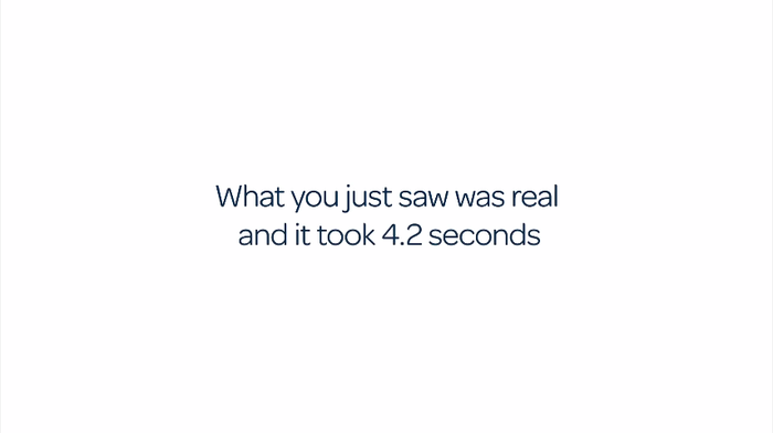
After the first run in real time, Omnes reclaims the stage. The intertitles are presented in a focussed setting, set in the Regular weight, center-aligned on white, avoiding anything that could distract from the message.
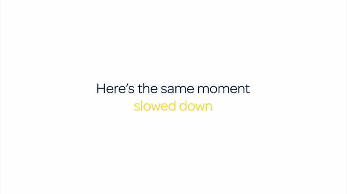
Morton Salt’s corporate colors are dark blue and yellow. Just like the use of the corporate typeface Omnes, they subliminally point to the brand without explicitly revealing the sender yet.

The clip ends with an image of the “Morton Salt Girl”. Since this brand figure is one of the ten best-known symbols in the United States, there is no need for additionally showing the wordmark. Omnes delivers the message (“It only takes one moment to make a difference / Help brighten the world”) and, in a bolder weight, the link to the campaign web page.
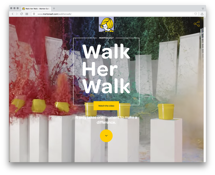
The landing page on Morton Salt’s “Walk Her Walk” campaign website seamlessly continues the visual identity with Omnes as typographic basis.
Credits:
OK Go: Damian Kulash, Timothy Nordwind, Andy Ross, Dan Konopka
Directed by Damian Kulash. Produced by Park Pictures Exec. Producer: Justin Pollock. Line Producer: Pat Frazier. Production Designer: Bradley Thordarson. Director of Photography: Shawn Kim. Editor: Cass Vanini. Post Effects: Artjail, Steve Mottershead
Formats
- Web (3272)
- Advertising (1402)
- Film/Video (643)
Topics
- Product (985)
- Social Media (185)
- Music (3870)
Designers/Agencies
Tagged with
- music videos (92)
- OK Go (1)
- Morton Salt (2)
- yellow and blue (122)
- viral media (5)
- salt (6)
Artwork location
- United States (6348)
- Chicago (190)


