
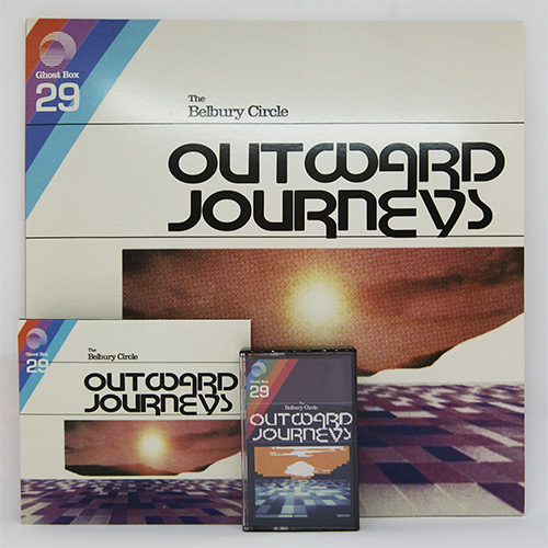
The Belbury Circle – Outwards Journeys album art

Outward Journeys is the first full length LP by The Belbury Circle, a collaborative project between Jon Brooks (The Advisory Circle) and Jim Jupp (Belbury Poly), featuring John Foxx on vocals and synth on two tracks. Released by Ghost Box on CD, LP, DL and Cassette.
Design is by Julian House, and beautifully captures the excitement and homespun aesthetic of early software and computer packaging.
… in particular, see the logos used by Apple Computers in the late 1970s or Steinberg’s audio software in the mid 1980s. This rendition of Motter Tektura appears to be lighter than the original. Not sure what has happened to the S — maybe an intentionally introduced glitch to emulate the pitfalls of rub-down lettering, and to match the low-fi aesthetic of the photograph? The crude bitmap variant is hilarious. It reminds me of this gem posted by Stephen.
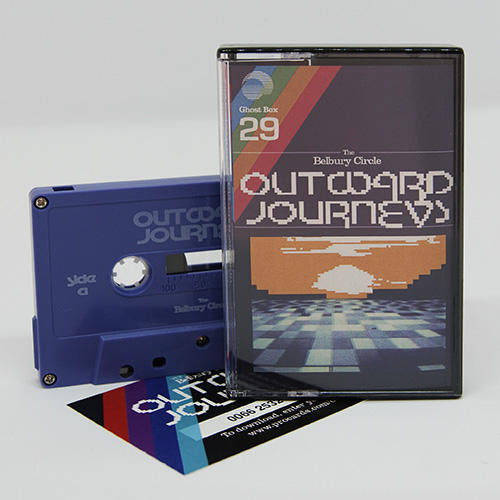
Casette and download card

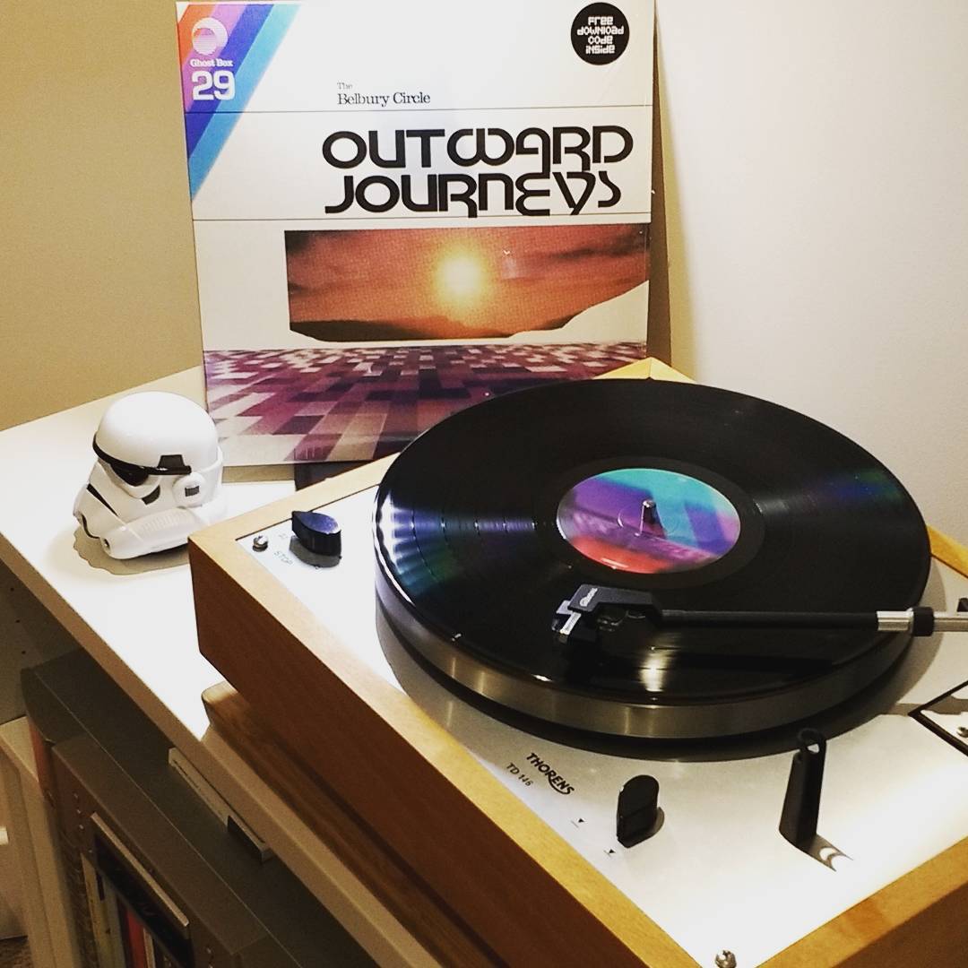
Inner sleeve with LP
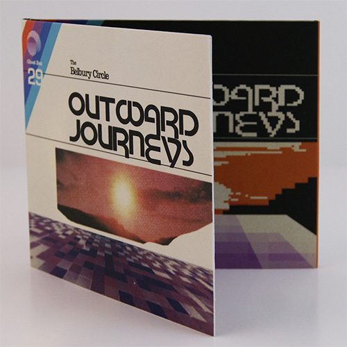
CD packaging


")


")

")


")


: Fin de Louis</cite>")


2 Comments on “The Belbury Circle – Outwards Journeys album art”
This is amazing—love it!
Now I know: It’s an anonymous 1990s digitization of Motter Tektura. The S with the thin spine is not the only flaw in this amateurish take. Better avoid. It’s a bummer that Motter Fonts (run by the designer’s son Siegmund Motter) haven’t released their official digital version yet.