
Blijven kijken! by Manu Adriaens
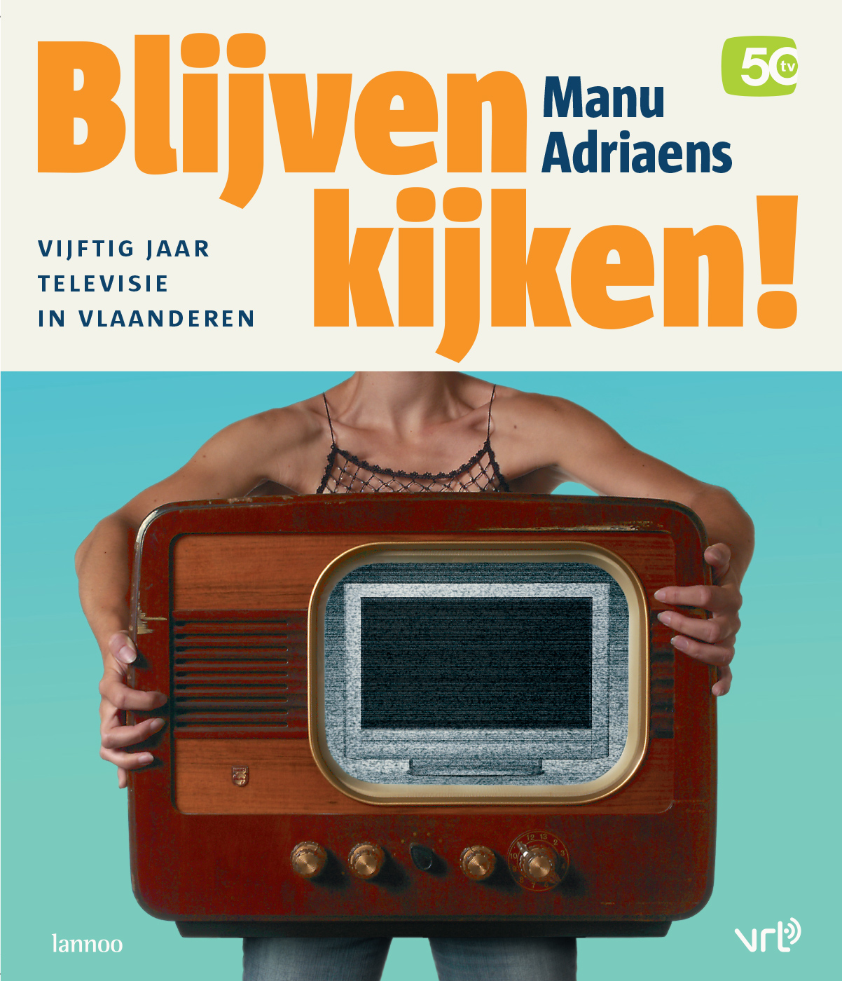
Photography: Phile Deprez (concept/styling: Jan Middendorp)
50 years of Flemish TV
VRT is Flemish Public Radio & Television, and this book was published by Lannoo publishers and VRT on the occasion of the broadcaster’s 50th television birthday. “Blijven kijken” could be translated as “Don’t go away” – although in Belgium, tv programs are seldom interrupted by ads.
I was using a lot of LucasFonts faces at the time, trying out unexpected possibilities of Lucas de Groot’s typefaces. I found the display properties of Sun Condensed ExtraBold extraordinary, and the dots on ‘i’ and ‘j’ happened to be vintage-television-screen-shaped and similar to the jubilee’s logo (top right).
In the hardcover edition, the secondary typeface was simply Sun Bold. For the cheaper paperback version I used a more display-style secondary typeface: Sauna Black Italic Swash, in a magenta-like hue I usually call Cyclamen.
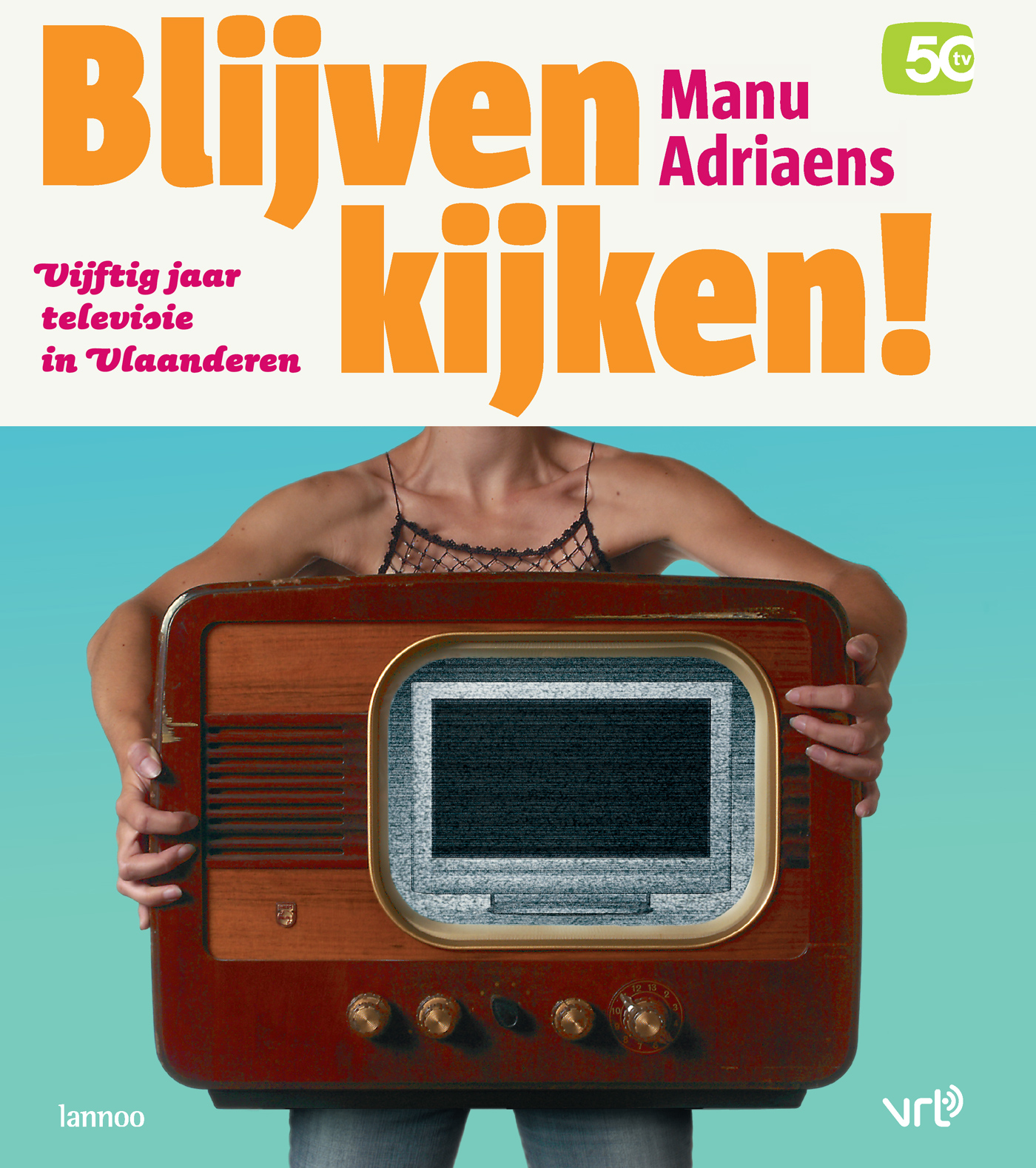
Photography: Phile Deprez (concept/styling: Jan Middendorp


")


 movie logo")


")


