
Pitchfork Music Festival 2018
Contributed by Johann Freitas on Mar 13th, 2018. Artwork published in
February 2018
.
Source: pitchforkmusicfestival.com License: All Rights Reserved.
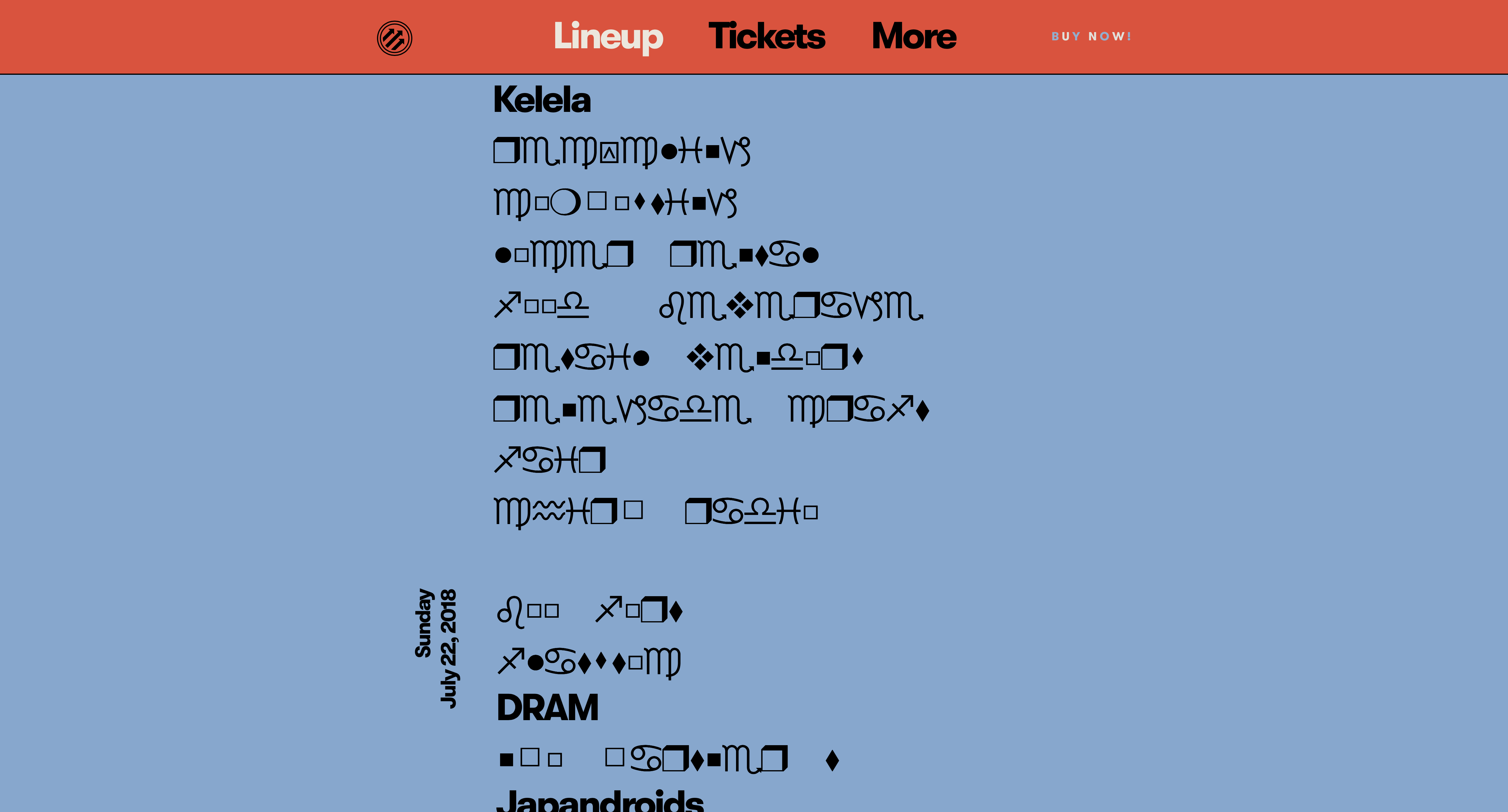
Pitchfork uses a custom version of GT Walsheim named Walfork. Introduced in 2016, it is different in the proportions and some details. Most notably, it has a double-storey ‘a’ and more conventional forms for ‘Y’ and ‘y’. On the announcement website for the 2018 edition of the Pitchfork Music Festival, it is combined with cryptic messages in Wingdings.
Source: pitchforkmusicfestival.com License: All Rights Reserved.
Source: pitchforkmusicfestival.com License: All Rights Reserved.

Source: pitchforkmusicfestival.com License: All Rights Reserved.


")


, 9–13 October 2013")


![“Savage Love (Laxed – Siren Beat)” [BTS Remix] single cover and lyric video](https://assets.fontsinuse.com/static/use-media-items/123/122464/thumb/5f7f7719/@2x/SAVAGE_LOVE_M1.webp "“Savage Love (Laxed – Siren Beat)” [BTS Remix] single cover and lyric video")


4 Comments on “Pitchfork Music Festival 2018”
Ha! I assume this is supposed to be read as an homage to David Carson and the iconic prank he made in a 1994 issue of Ray Gun magazine. Carson had to design a spread on musician Bryan Ferry, but when he read the interview, he deemed it boring and not worth reading, so he changed the font to Zapf Dingbats for the entire article.
Back in the 1990s, the “encryption” was only visual. The underlying digital text string on Carson’s computer still contained the words of the original interview. His copy of Zapf Dingbats had its symbol glyphs mapped to alphanumeric characters. What makes the Pitchfork website even more cryptic is the fact that we now live in the era of Unicode. Dingbat fonts don’t (mis)use unrelated character slots anymore. Instead, the symbols are either placed in the Private Use Area (PUA) or mapped to designated codepoints. For example, the early pre-Unicode version of Wingdings had the cancer zodiac sign mapped to the lowercase letter a. In Wingdings v5 from 2006, the same glyph can be found on U+F061*, a codepoint in the PUA. The character is included in Unicode as CANCER (U+264B): ♋.
*) It is more complicated: The glyphs in Wingdings are double encoded, using CMAP subtable codes. GID 72 “cancer” has both 0x61 (= Latin lowercase a) and 0xf061 (PUA).
The symbols are served in the website’s source code as Unicode characters. When they are rendered by the browser, another layer of confusion is added. Pitchfork’s CSS may specify “font-family: Wingdings;”, but since it is not provided as web font, the actual font in use depends on the fonts available on the visitor’s machine.
In my case, I do have an active copy of Wingdings, but it doesn’t offer glyphs for codepoints like U+264B and hence is not used. Instead, the browser picks another font that includes the characters in question. The outcome is different from browser to browser. While Firefox (left) uses Apple Symbols (with pointed waves for Aquarius, ♒︎), Safari (right) thinks that Arial Unicode MS is the better choice. Chrome (center) uses Arial Unicode for the geometric shapes too, but doesn’t show the zodiac symbols, for some reason. Your mileage may vary!
So what are the mysterious messages hiding in Pitchfork’s festival announcement?
With the help of Lingo Jam’s WingDing translator, I was able to decipher the three lines shown in the screenshot above:
⍓︎♏︎●︎●︎□︎⬥︎ ❍︎◆︎⬧︎⧫︎♋︎❒︎♎︎ = yellow mustard
♍︎♒︎□︎◻︎◻︎♏︎♎︎ □︎■︎♓︎□︎■︎⬧︎ = chopped onions
⬧︎⬥︎♏︎♏︎⧫︎ ❒︎♏︎●︎♓︎⬧︎♒︎ = sweet relish
Delicious!
Johann’s screenshots don’t show Wingdings either, his browser also settled for symbols from Arial Unicode MS.
The image below shows what the real Wingdings would look like. Again, the Aquarius symbol (♒︎) is a good glyph for identifying the font: Here the waves are pointed and slanted.
It seems that Pitchfork Music Festival meanwhile got rid off the cryptic messages. You can still see them on Archive.org.
Other encrypted lines on the Pitchfork website used symbols that are included in Wingdings, but are absent from (my versions of) Apple Symbols and Arial Unicode MS, like “open mailbox with raised flag” (U+1F4EC) or “open file folder” (U+1F4C2). The browser hence falls back to the only font on my machine that includes these codepoints: Apple Color Emoji. A truly Carson-esque mess!
The first line in this image reveals the address of the venue:
?︎?︎?︎?︎ ⬥︎?︎ ❒︎♋︎■︎♎︎□︎●︎◻︎♒︎ ⬧︎⧫︎ = 1501 w randolph st
I bet you can decipher the others yourself now!
Wow, incredible detail! Interest in Wingdings is greater than I had thought. I recently ran an analytics tool on all Wikipedia articles in the “Typeface” category to see what people were interested in. To my astonishment the Wingdings article is number 4! It gets the most pageviews above all articles on individual fonts except Helvetica, and even above the “typeface” article itself. In 2021 it actually became even more popular, and is currently at 3, behind only sans-serif and Helvetica.
Bit of a shame, really, as it’s not a particularly good article! Hopefully the viewers aren’t all conspiracy theorists. I can remember as a kid running into it at the bottom of the font menu in IT lessons and being totally mystified: what is this? Why does it ruin your text? So I do understand the fascination.