Leonhard Lehnerer invoice, 1924
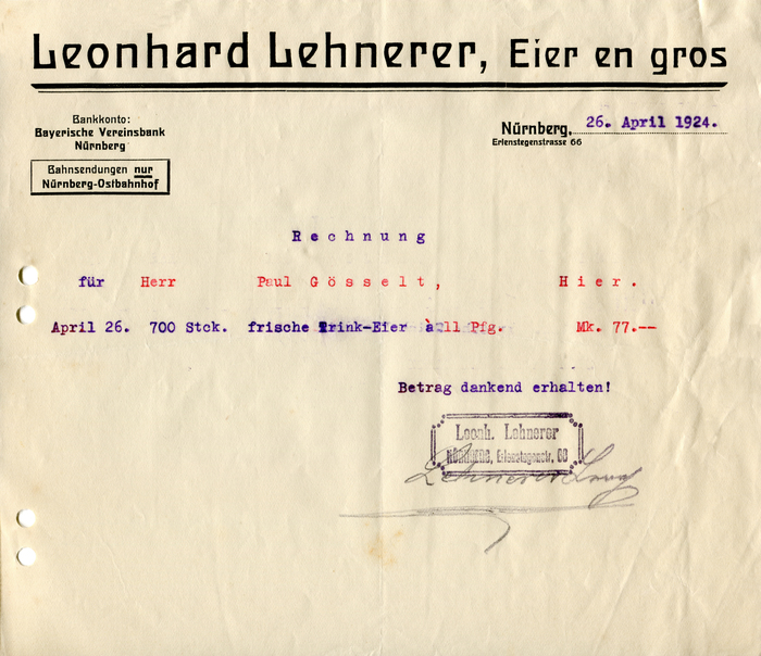
Leonhard Lehnerer was an eggs wholesaler in Nuremberg, Germany. This invoice from 1924 is for 700 frische Trink-Eier, i.e. eggs that are so fresh one could drink them raw.
The typeface used for the letterhead is not as fresh, though. Langschrift was first cast two decades earlier, in 1905, by the Flinsch foundry in Frankfurt am Main. Here it appears in five sizes from two of the three weights. Like last week’s invoice, this is evidence that the neudeutsche Schriften from the first years of the 20th century remained popular well into the 1920s. In his review for Deutsche Kunst und Dekoration, Rudolf Kautzsch compares Langschrift to Eckmannschrift: Both are Lateinschriften—i.e. roman (as opposed to Blackletter) types—that don’t look like written with a pen, but painted with a brush. Their common traits include a reduced differentiation between stems and hairlines, peculiarly soft curves, and closed squarish shapes with horizontals that are made as wide as possible. And yet the two typefaces have a completely different feel. Langschrift stays closer to the old Antiqua, with lower contrast, stricter verticals, and more balanced proportions. Kautzsch concludes: The result is idiosyncratic and elegant. While there sure are more ingenious typefaces, Langschrift is the healthy fruit of a theoretically clear and artistically serious work.
None of this elegance is visible in the mundane in-use example from the 1920s. In the simplistic arrangement, the letterforms appear coarse and primitive. The thick-thin underline is functional at best. The image below shows how typography with Langschrift was originally envisioned: in a carefully centered setting (notably in all caps), with floral borders and ornaments, printed in two colors.
The name (lit. “Long Type”) doesn’t refer to the formal qualities of the typeface. Like most Künstlerschriften in these days, Langschrift is named after its creator, Paul Lang (1877–1937). Lang had studied at the Kunstgewerbeschulen in Stuttgart, Dresden, and Munich, and designed his typeface while being a teacher in Krefeld. In 1906, he was appointed professor for drawing plants, ornaments, and figures at the Kunstgewerbeschule Stuttgart. He was married to Minna Kurz, an Arts and Crafts artist in her own right. Together they created textile designs, but also monograms. In 1913, Lang adopted the name of his wife. The family was thenceforth known as Lang-Kurz (“Long-Short”). Their daughters Urs(ula) and Regi(na) AKA Relang were well-known photographers, Anni (langani) was a jeweller.
Formats
- Ephemera (782)
Topics
- Food/Beverage (1954)
Tagged with
- eggs (16)
- invoices (42)
- letterheads (257)
- borders and rules (664)
- 1920s (78)
- German (language) (1317)
- typeface profile (71)
- one typeface family (1082)
- job work (177)
- Weimar Republic (79)
















5 Comments on “Leonhard Lehnerer invoice, 1924”
This is a good post. Chapeau!
Thank you, Dan! It was written with you in mind. Not sure if there are many people who appreciate reading 400 words about a rather unimpressive old piece of paper. “Weekly Invoice. Making a mountain out of a molehill.”
One of the more striking fonts I’ve seen in a while.. thank you for sharing this invoice series!
Thank you, Faten! The series is currently paused, but I plan to continue it later.
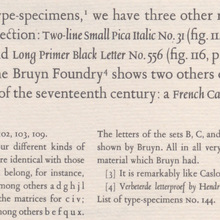
Here’s a specimen of Langschrift from Wetzig’s Ausgewählte Druckschriften in Alphabeten, reproduced in Hans Reichardt (ed.): Bleisatzschriften des 20. Jahrhunderts aus Deutschland. Offenbach: Spatium (2008).