
The Pointer Sisters – That’s A Plenty album art
Contributed by Florian Hardwig on Apr 22nd, 2018. Artwork published in
.
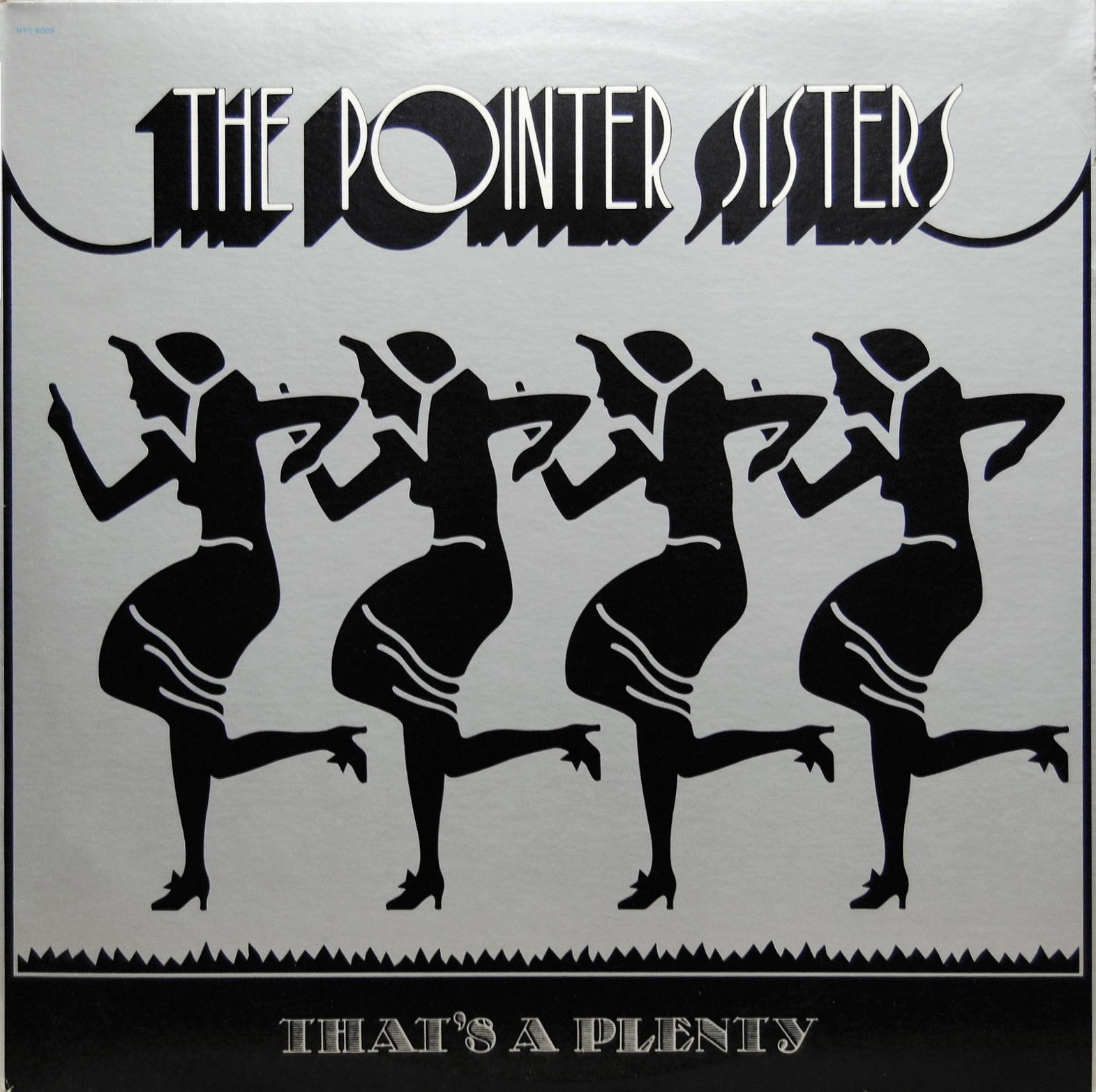
That’s a Plenty is the second album released by Oakland family girl group The Pointer Sisters in 1974 on the Blue Thumb label. — Wikipedia
The band’s name is set in shaded Art Deco caps from either Hollywood aka Cinema or the largely identical Epic Shaded. The hatched face used for the title is an interesting one, too: It’s Schraffierte Glass-Antiqua, originally designed by Franz Paul Glass and first cast by the German foundry Genzsch & Heyse in 1913. The version used here is probably “Flapper Lined”, the phototype revival made by Lettergraphics International Inc. before 1969. Tom Carnase’s ITC Busorama (1970) was chosen for the track list on the back cover.
Art direction, photography: Herb Greene. Cover Art: Randy Tuten


")


