
Schachnovelle – Stefan Zweig (Fischer)
Contributed by Indra Kupferschmid on Mar 24th, 2013. Artwork published in
.
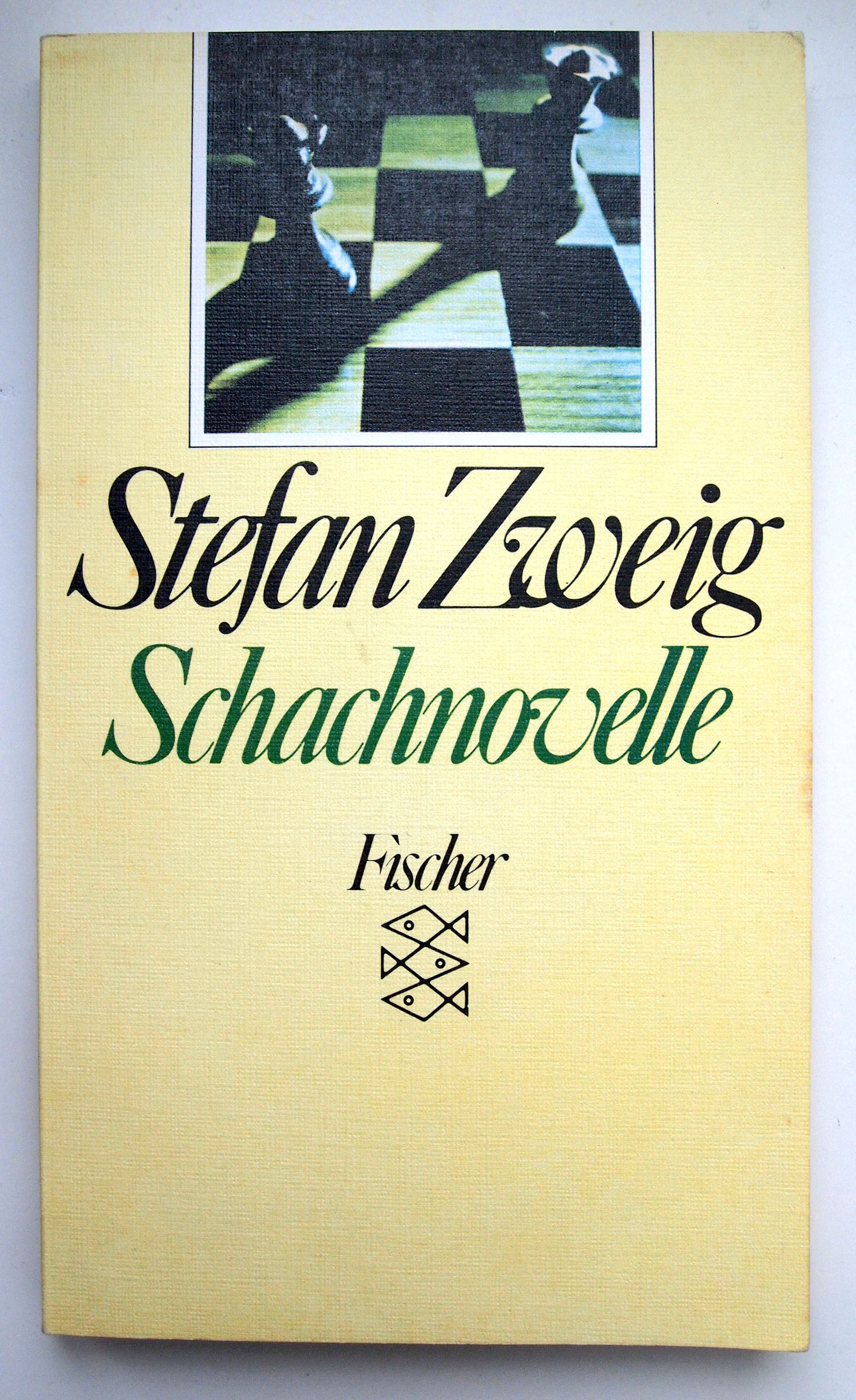
Photo: Indra Kupferschmid. License: All Rights Reserved.
Speaking of Caslon Italics – here’s a book cover with spacing of the other extreme: Stefan Zweig’s “The Royal Game” in the German Fischer Taschenbuch edition from the tight-and-touching 1980s. (The omitted i-tittle in the Fischer logo is an interesting trick.) Elsner + Flake’s Caslon 540 comes closest.


")

</cite>")
")
")


1 Comment on “Schachnovelle – Stefan Zweig (Fischer)”
In addition to the general fashion of the times, the excessively tight spacing here might also have been motivated by the wish to make a (partly) connected script out of an italic. It hardly ever works.