Four Seasons Total Landscaping
Contributed by Laurence Penney on Nov 8th, 2020. Artwork published in
November 2020
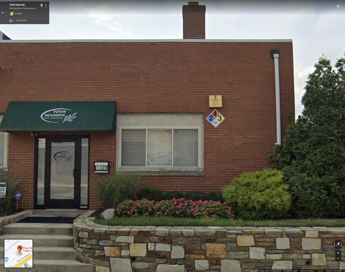
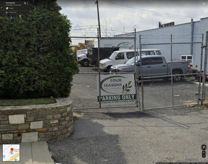
.The world-famous conference center, Four Seasons Total Landscaping, has opted for Lithos in the word mark and on exterior signage, the early 1990s favorite a nod to the 1992 foundation of the facility. The branding type is supported by Avenir and Bree for headings and text respectively. On digital platforms, however, there is prominent usage of Adobe’s Trajan, condensed approximately 25%, suggesting a future direction for the identity.
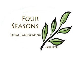
Source: www.fstl1992.com License: All Rights Reserved.

Source: www.fstl1992.com License: All Rights Reserved.

Source: www.fstl1992.com License: All Rights Reserved.
Formats
- Web (3284)
- Signs (1384)
- Branding/Identity (4744)
Designers/Agencies
- unknown (2140)
Tagged with
- shop fronts (269)
- US presidential campaigns (38)
- logos (2686)
- swooshes (3)
- awnings (24)
- signs (317)
- stretched type (291)
- green (492)
- leaves (27)
- landscaping (7)
Artwork location
- United States (6351)
- Philadelphia (46)
- Pennsylvania (35)






















7 Comments on “Four Seasons Total Landscaping”
Fantasy Island deserves an entry, too.
Well, this is wild: a satirical Four Seasons t-shirt designed by Sean Tubridy happens to use Tango, the typeface of Fantasy Island, the adult bookstore next door.
Important update: Fantasy Island Adult Book Store
Richard Hall’s story about this building’s unexpected rise to fame was just published by The Independent.
FSTL’s official merch isn’t always 100% on brand. At least this newly added sticker uses yet another set of fonts:
“Lawn and Order” sticker, Four Seasons Total Landscaping.
The mix includes Calibri, the default font from Microsoft Office, and Beautiful People, an upright script by Billy Argel, here tastefully used with some slight tracking to break those pesky connectors. The font for “Total Landscaping” is unidentified. Judging from the inconsistent weight and spacing, I hope no money was spent on it. These suboptimal font choices are easily outweighed by the slogan – “Make America Rake Again”!