
National Trust Tree Appeal Poster
Contributed by Florian Hardwig on Sep 30th, 2013. Artwork published in
.
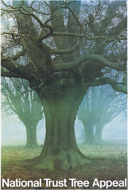
This poster design by David Gentleman for the National Trust features seriously kerned ‘Tr’ pairs, as they were fashionable in the 1970s. In case you are looking for a digital font that comes close to this, forget about the ones that are named Helvetica. Apart from the too loose spacing and the differences in the overall proportions, they don’t have that restrained exit stroke on ‘a’. Better options are Neue Haas Grotesk Display Medium and URW’s Nimbus Sans P (Poster) Bold. Latter has the longer ascender on ‘t’.


")


 movie logo in trailer and posters")


")


2 Comments on “National Trust Tree Appeal Poster”
The National Trust (a real force for good btw) have since switched to their own proprietary typeface, apparently inspired by stonecarving (it reminds me of Lydian), probably to avoid their design work ending up looking of its time.
Elmtree, the new National Trust typeface was designed in 2009 by Paul Barnes. He gave a pretty interesting history of the project last year at TYPO Berlin (and probably other venues).