

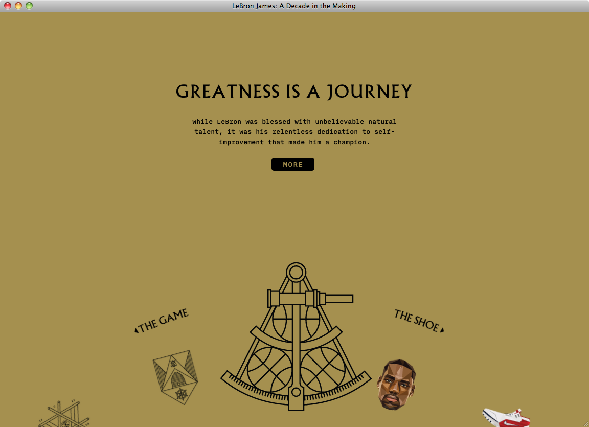
Source: lebron11.nikeinc.com License: All Rights Reserved.
Nike celebrates the long and ongoing collaboration with LeBron James and the release of the latest shoe model (LeBron 11) of the basketball star with a striking micro-website. The use of Albertus for the headings of each chapter and Nitti for the rest of the text accents the geometric graphics.
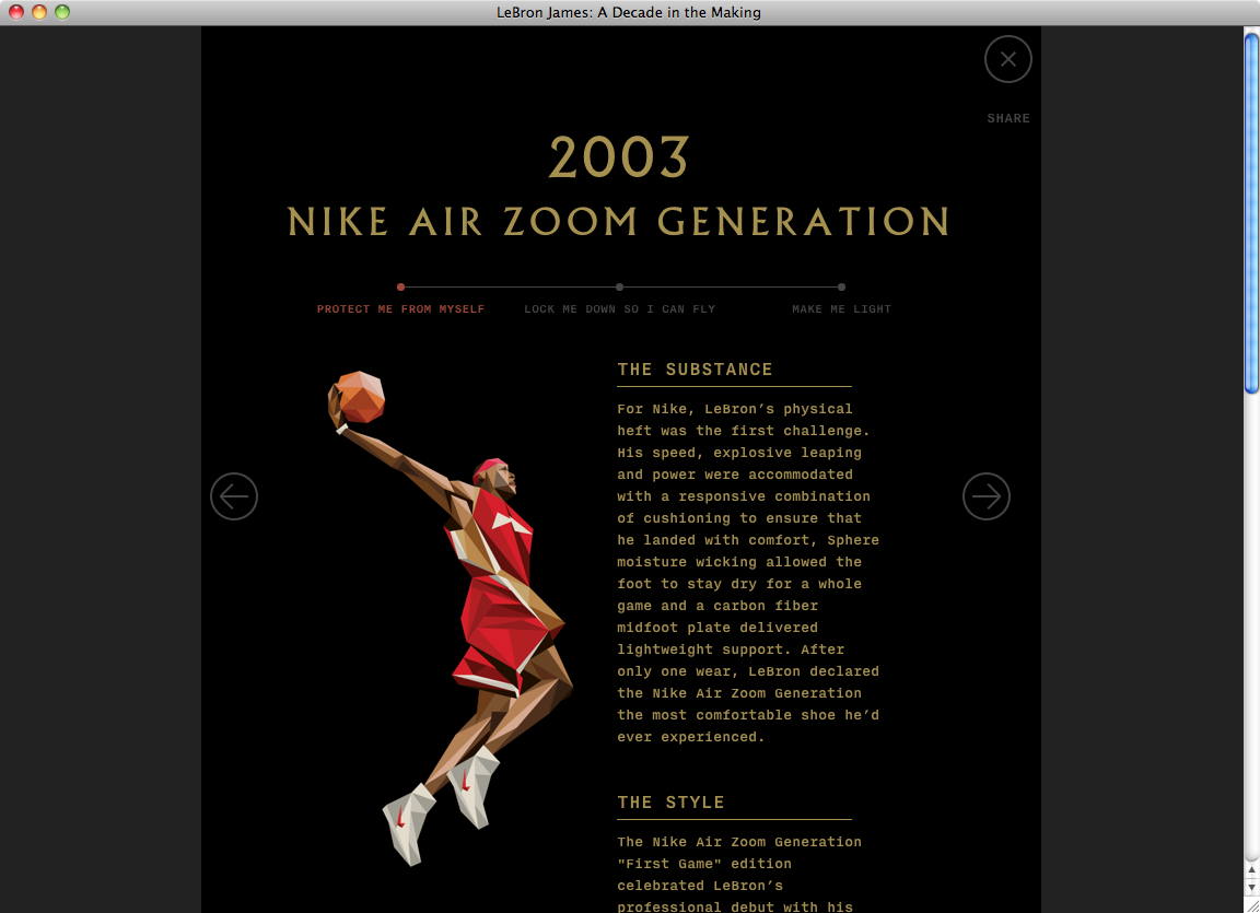
Source: lebron11.nikeinc.com License: All Rights Reserved.
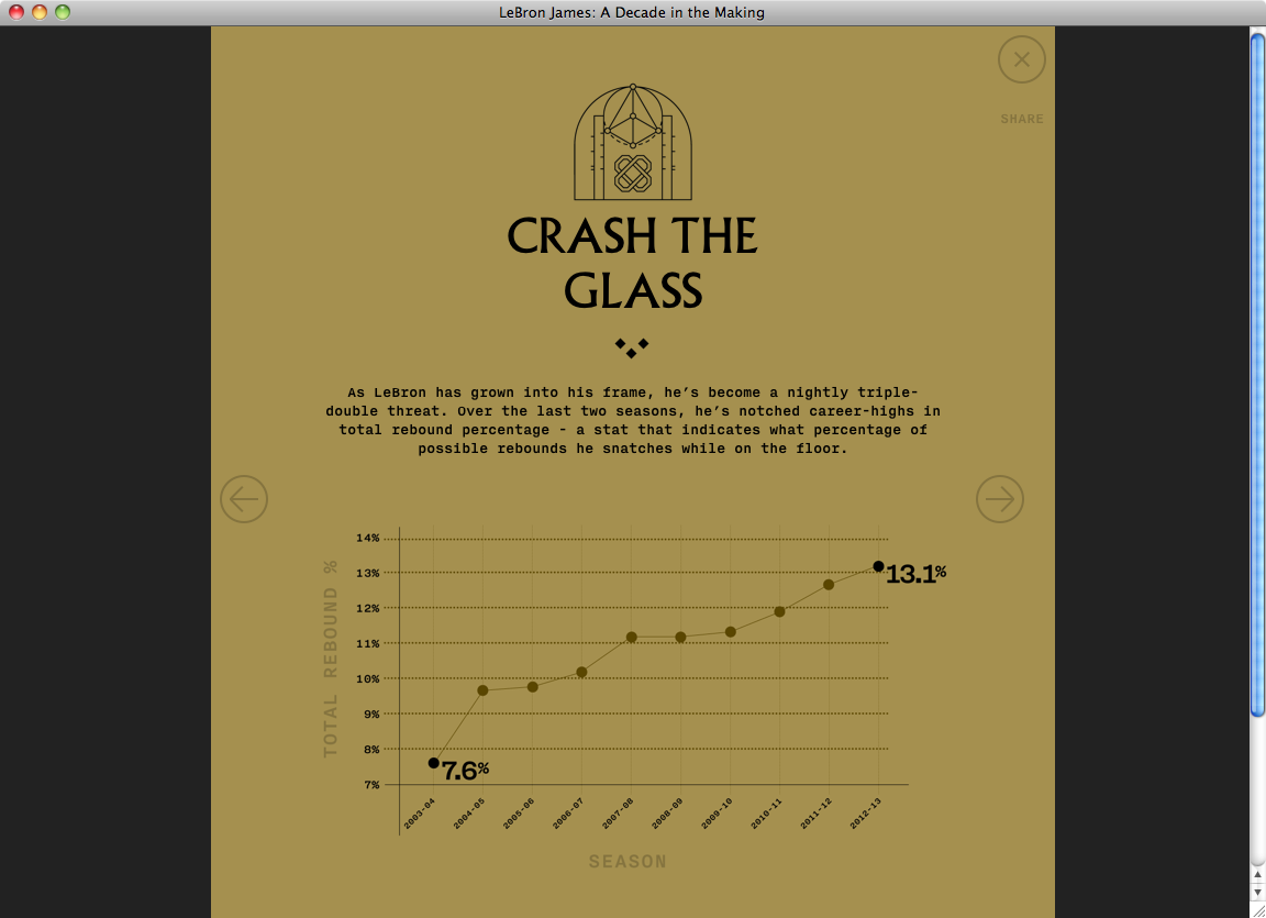
Source: lebron11.nikeinc.com License: All Rights Reserved.
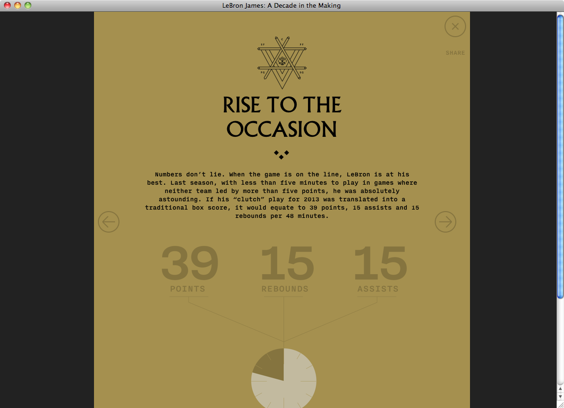
Source: lebron11.nikeinc.com License: All Rights Reserved.
Source: lebron11.nikeinc.com License: All Rights Reserved.


2 Comments on “LeBron 11 website”
Albertus is a typeface that really requires kerning — especially around its ‘A’ and ‘T’. Words like GREATNESS and GENERATION are dramatically improved when kerning is enabled through
text-rendering: optimizeLegibility.Keep in mind, though, that, according to Elliot Jay Stocks,
text-rendering: optimizeLegibility