
Korbmacher-Verein Kranichfeld invoice, 1939
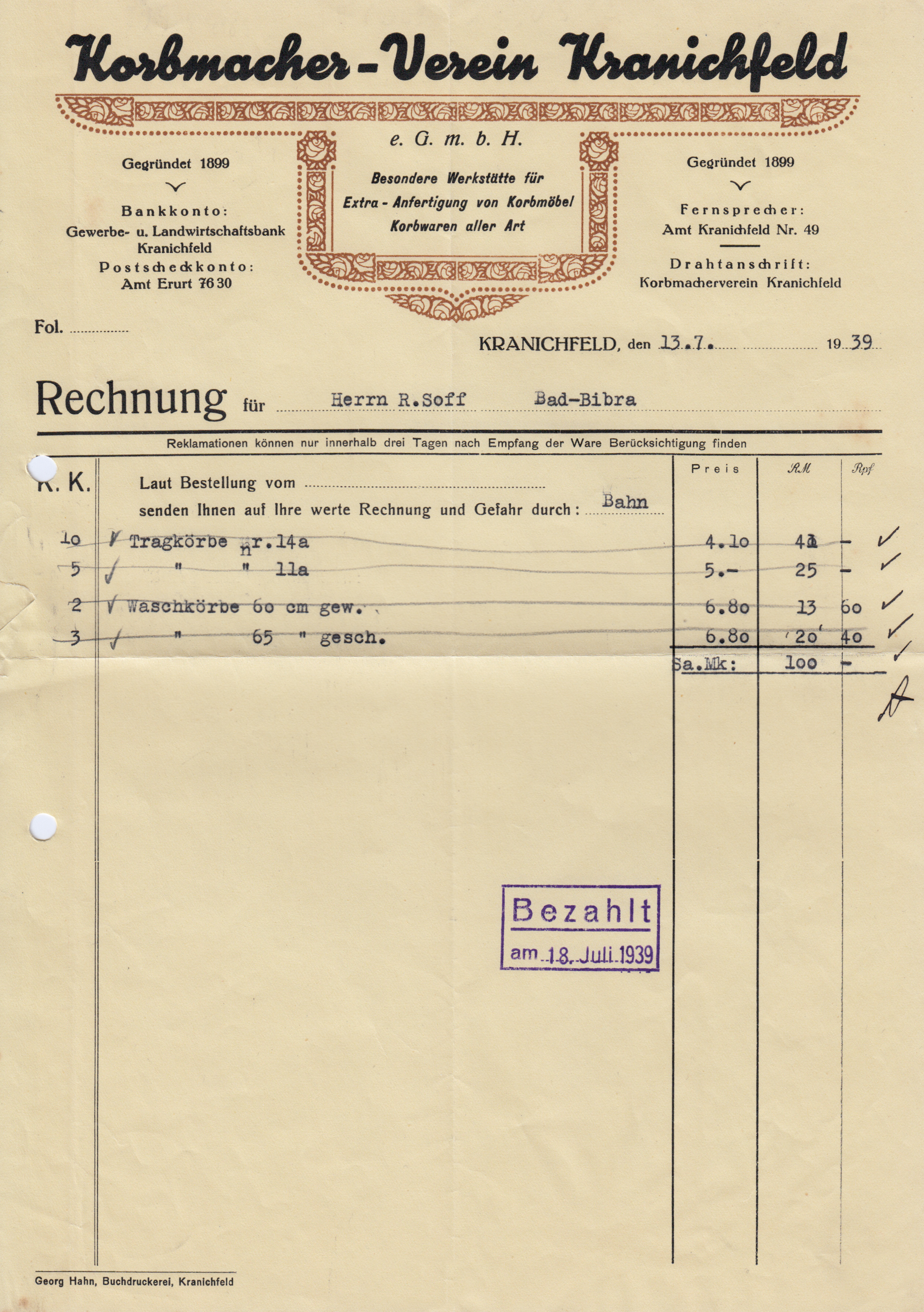
This week’s edition brings some more Mammut. Isn’t this chummy script adorable? It almost looks like icing lettering on a cake, made with a piping bag. Here it adorns an invoice from the association of basket makers in Kranichfeld, Thuringia, for panniers and clothes baskets worth ℛℳ 100.
The name is placed above a construction of floral border elements printed in a second color. Its symmetry is disturbed by the font choice, though; not so much by the moderate slant of Mammut, but rather by the inclined type placed in the framed center field. The italic sans appears to be a version of a typeface that goes back to the mid-19th century and was cast under generic names like Kursiv-Grotesk (Schelter & Giesecke, Stempel, AG für Schriftgießerei), Grotesk-Kursiv (Bauer), or Kursiv-Steinschrift (Klingspor).
Bank details and contact information are set in Magere Lo, a light style added in 1926 to Louis Oppenheim’s Lo-Schrift. It was revived by Erik Spiekermann as LoType light, preserving most of its German peculiarities like the slashed ‘7’ and ‘Z’, but not the ‘g’ that resembles a crashed penny-farthing, at least not in the light weight. This form was quite popular in the 1910s, but not everybody is fond of it. The original metal version also came with a more conventional form which is used in the revival.
In those olden days, ligatures for ‘ch’ and ‘ck’ were mandatory in German typesetting. They weren’t dissolved even when tracking was applied for emphasis (another relic from blackletter, a genre which has no italics), resulting in uneven word images, see “Postscheckkonto”. However, of the eight ‘ch’ pairs that appear in Magere Lo, three don’t use ligatures. Maybe there weren’t enough sorts available? Or maybe the typesetter wasn’t a very skilled one, see also “Erurt” (should be “Erfurt”).
“Rechnung” seems to be in Elzevir as cast by the Emil Gursch foundry in Berlin-Kreuzberg. This face was offered in two versions — Elzevir 2 is distinguished by an angled base serif on ‘u’. There’s another unidentified Romanisch/Romana-like serif with a striking ‘R’, and a sans serif with two-storey ‘g’, similar to Schelter & Giesecke’s Breite magere Grotesk (the bold companion style was revived a FF Bau) — I’m grateful for any pointers.

In contrast to older script typefaces with delicate connectors, Mammut is designed without any overhangs, i.e. all glyphs end at the border of the rectangle defined by the metal sort. Thanks to the ink spread in letterpress printing, the gaps get filled in more or less. This close-up reveals that they are still discernible, though. About the only connection that is really smooth is between ‘c’ and ‘h’ — because that pair is a ligature.


")


")
 album art")


")


