
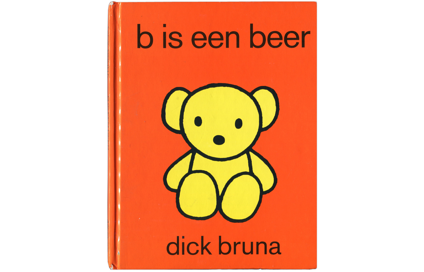
B is een beer by Dick Bruna
Contributed by Jan Rutten on Mar 22nd, 2015. Artwork published in
.
Dick Bruna, Mercis Publishing bv. License: All Rights Reserved.
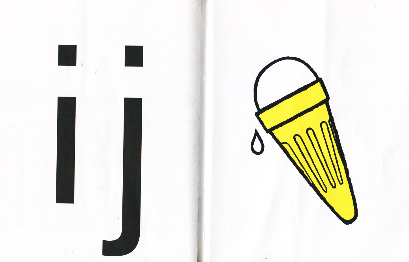
A children’s book by Dick Bruna that is meant to teach the alphabet. Each spread consists of a lowercase letter and an illustration of something that starts with that letter. Like most of Bruna’s children’s books of that period it is set in Mercator [edit: it’s Akzidenz-Grotesk, see comments].
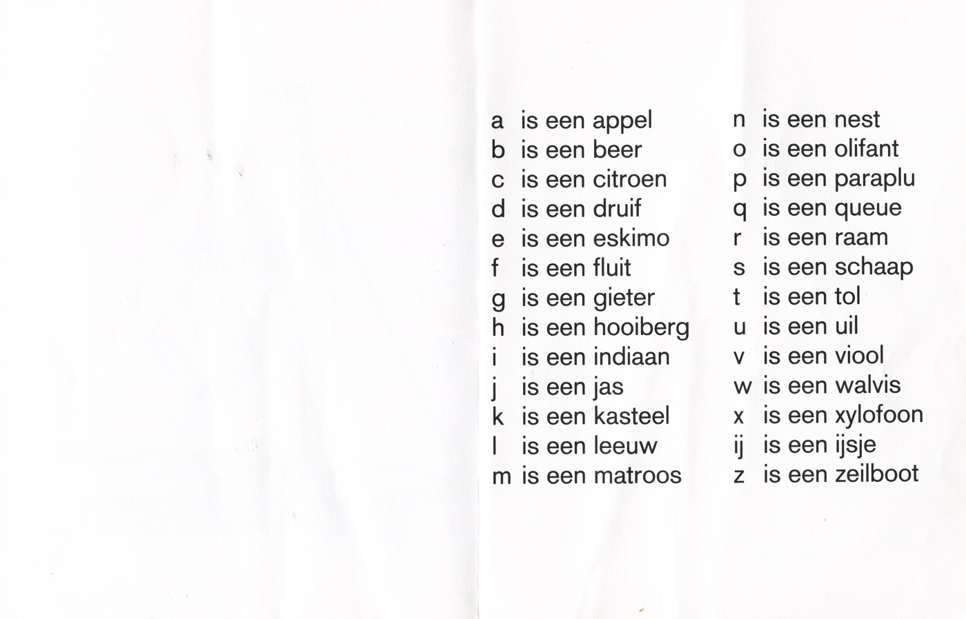
Peculiar is that instead of ‘y’, the Dutch diphthong ‘ij’ is used.

Dick Bruna, Mercis Publishing bv. License: All Rights Reserved.
a is for appel
Dick Bruna, Mercis Publishing bv. License: All Rights Reserved.
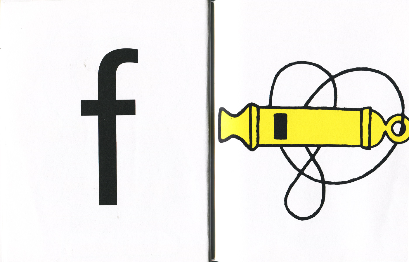
f is for fluit
Dick Bruna, Mercis Publishing bv. License: All Rights Reserved.
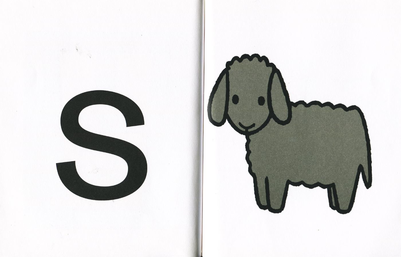
s is for schaap
Dick Bruna, Mercis Publishing bv. License: All Rights Reserved.
ij is for ijsje


")


 opening titles")

")


2 Comments on “B is een beer by Dick Bruna”
While some Bruna editions used LA Mercator (Ik Kan Lezen, for example), they also used versions of Akzidenz Grotesk–– This example uses AG, not Mercator, as identified by the lowercase “t” and the upwards curving tail on the lowercase “a.”
Right you are! Thank you very much for this correction.