Nuits Sonores 2023
Nuits sonores (“Sonic Nights”) is the title of a yearly event dedicated to electronic music, visual and performance art that takes place in Lyon, France, in the month of May. It was initiated in 2003 by Arty Farty, a non-profit association whose purpose is to serve youth culture, democratic renewal and public welfare. The event traditionally starts on the Wednesday before Ascension Day – which, in the French calendar, marks the start of the festival season – and lasts five days. Various locations across the city become part of a large parcours, from small galleries in the historic center via the banks of river Rhône to extensive abandoned industrial estates in the outskirts.
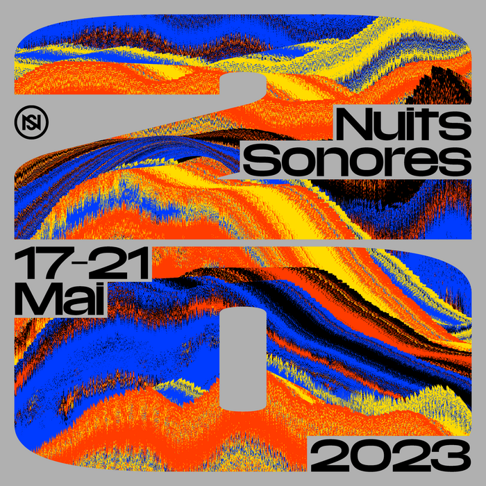
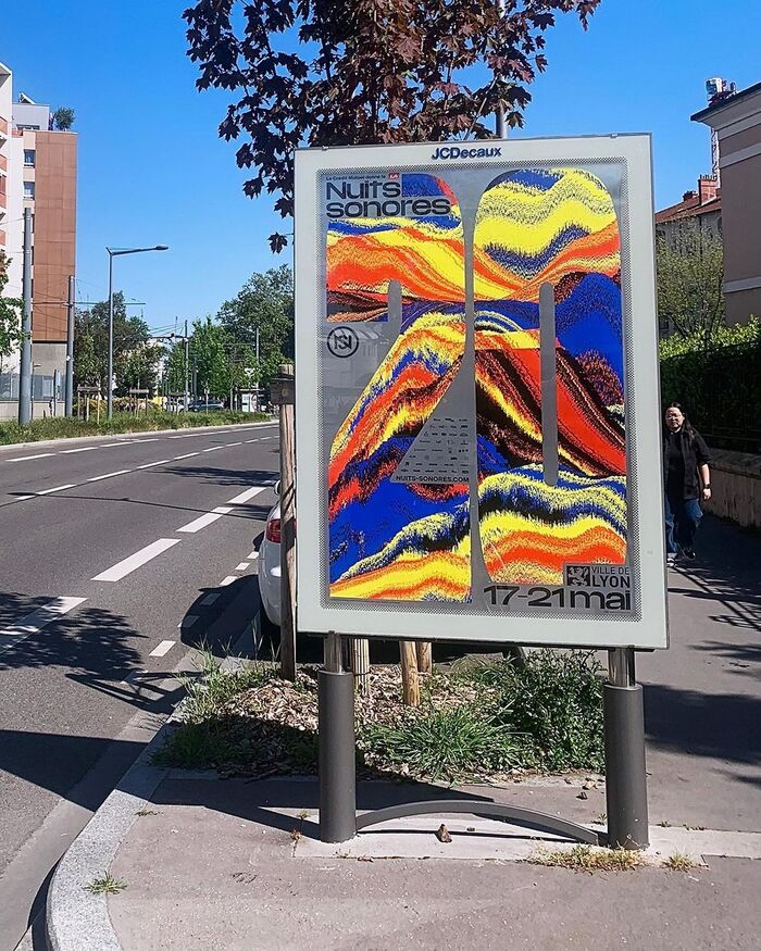
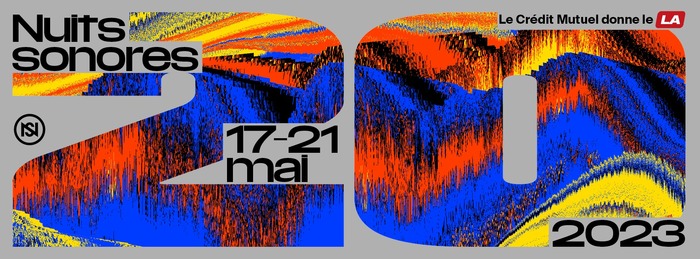
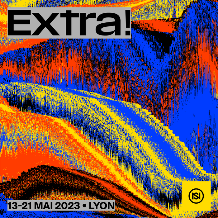
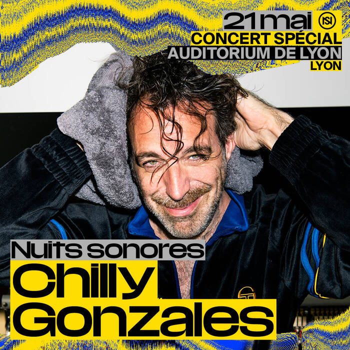
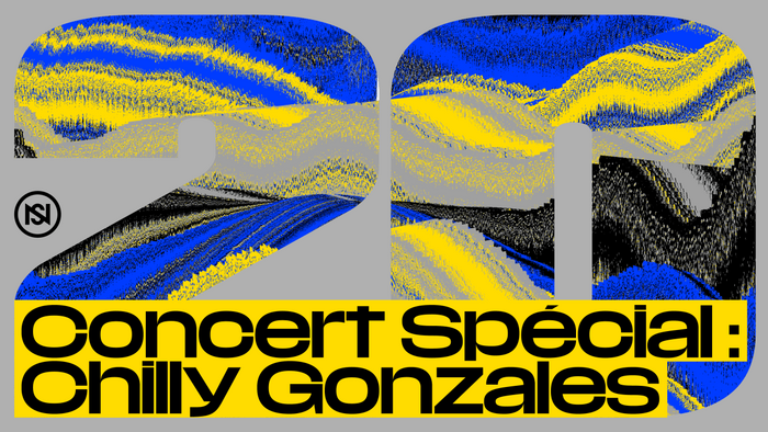
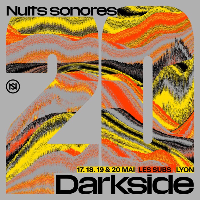
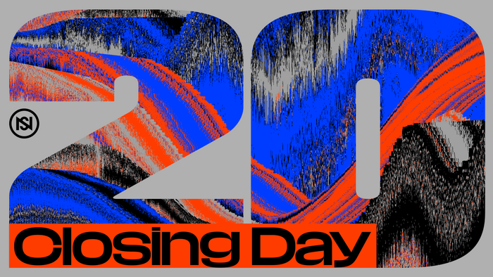
In 2023 Nuits sonores celebrated twenty years of existence. On that occasion the curators wished to celebrate the jubilee with an exceptional visual identity. They asked Lyon-based studio Superscript², consisting of Patrick Lallemand and Pierre Delmas Bouly, to pick a young emerging talent to collaborate with – and they chose Anthony Couret of Studio Antho, a specialist in creative coding. Together they conceived the basic approach.
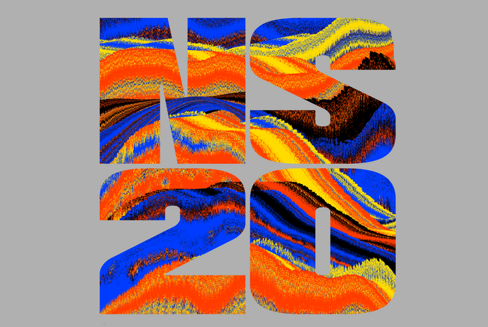
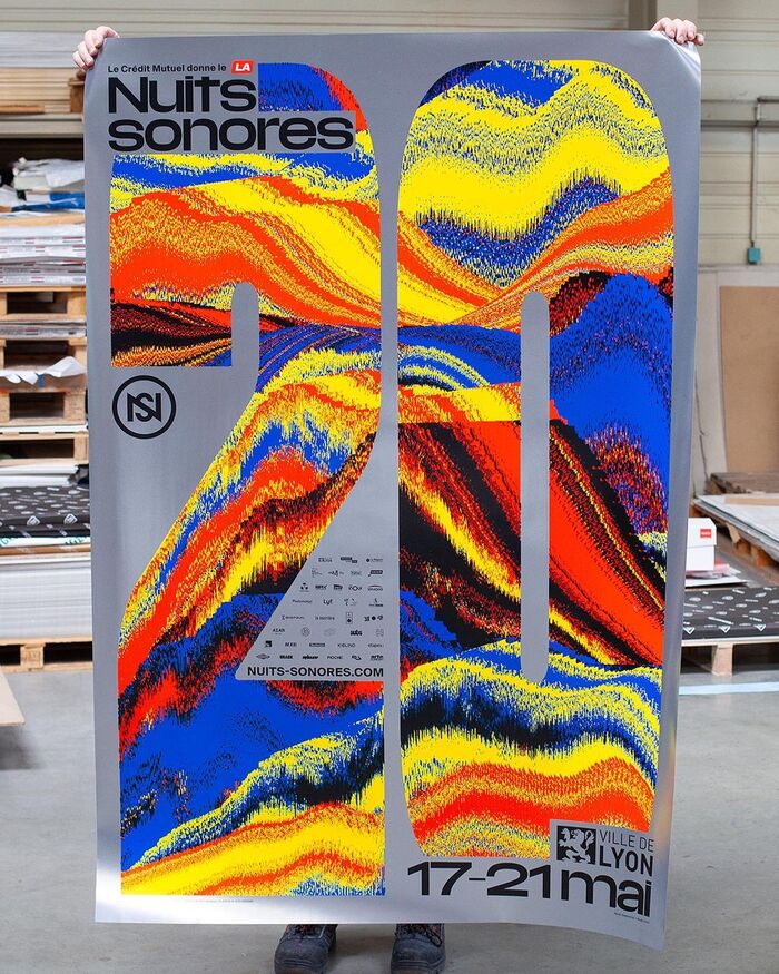
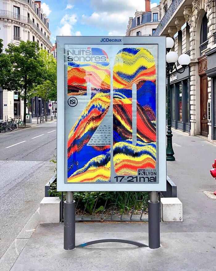
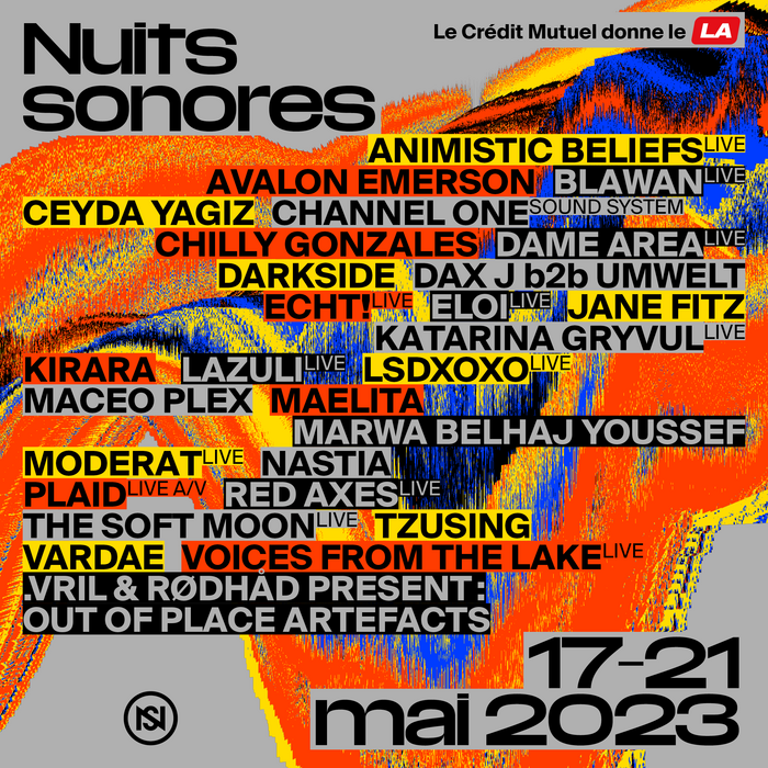
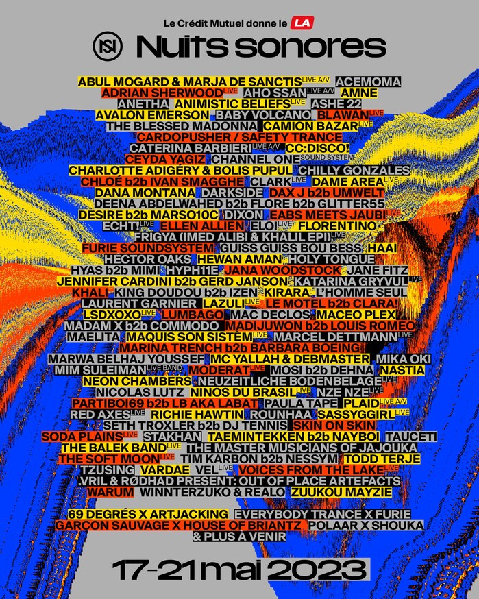
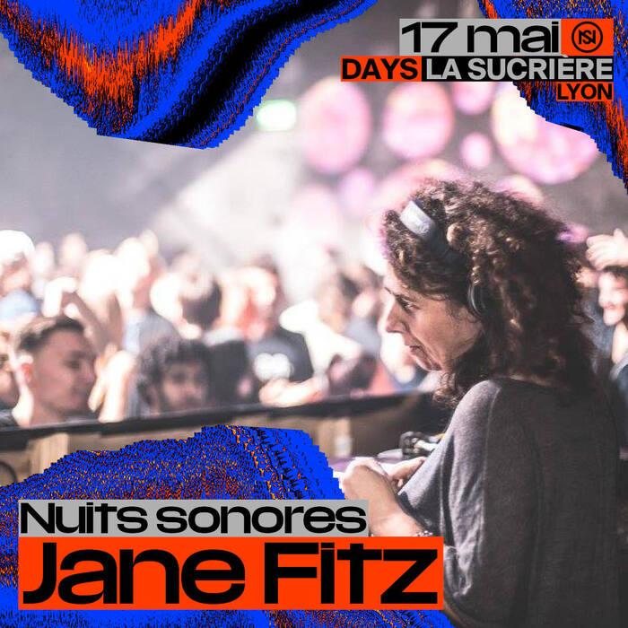
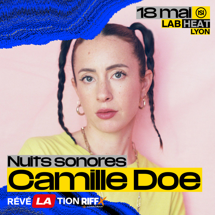
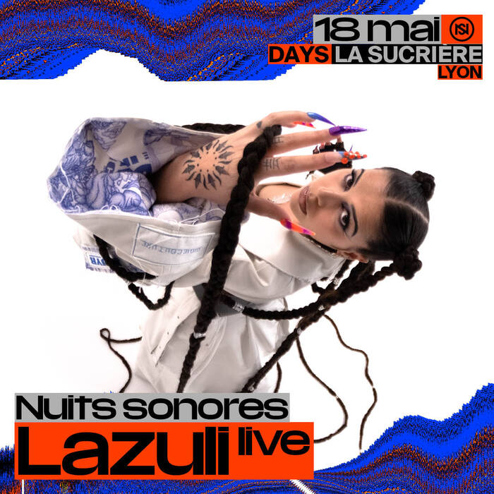
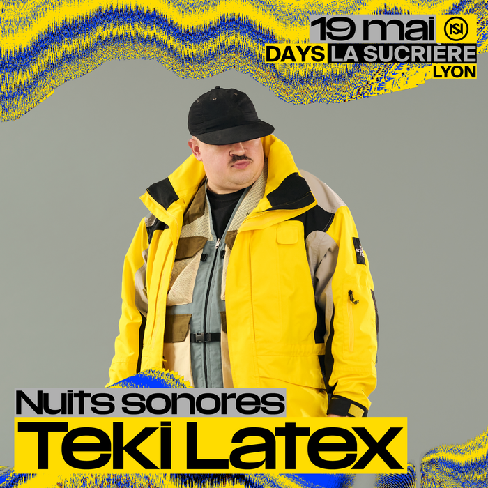
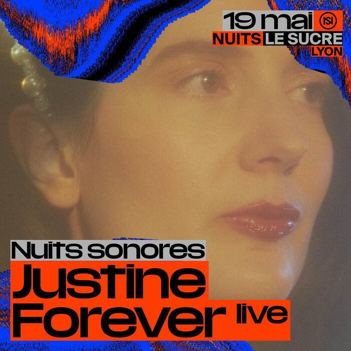
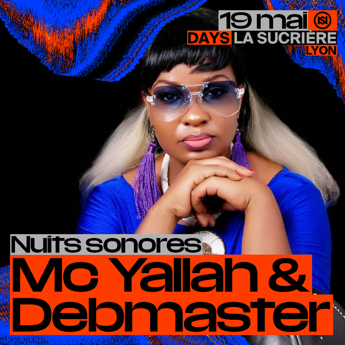
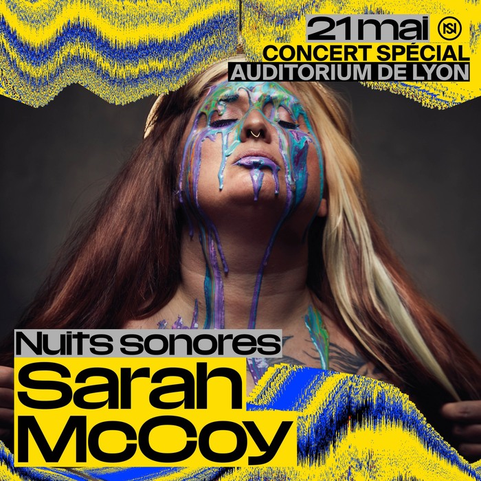
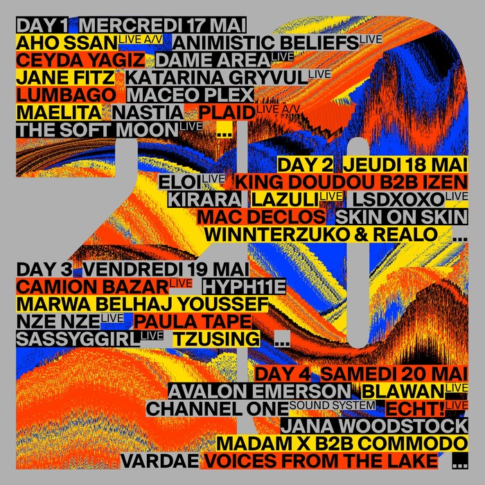
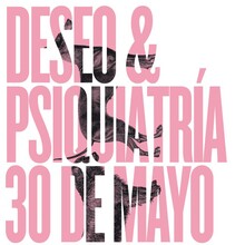
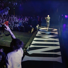
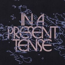
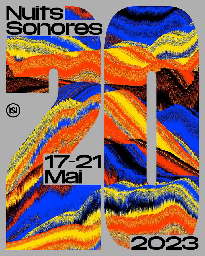
With around fifty images representative of earlier editions of the event as a source material, they decided to treat these as if they were tiny samples of music. These visual samples were first repeated in order to build up a rhythm, then they were algorithmically dislocated in space to turn them into an oscillating texture, and finally interpolated into a diffusion scheme akin to the visualization tool of a music application. The result is a design principle that will reproduce a recognizable language while each medium might display a different specific outcome of abstract color waves. Apart from the generative code, the designers set on bright red, blue and yellow as colors, a custom-drawn “NS 20” for Nuits Sonores 20 years and on Media Sans as the leading display typeface. As subordinate secondary typeface you will see Suisse Int’l in all caps in some of the pictures in this post.
Media Sans is a collection of 42 styles assorted in five families ranging from Extra Condensed to Extended. The common feature is an extremely high x-height that allows for very tight line spacing. The typeface designed by Jean-Baptiste Levée stems from a project for French newspaper Libération. Since 2018 it’s available to the general public from Production Type.
- Chapters
- descriptions off, selected
- captions settings, opens captions settings dialog
- captions off, selected
This is a modal window.
Beginning of dialog window. Escape will cancel and close the window.
End of dialog window.
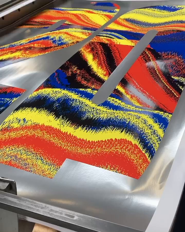
The posters were screenprinted using silver instead of grey by Lézard Graphique, one of the most beloved printing houses among museums and theaters in France.
- Chapters
- descriptions off, selected
- captions settings, opens captions settings dialog
- captions off, selected
This is a modal window.
Beginning of dialog window. Escape will cancel and close the window.
End of dialog window.
Formats
- Branding/Identity (6425)
- Posters/Flyers (4572)
Designers/Agencies
- Superscript² (3)
- Studio Antho (1)
Tagged with
- Nuits Sonores (2)
- music festivals (275)
- anniversaries (265)
- identities (1517)
- posters (1017)
- generative (33)
- red yellow and blue (55)
- primary colors (85)
- lettering (530)
- type with pattern fill (117)
- stacked glyphs (410)
- initialisms/monograms (317)
- numerals (867)
- screen printed (278)
- process (119)
- metallic paper or ink (159)
- silver (130)
- social media (628)
- lineups (184)
- all caps (5785)
- typeface combinations (3040)
- baseline shift (95)
- highlighted (32)
- French (language) (1897)
- CGI (51)

