
Estonian Farm Architecture
Contributed by Florian Runge on Oct 26th, 2015. Artwork published in
.
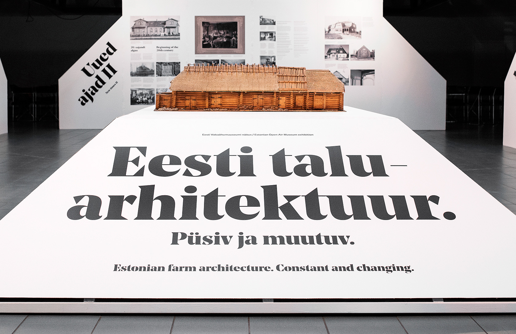
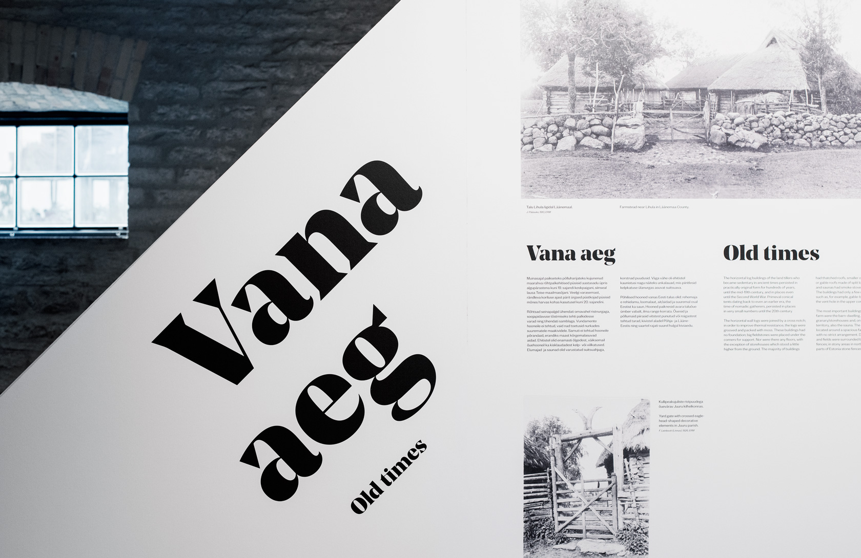
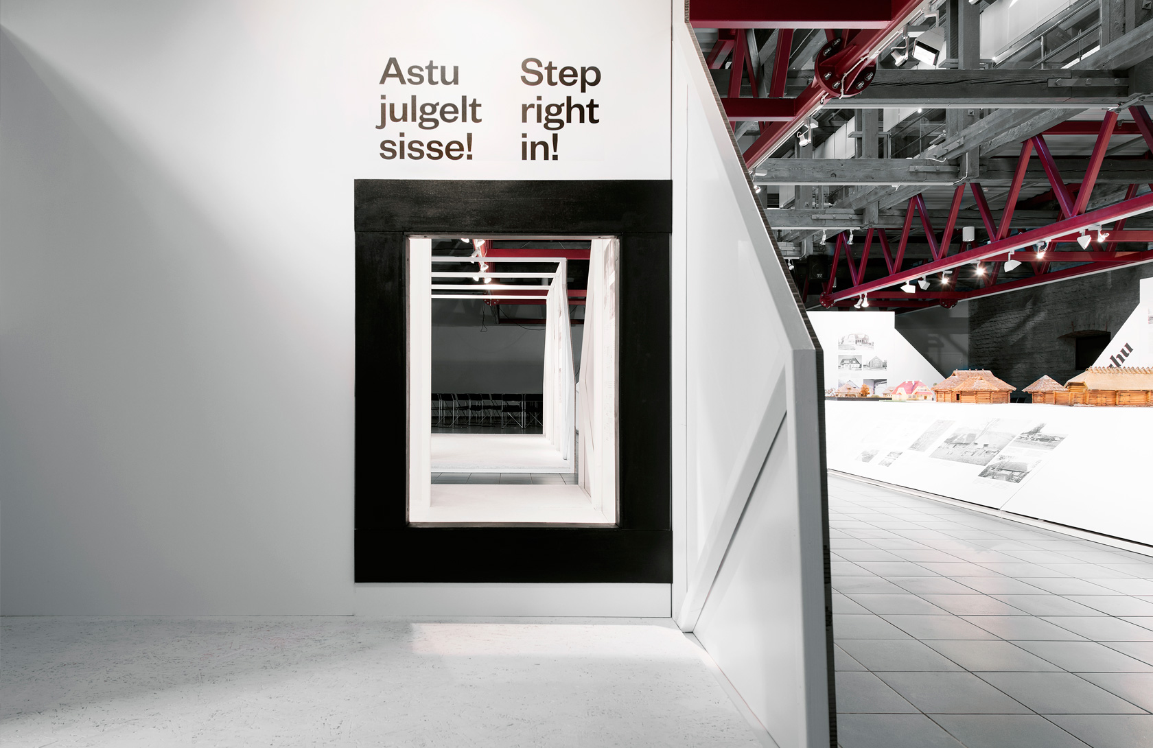
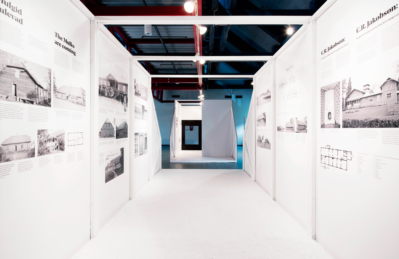
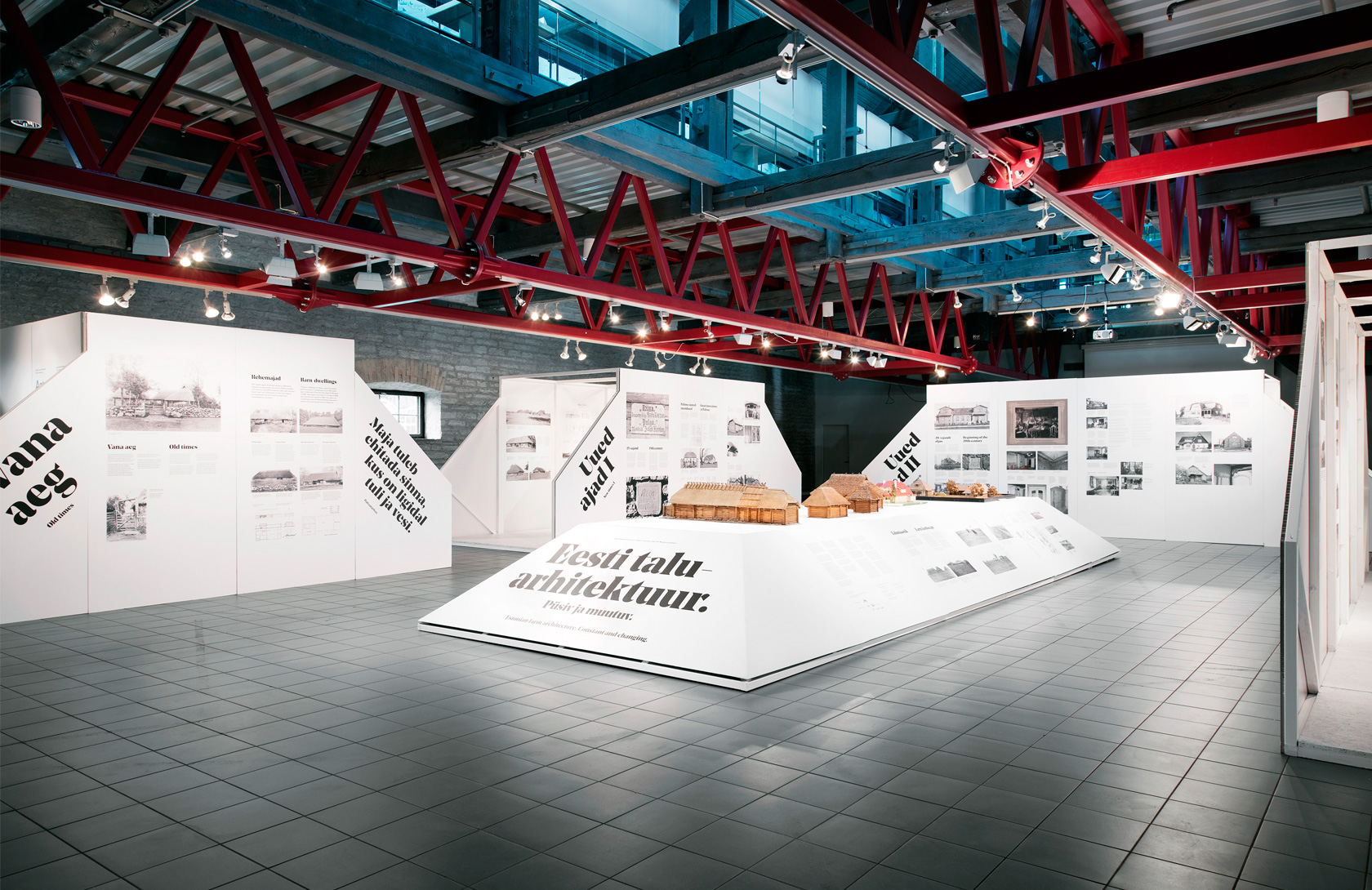
The exhibition concentrates on the later part of Estonian farm architecture (from mid-19th to mid-20th century. A revival of an early 20th century grotesk was therefor chosen as the text typeface and a modern, slightly robust serif as the headline font. The bold typography complements the minimal white structures resembling the shape of a farm house.
Exhibition design: KAMP Architects
Exhibition photos: Terje Ugandi


 movie posters and DVD cover")


")


1 Comment on “Estonian Farm Architecture”
Wow. (That’s all I can say!)