Meatpacking District
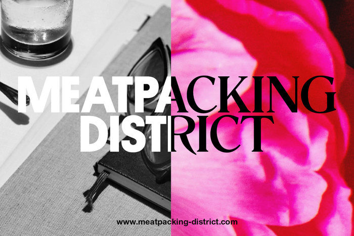
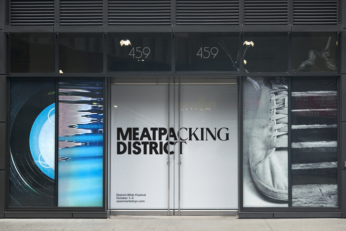
Base’s new identity for New York’s Meatpacking District reflects past and present.
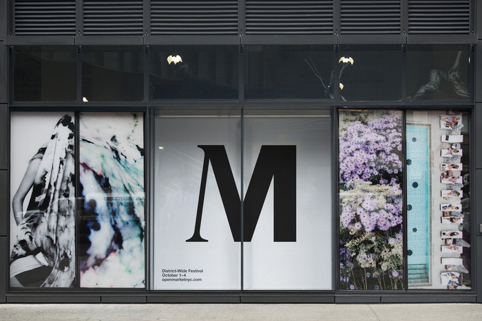
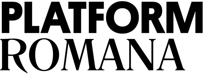
“The new look has been rolled out over the past few weeks and centres around a word mark with contrasting bold and light typefaces. Base says the contrast ‘pays homage to the history and provenance of the district while capturing the renaissance currently taking place in the neighbourhood.’” — Rachael Steven, Creative Review
Typefaces
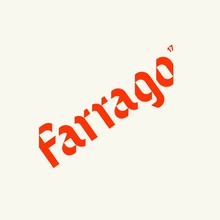
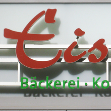
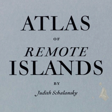
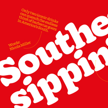
The typefaces are Platform, a recent exploration of basic geometric forms by Berton Hasebe, and Romana, a German design rooted in 19th-century Oldstyle type from France. The two faces are clear contrasts between modern and traditional, as well as mechanical and human. Romana was a good choice for the serif side because its high-waisted ‘G’ and long-legged ‘R’ are distinctive shapes, emphasizing the difference between hand-wrought letters and the cold, crude geometry of Platform.
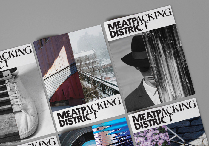

Website


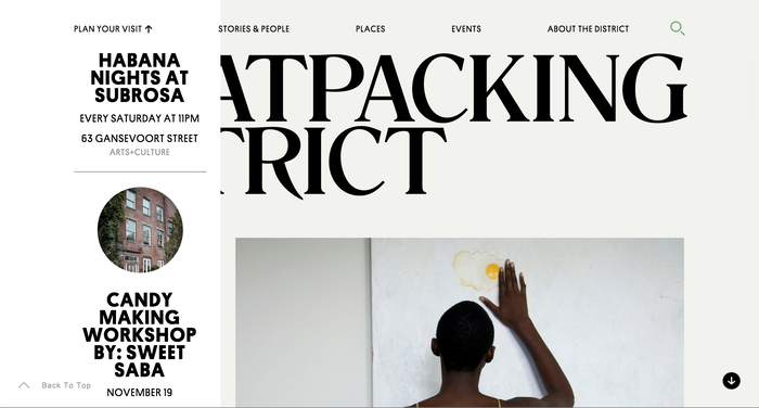
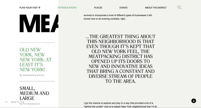
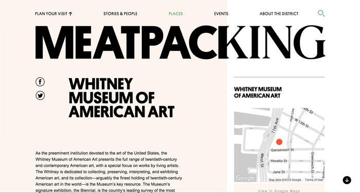
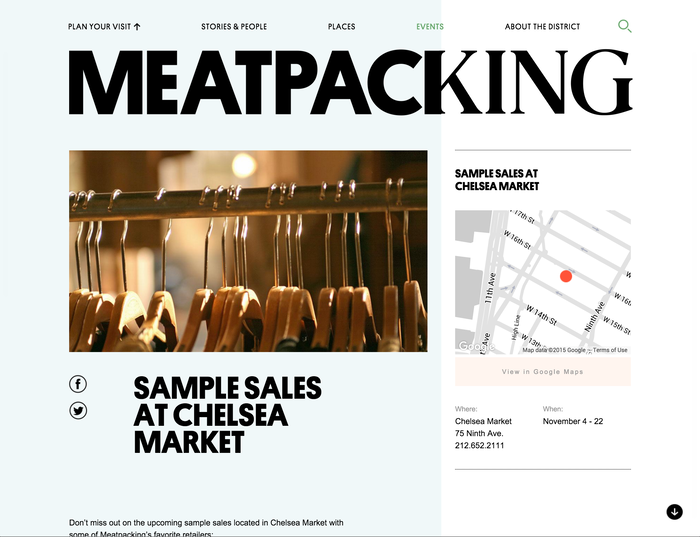
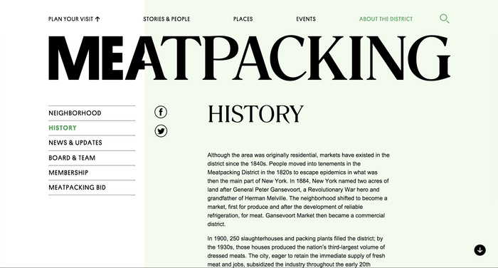
The Meatpacking District website is especially inventive with the split-personality identity. Each side is a column of content that scrolls independently. Webfont versions of Platform (from Commercial Type) and Romana (from Elsner+Flake) are used for headlines, nav, and pullquotes. The text is set in Arial.
Formats
- Web (3298)
- Advertising (1406)
- Branding/Identity (4763)
- Booklets/Pamphlets (1472)
Topics
- Local (833)
Designers/Agencies
- Base (5)
Tagged with
- logos (2695)
- typeface combinations (2106)
- pull quotes (105)
- New York City (77)
- neighborhood (2)
- lamp post banners (29)
Artwork location
- United States (6378)
- New York City (1706)
In Sets
- [1] (Ivan Ilic) (171)
- JB (Genevieve Beharry) (15)
- Design Inspiration (charles Jackman) (7)
- Hammer (Florian Mörk) (73)
- _identity (Ricky Chiang) (16)
- cool (Karo Konieczna) (874)
- FAVS (HIEU) (141)
- ppt (wang yorka) (5)
- Identity (miguel anønimo) (112)
- AFA ACADEMY (Daniel Cannizzo) (45)
- osado (Matteo Carmona) (20)















1 Comment on “Meatpacking District”
I realize that Arial’s resurgence (worthy of an essay itself), Romana, and maybe even tinted pastels are big right now, but I can’t deny it: it’s fantastically executed from both design and development angles. Love it.