
Esquire’s Big Watch Book, issue 1
Contributed by Florian Hardwig on Nov 27th, 2015. Artwork published in
October 2015
.
Source: www.hearst.co.uk License: All Rights Reserved.
“Esquire, Britain’s most sophisticated men’s magazine, is launching its standalone new brand, The Big Watch Book, with an exclusive Harrods partnership.” — hearst.co.uk
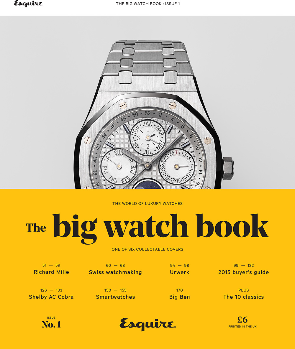
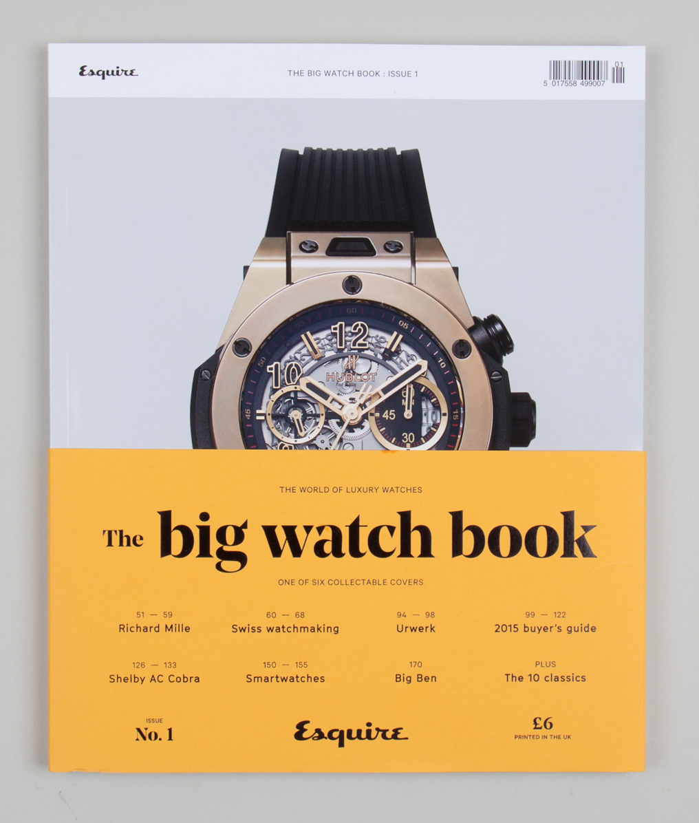
The publication comes in six collectable covers, with titles set in Noe Display Bold (Schick Toikka, 2013). The sans serif is GT Cinetype (Grilli Type, 2015) [thanks to Love and Alberto for the ID!].
Creative Direction by Nick Millington
Photo Director Henny Manley
Art Director Peter Ainsworth
Senior Designer Anup Parmar
Designer Lisa Barlow

Source: nickmillington.com License: All Rights Reserved.

Source: nickmillington.com License: All Rights Reserved.
Source: nickmillington.com License: All Rights Reserved.
Source: nickmillington.com License: All Rights Reserved.


")


")

3 Comments on “Esquire’s Big Watch Book, issue 1”
The other typeface looks a lot like GT Cinetype.
grillitype.com/typefaces/gt…
Is the unidentified type maybe GT Cinetype?
Alberto, Love — yes, that’s the one, thank you. Added.