
Cooke Curtis & Co. by The District
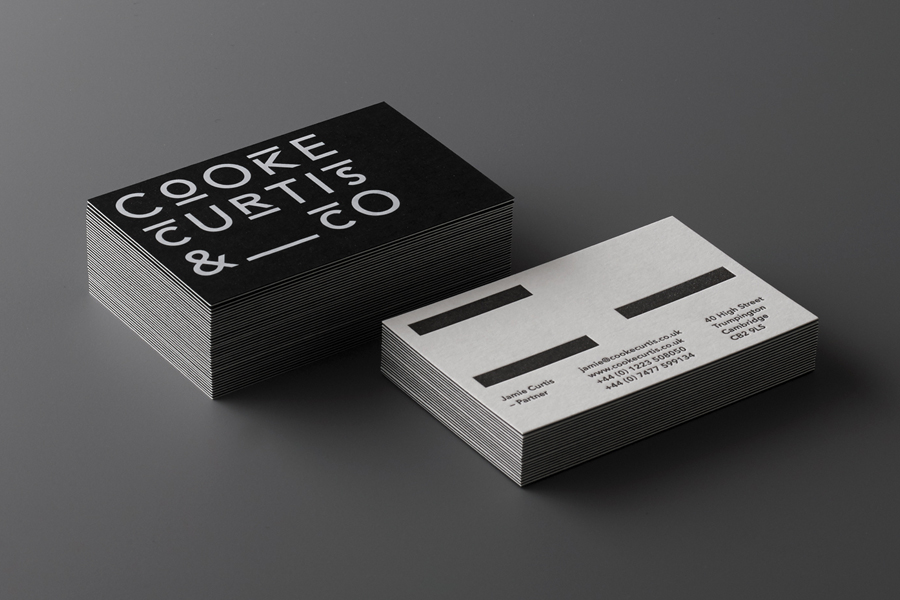

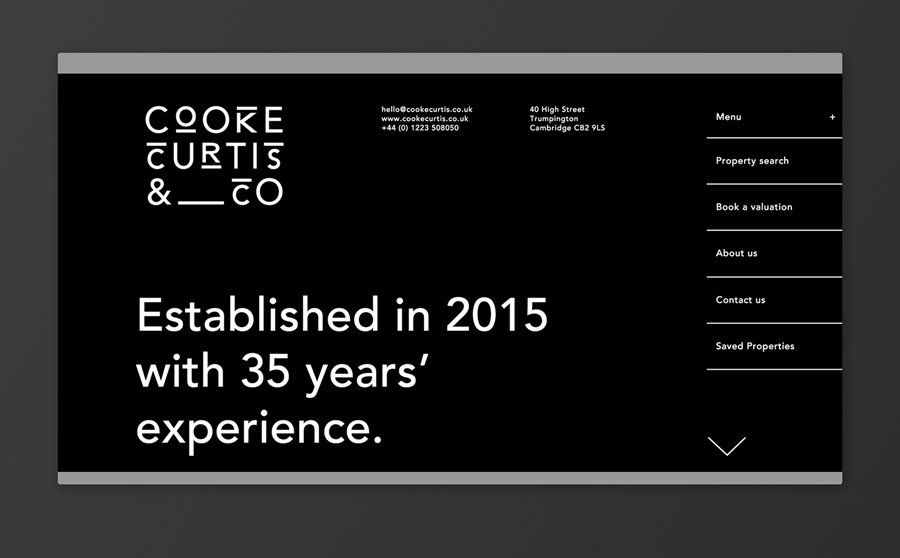
Cooke Curtis & Co. is an award-winning estate agent with an office in Cambridge, United Kingdom. It has a portfolio and a thorough understanding of properties throughout the city and in neighbouring villages. Although the business was established last year, its founders have over thirty-five years of industry experience.
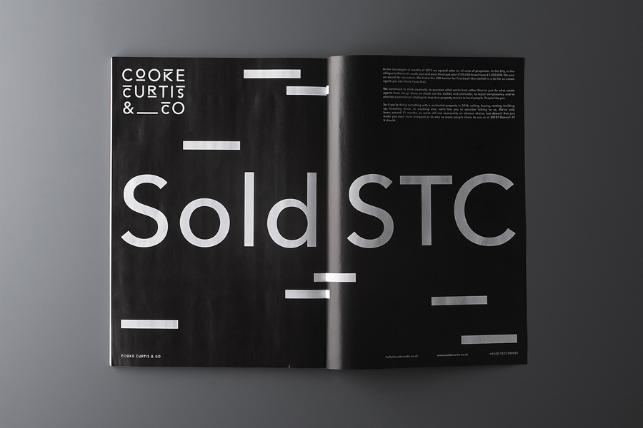
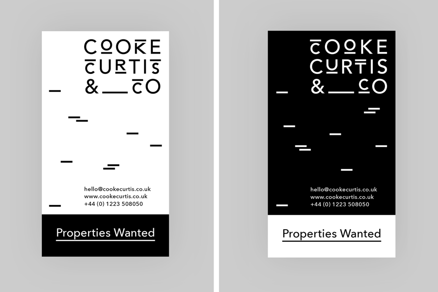
Graphic design studio The District were commissioned by the estate agent to develop a visual identity that would work across a broad range of printed and digital media, from business cards, letterheads, brochure and website to ‘for sale’ signs, vehicle graphics and key rings.
With the intention of delivering a distinctive and impactful solution sensitive to the heritage of the founders, and the will to cut through the hyperbole of the industry, The District took a bold typographic approach that discards photography in favour of the monolinear geometric sans-serif letters of Avenir Medium, emphasised by a black and white colour palette.
Read more about this project on BP&O.


")


")


![<cite>Prawdziwe wyobrażenie trojga dzieci </cite>[...], Second Edition Project](https://assets.fontsinuse.com/static/use-media-items/116/115147/thumb/5eeb50be/@2x/Ada%20Pawlikowska%201.webp "<cite>Prawdziwe wyobrażenie trojga dzieci </cite>[...], Second Edition Project")

