
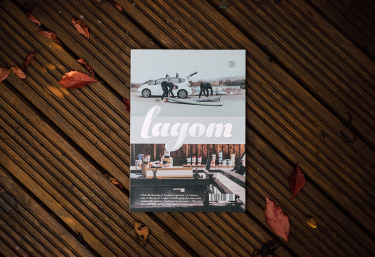
Lagom magazine
Contributed by Tomas Brousil on Feb 29th, 2016. Artwork published in
.
License: All Rights Reserved.
“Lagom” is a Swedish word with no direct English translation, but loosely describes the concept of having just the right amount of something: not too little, not too much. This general theme of leading a balanced life pervades every issue of Lagom and guides us to new stories.
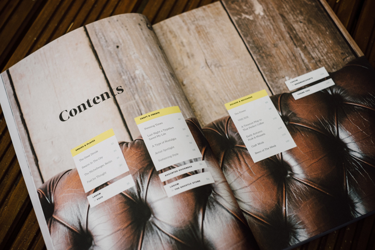
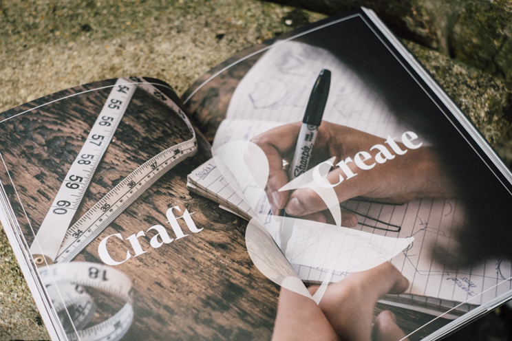
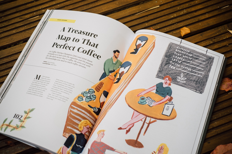
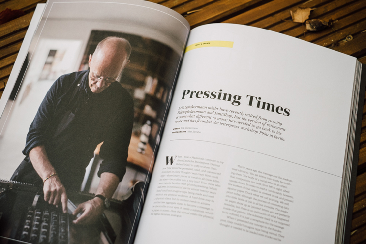
The magazine is divided into three distinct sections: Spaces & Places, Craft & Create, and Escape & Recharge. So, moving through each issue, the reader finds inspirational workspaces, hotels, restaurants, and homes from around the world; then gets to meet the makers and craftspeople creating truly unique work; then finally unwinds with a look at pastimes and hobbies that help attain that all-important sense of balance in our busy, modern lives.
License: All Rights Reserved.
License: All Rights Reserved.
License: All Rights Reserved.
License: All Rights Reserved.


")


")


2 Comments on “Lagom magazine”
Just a minor correction to say that the logo is actually a modified version of Aparo, by DSType — I didn’t hand-draw it. :)
Thanks for setting the record straight, Elliot! Corrected.