
Massimo Vignelli’s A Few Basic Typefaces
Vignelli presented his (now famous) type philosophy at an SVA exhibition in 1991, revisiting it 20 years later for his Canon.

This Massimo Vignelli poster announces the School of Visual Arts’ “third in a series of exhibitions honoring the great visual communicators of our time.” February 22 to March 8, 1991 at the Visual Arts Museum. According to Vignelli:
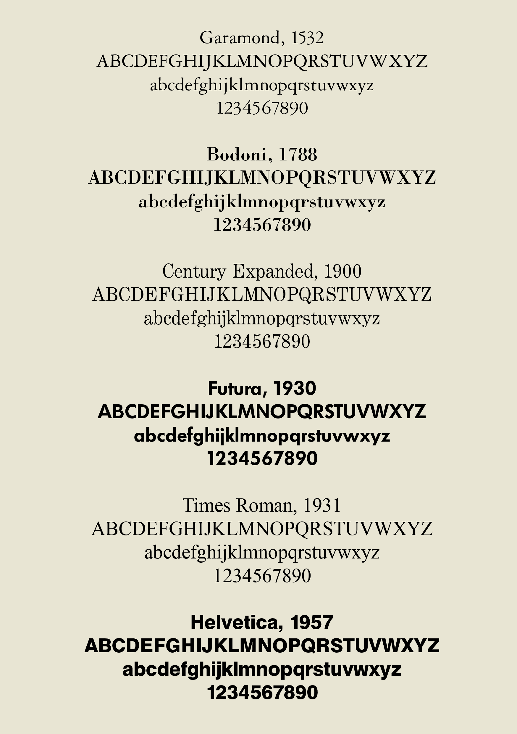
The exhibition showed work that we had done over many years by using only four typefaces: Garamond, Bodoni, Century Expanded, and Helvetica. The aim of the exhibition was to show that a large variety of printed matter could be done with an economy of type with great results. In other words, is not the type but what you do with it that counts. — The Vignelli Canon, 2009–10
Vignelli is famous (or infamous) among designers for sticking to a handful of typefaces and publicly poo-pooing all the new stuff that was sprouting in the early years of DTP. He expounds on his philosophy in Canon:
As I said, at the time, if all people doing desktop publishing were doctors we would all be dead! Typefaces experienced an incredible explosion. The computer allowed anybody to design new typefaces and that became one of the biggest visual pollution of all times. …
I still believe that most typefaces are designed for commercial reasons, just to make money or for identity purposes. In reality the number of good typefaces is rather limited and most of the new ones are elaborations on pre-existing faces. Personally, I can get along well with a half a dozen, to which I can add another half a dozen, but probably no more. Besides those already mentioned, I can add Optima, Futura, Univers (the most advanced design of the century since it comes in 59 variations of the same face), Caslon, Baskerville, and a few other modern cuts. As you can see my list is pretty basic but the great advantage is that it can assure better results. It is also true that in recent years the work of some talented type designers has produced some remarkable results to offset the lack of purpose and quality of most of the other typefaces.
Vignelli himself was partially responsible for creating a new typeface (well, technically a modern revival) just a few months before this SVA exhibition: WTC Our Bodoni. From its release specimen:
When Bert Di Pamphilis of the World Typeface Corporation, New York, asked us to design a new typeface, we told him that we do not believe in “new” typefaces, but that there was room for improvement on existing, classic typeface designs. We consider the ratio between upper- and lower-case Helvetica letters to be the best there is. We wanted to redesign Bodoni using a similar ratio between the cases, with short ascenders and descenders; and articulate the type in four weights: light, regular, medium, bold. We worked on this project with Tom Carnase, undoubtably one of the very best type designers in the world. We were quite pleased with the results of our efforts, and we plan to apply the same concept to a few other classic typefaces, such as Futura, Century and Garamond.

The exhibition poster, however, doesn’t use WTC Our Bodoni, opting instead for a more standard digital or phototype version of Bodoni, perhaps to reflect the work shown in the exhibition using older cuts of the typeface.


2 Comments on “Massimo Vignelli’s A Few Basic Typefaces”
Hello Stephen
If I’m not mistaken, Vignelli didn’t actually favour any version of Garamond, but ATF’s Garamond 3 — as used, for instance, in his Field Guides (1977–1994) for the Audubon Society.