
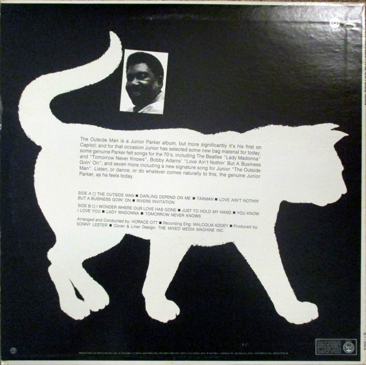
The Outside Man by Junior Parker
Contributed by Stephen Coles on Sep 12th, 2016. Artwork published in
.
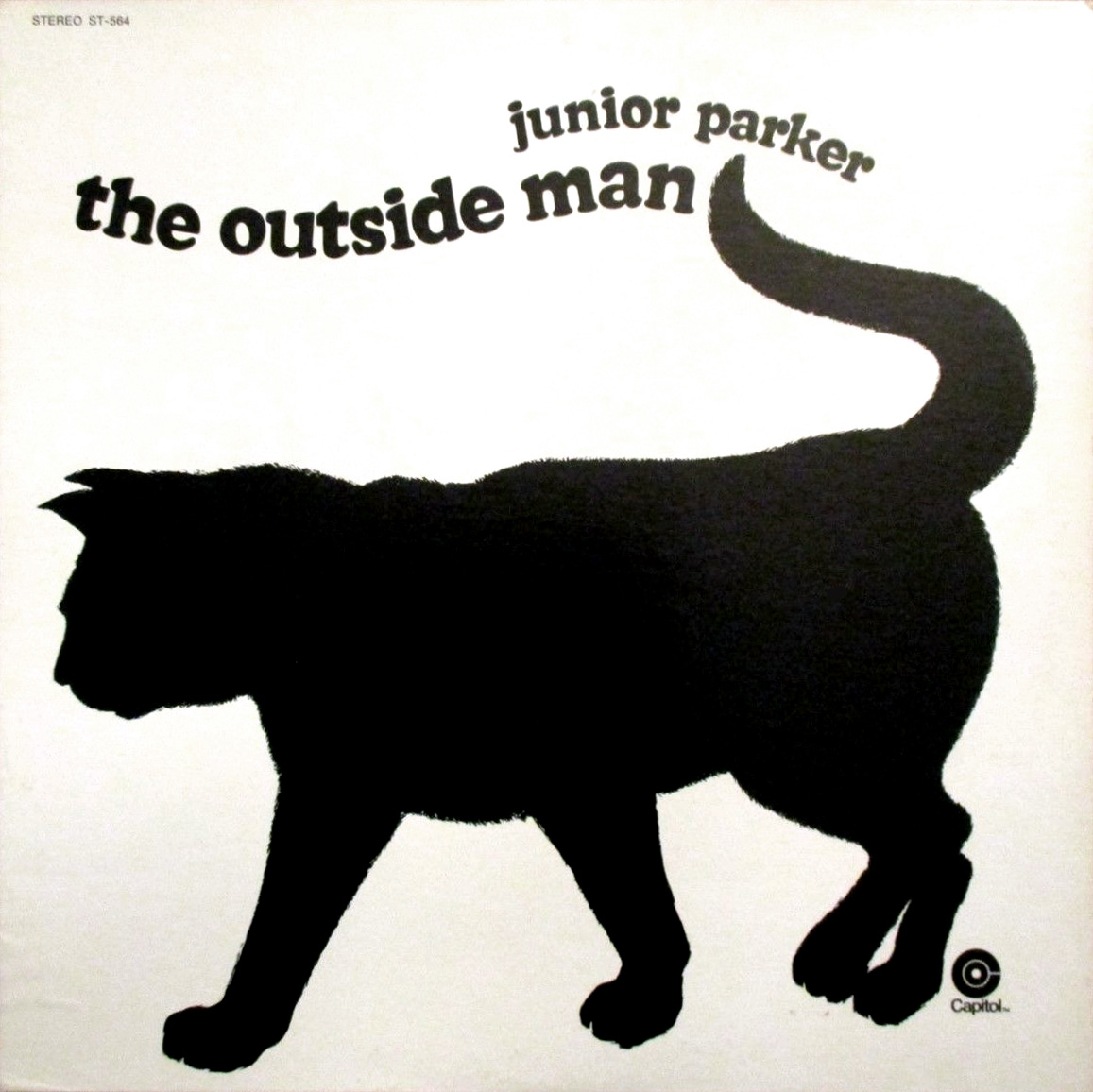
This top-heavy Cooper Black is not custom lettering; it’s Photo-Lettering’s Ziptop Cooper Black from their bizarre and groovy line of “Zip-Top” fonts.


")


")


")


4 Comments on “The Outside Man by Junior Parker”
More Cooper Cats:
Makes me think of Supercooper by Alphabet Innovations (1970). Similar kind of alteration, but quite different connotations.
And if you really want to go funhouse with the Cooper distortion there was also Scorpio and Somalia.