
Salões de Paris by Marcel Proust, Carambaia
Contributed by Tereza Bettinardi on Nov 4th, 2016. Artwork published in
.

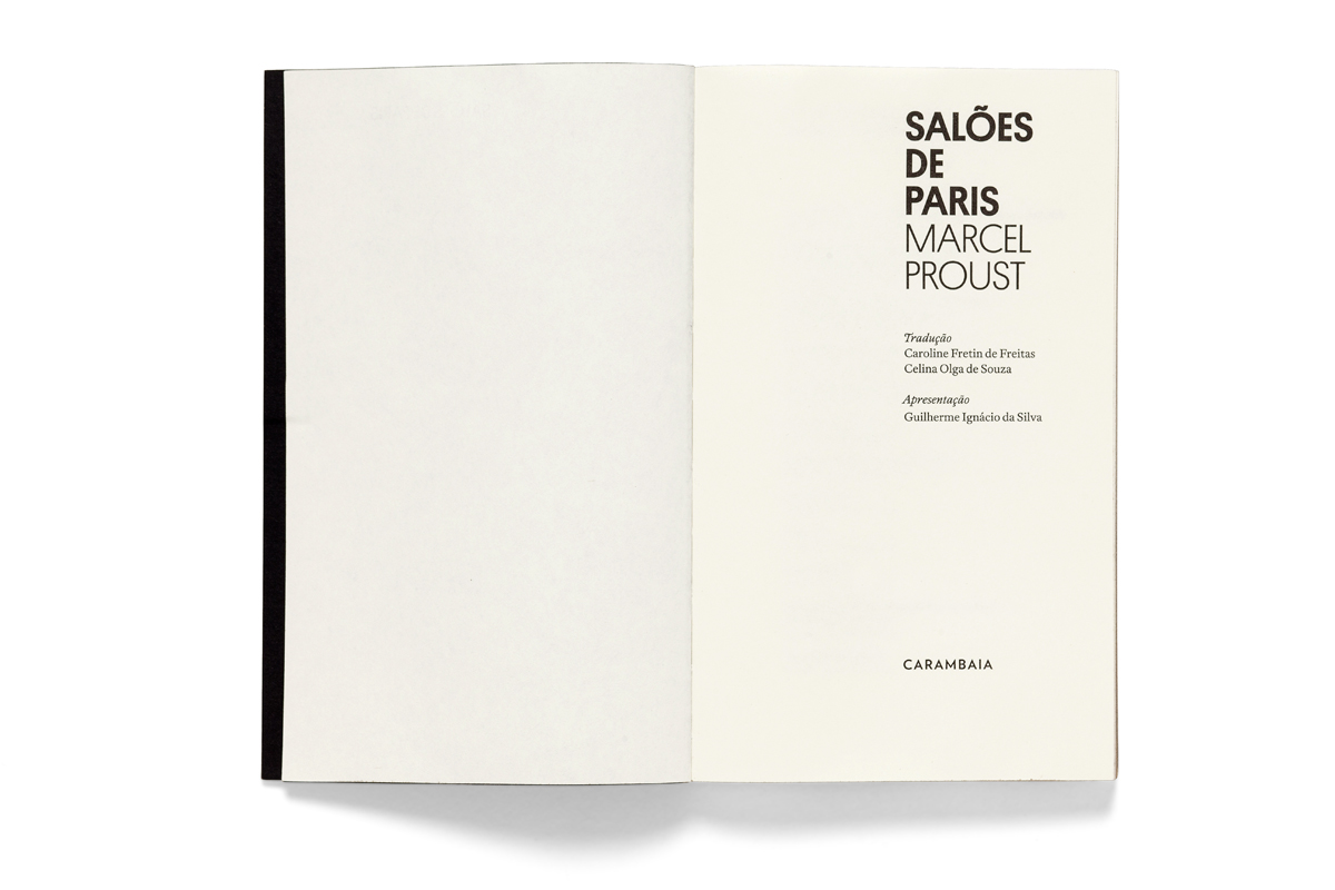
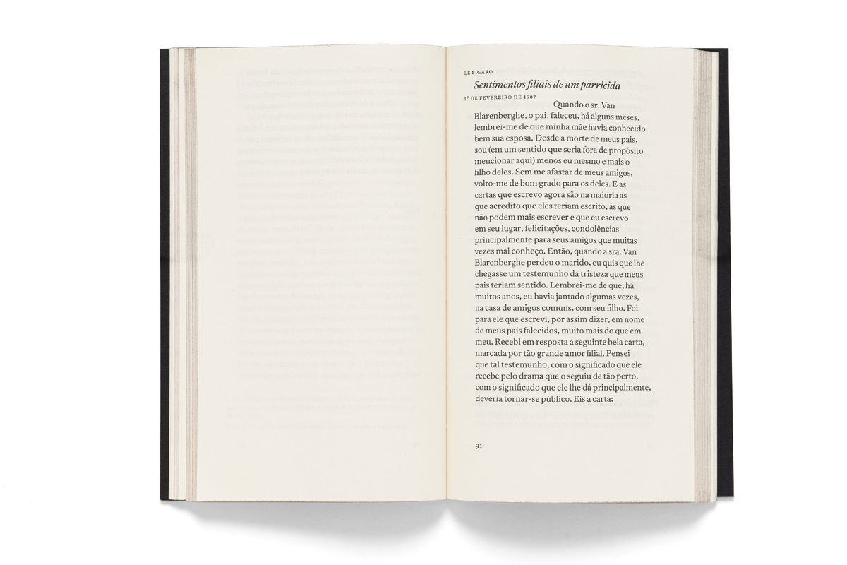
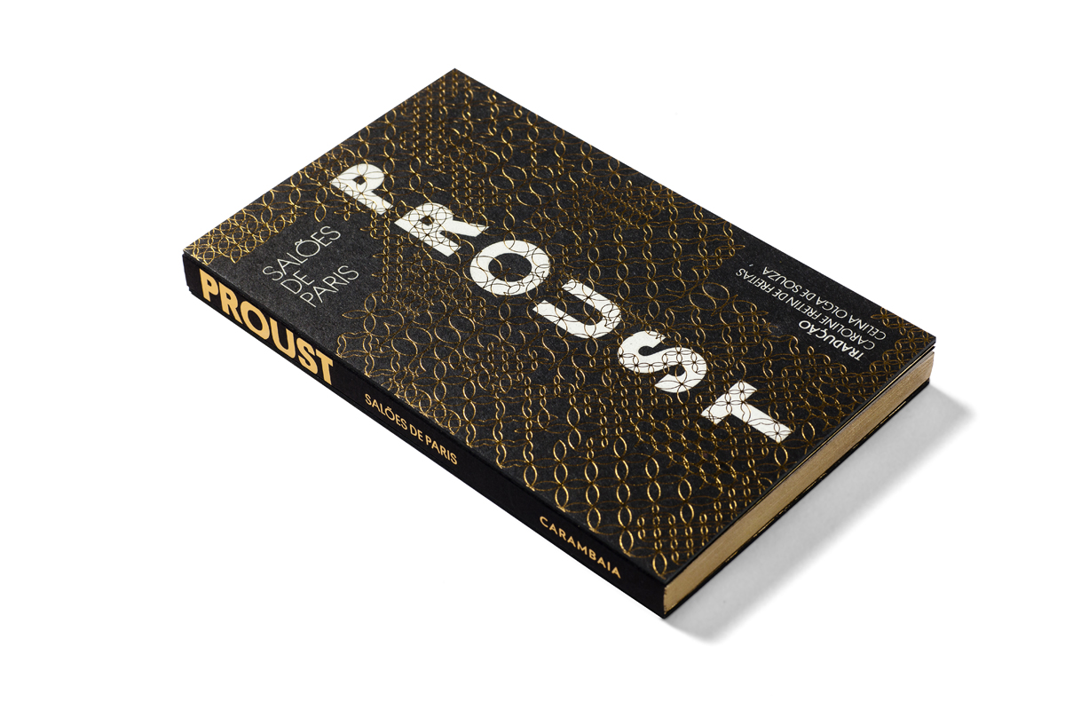
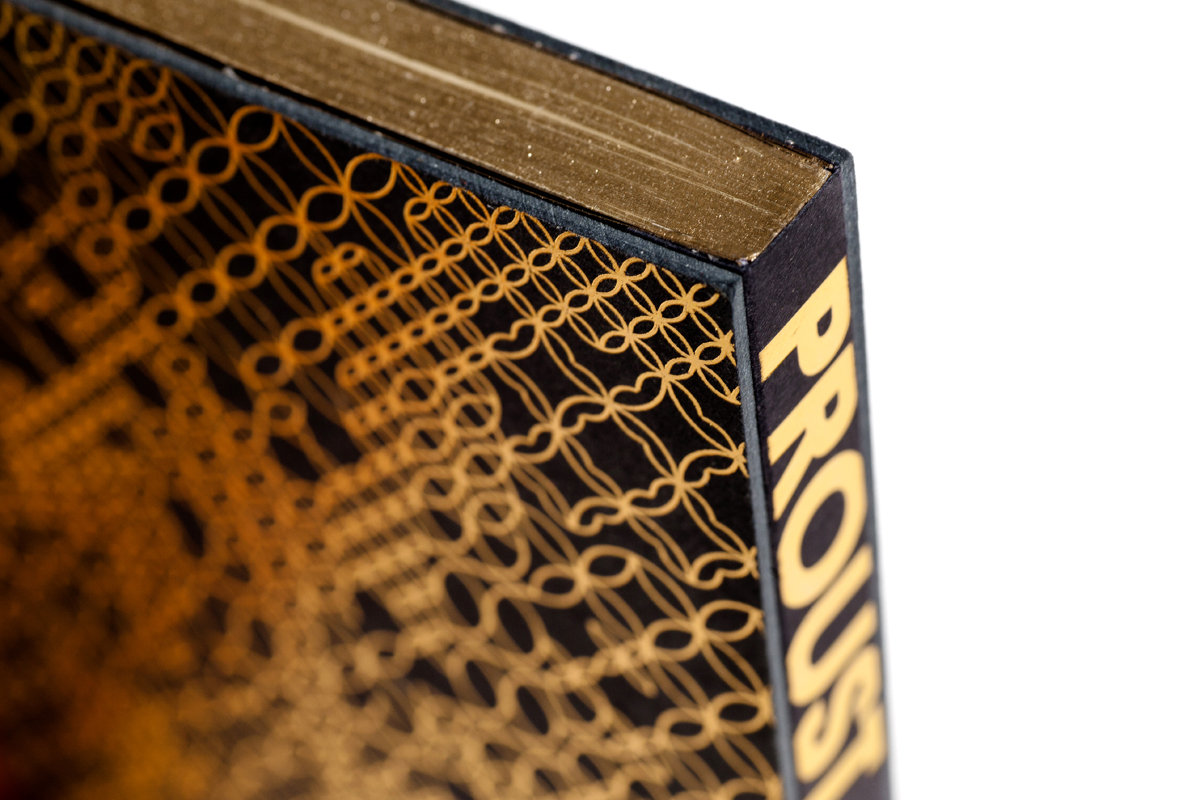
Before becoming the renowned author, Marcel Proust wrote worldly chronicles in several newspapers and magazines describing the salons of the upper bourgeoisie, providing him with copious material for In Search of Lost Time. Twenty-one chronicles from Parisian newspapers and short-lived magazines were specially selected for the Brazilian edition titled Salões de Paris. The idea was to honour and bring back the belle epoque atmosphere through a fully ornamented cover. Bodonian binding was used to make it easier to open and the gilding edges were also meant to assure book preservation. In contrast to the outside, the internal pages were designed to be the most silent as possible.


")


4 Comments on “Salões de Paris by Marcel Proust, Carambaia”
Um autor clássico nessa composição de texto horrorosa. Por que não usar um estilo tradicional? Uma fonte levemente mais tradicional? Nada mais estranho que ler Proust nesses ares ultramodernos. A capa, o projeto gráfico: maravilhosos. Mas quanto à composição de texto: um pecado, um sacrilégio, provavelmente porque se quisesse render umas páginas. Os textos de Proust são das décadas de 1900–1910, e essa editora, que sabe reconhecer a tipografia de cada época (é admirável essa marca em outros trabalhos), em prol de não sei o quê, resolve abandonar o 'formato’ clássico para aludir, pobremente, à modernidade em que se insere Proust, aos 'salões’, como se Proust fosse devoto dos salões e não estivesse realizando um estudo para sua obra vindoura, à qual, aliás, pertencem alguns textos desta coletânea. É pena, pois se trata de um livro de luxo – e apesar de todas as implicâncias desse autor para o gênero romance, sabidamente modernista, talvez melhor aproximação se realizasse pela moldura artística da época. Ora, pois não há momento mais belo na França: Art-nouveau, impressionismo e outras vanguardas. É pena, é pena. Aliás, se se trata de publicações num jornal, por que não optar, realmente, pelas tipografias em voga? Didot, Century… Mas não, saiu essa Antwerp, que não tem absolutamente nada a ver com a tecnologia da época.
À parte isso, excelente trabalho.
Que pena ter o pensamento (obtuso) de que um texto precisa estar preso à época em que ele foi escrito. À parte disso, comentário lido.
For everyone who doesn’t read Portuguese (like me):
Via machine translation, I get that Scott thinks this work is excellent, especially the cover. However, he’s not happy with the choice of Arnhem as the text typeface in the book’s interior, as it “has absolutely nothing to do with the technology of the time”, i.e. the first decades of the 20th century, when Proust wrote these texts. Scott would have preferred “a slightly more traditional typeface, used in a traditional way. Nothing stranger than reading Proust in these ultramodern airs.”
Tereza doesn’t agree: “What a bummer to have the (obtuse) view that a text needs to stick to the period it was written in.”
I fully agree with Tereza. How sad if we had to score every Jane Austen drama with Beethoven or Thomas Moore or whatever else was popular in 1800.
[English translation below]
Que momento precioso vir aqui depois de tanto tempo e encontrar estes comentários inesperados!
É uma pena que, nos meus anseios de encontrar algumas mentes um pouco mais devotas à tipografia bem-equilibrada, eu tenha constatado, dentre os comentários, que a obra em questão não chegou a causar nenhuma estranheza. No entanto, também para defender a ideia à qual pareço ter sido contrário, quero apelar para o gosto geral, simplesmente, sem qualquer princípio temporal que norteie o ‘deleite estético’ – chamemo-lo assim.
E para isso devo apontar para o excelente trabalho feito na edição do livro Diário Goncourt (texto mais ou menos da mesma época que o de Proust), que também está neste site: notem como a tipografia é bem-ponderada ao fazer uso de uma segunda fonte, também serifada (serif) e de bom contraste para display – que é a “SangBleu Empire”. Os entretítulos ficam à esquerda, em caixa alta e sem itálico. O corpo do texto é ‘justificado’. Os números das páginas ficam ao centro. Poder-se-ia optar por alocá-los nas bordas externas, arranjar-se-ia um efeito igualmente prazeroso. Tudo isso foi feito de tal maneira que ficaram conciliadas às forças tradicionais as modernas; numa obra que é inegavelmente moderna, mas inegavelmente clássica também.
Agora, com respeito a edição de Salões de Paris, de Proust. Tentem pensá-la em comparação à outra, o que não seria inadequado, posto que uma e outra pertencem mais ou menos ao mesmo contexto literário-histórico e, sobretudo, foram organizadas/realizadas pela mesma editora.
Notem como os títulos, em cada seção do livro, estão destacados do corpo do texto – vejam como há pouca diferença entre um e outro, pouco contraste. Ademais, nada parece se centralizar. O título fica sempre à esquerda (o que é bastante comum), mas, nesse caso, o corpo do texto também não está ‘justificado’, e sim alinhado à esquerda, da mesma forma que os entretítulos. Ambos estão muito próximos um do outro. Ao mesmo tempo, as margens externas são tão generosas que as quebras de linha gritam aos olhos do leitor, só podendo conduzir, em termos de efeito, uma leitura muito cansativa. As datas se confundem com o cabeçalho (nos exemplos, o cabeçalho com o nome do jornal, Le Figaro).
Agora, independente do que se possa pensar em relação a esse princípio de temporalidade à qual se poderia aplicar o planejamento gráfico de uma obra literária, digam se, quase em termos gerais ou absolutos, este livro de Proust não deixou um bocado a desejar, graficamente. O que vocês dizem?
P.S.:
Perdoem-me, aliás, que eu não tenha preferido me expressar em inglês, como língua franca. E aliás acho que Beethoven talvez não venha a calhar muito bem com Jane Austen. A imagem dos salões e das mansões inglesas desse período tem uma cor tão espontaneamente florida, que sempre me lembro de Mozart ou de alguns quartetos de Haydn, cuja textura do violino me parece indispensável. Se bem que, de certo modo, Beethoven seja muito bom. Sempre imagino estas personagens dançando ao som do primeiro movimento da sinfonia no. 31 de Mozart; quem sabe, alguma obra obscura de Handel não se saísse mal?! Enfim, quero agradecer aos que me deram atenção em meu primeiro comentário, e em especial ao sr. Florian Hardwig, por tê-lo traduzido aqui e facilitado sua compreensão.
Obrigado!
__
[Translated to the English with DeepL.com/Translator]
What a precious moment to come here after so long and find these unexpected comments!
It is a pity that, in my longings to find some minds a little more devoted to well-balanced typography, I found, among the comments, that the work in question did not come to cause any strangeness. However, also to defend the idea to which I seem to have been opposed, I want to appeal to general taste, simply, without any temporal principle guiding the ‘aesthetic delight’ – let us call it that.
And for this I must point to the excellent work done in the edition of the book Goncourt Diary (a text from more or less the same period as Proust’s), which is also on this site: notice how the typography is well weighted by making use of a second font, also serifed (serif) and of good contrast for display – which is “SangBleu Empire”. The intertitles are on the left, in uppercase and not italicized. Body text is ‘justified’. Page numbers are in the center. One could choose to place them on the outer edges, it would have an equally pleasing effect. All this has been done in such a way that traditional forces are reconciled with modern ones; in a work that is undeniably modern, but undeniably classical as well.
Now, about Proust’s Salons de Paris. Try to think of it in comparison to the other one, which would not be inappropriate, since both belong more or less to the same literary-historical context and, above all, were organized/realized by the same publisher.
Notice how the titles, in each section of the book, are detached from the body of the text – see how little difference there is between one and the other, little contrast. Moreover, nothing seems to be centered. The title is always on the left (which is quite common), but in this case, the body text is also not ‘justified’, but left-aligned, just like the intertitles. Both are very close to each other. At the same time, the outer margins are so generous that the line breaks scream at the reader’s eyes, and can only lead, in terms of effect, to very tiresome reading. The dates get confused with the headline (in the examples, the headline with the name of the newspaper, Le Figaro).
Now, regardless of what one might think about this principle of temporality to which the graphic planning of a literary work could be applied, tell me if, almost in general or absolute terms, this book by Proust didn’t leave a bit to be desired, graphically. What do you say?
P.S.:
Forgive me, by the way, that I have not preferred to express myself in English, as a lingua franca. And by the way I think Beethoven might not come in very handy with Jane Austen. The image of the English salons and manors of that period has such a spontaneously flowery color, that I am always reminded of Mozart or some of Haydn’s quartets, whose violin texture seems indispensable to me. Although, in a way, Beethoven is very good. I always imagine these characters dancing to the sound of the first movement of Mozart’s Symphony No. 31; who knows, maybe some obscure work by Handel would do well?! Anyway, I want to thank those who paid attention to my first comment, and especially Mr. Florian Hardwig, for having translated it here and making it easier to understand.
Thank you!