
The Reykjavik Art Museum
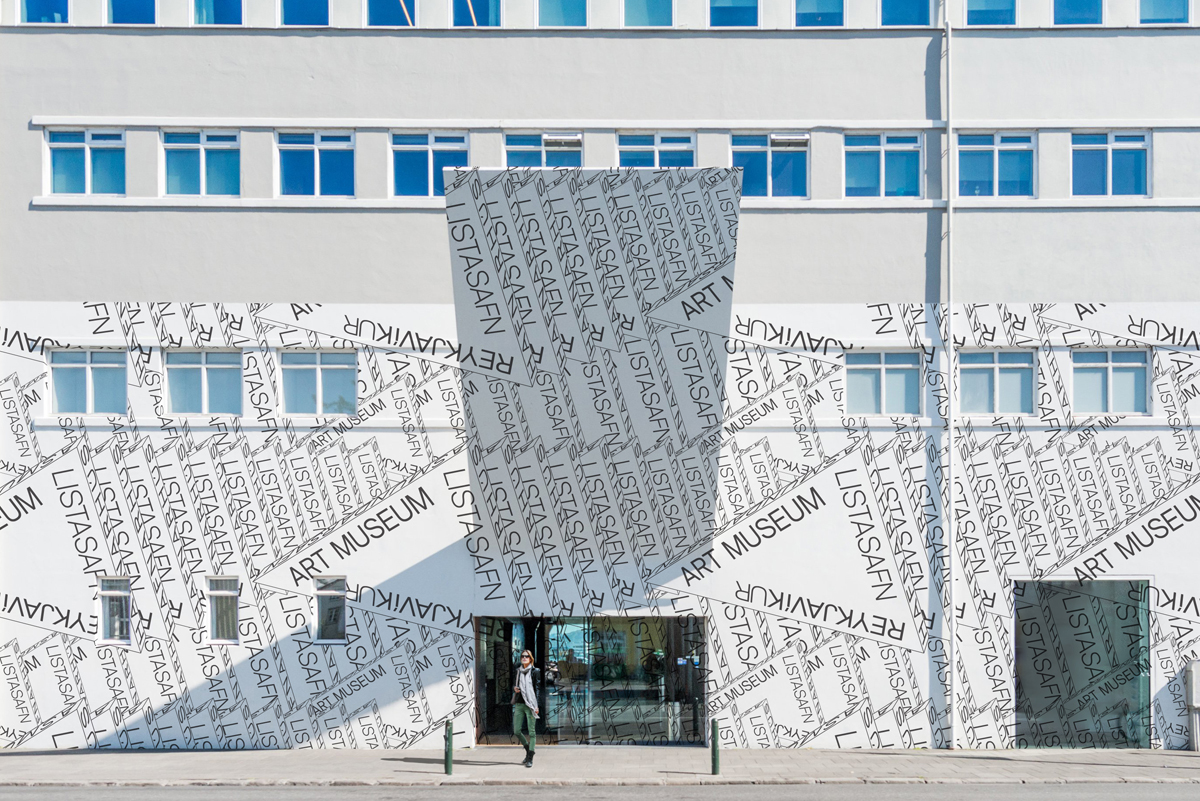
Listasafn Reykjavíkur (Reykjavik Art Museum), the largest visual art institution in Iceland, worked with karlssonwilker on developing their new identity and design system as part of its transformation effort.
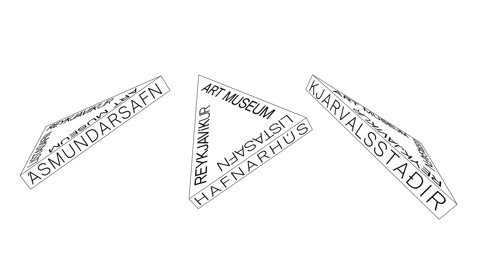
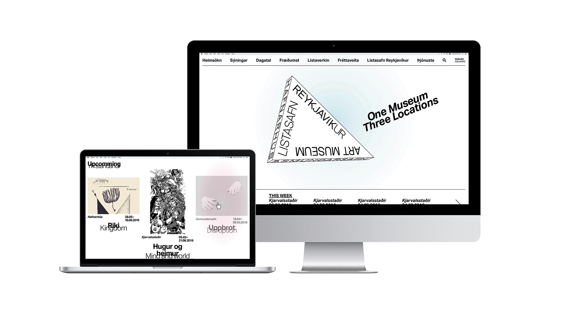
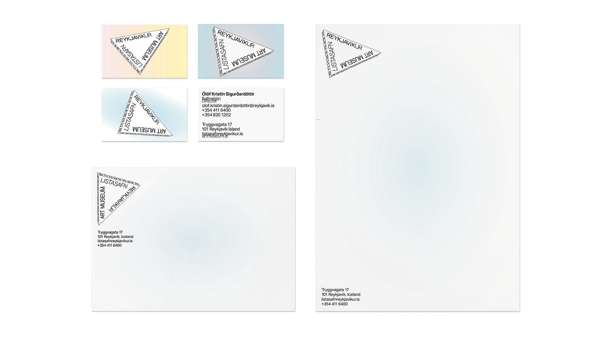
They designed a system that provides the museum with visual tools to express its diversity in programming and shows a connection between the museum’s three houses.
“The Reykjavik Art Museum partnered with prominent New York-based design studio karlssonwilker inc. to offer a fresh perspective on the development of a cohesive brand identity for its three art museums. karlssonwilker’s collaboration with Reykjavik Art Museum marked a natural union, as one of the studio’s partners Hjalti Karlsson was born and raised in Reykjavik. The karlssonwilker design lens has an inherent cultural awareness which speaks to both local and international audiences.” — Ólöf Kristín Sigurðardóttir, Museum Director
Suisse Int’l is available as part of the Suisse collection from Swiss Typefaces.


")


")


")
1 Comment on “The Reykjavik Art Museum”
Just got back from trip to Reykjavik and the karlssonwilker stamp is very hard to see on the refurb – the front façade of the museum is grey and blank, nothing like the picture shown (assume this is a mock-up, along with the banners). The museum itself is quite impressive inside, all chunky metal and varnished concrete. But the branding is currently tacked on as an afterthought or a logo in the bottom corner. Maybe they’ll grow it over time…