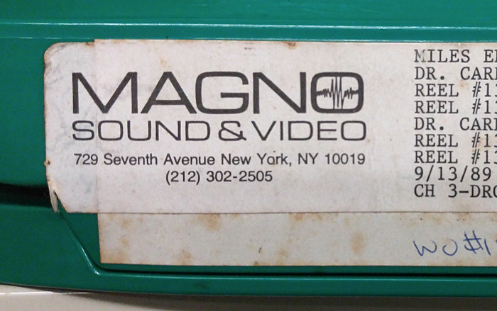
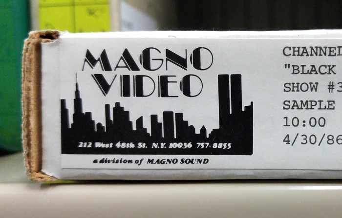
Magno Sound & Video and Magno Video logos
Contributed by Ian Lanius on Jan 25th, 2017. Artwork published in
circa 1985
.6
To me, this Magno Sound & Video logo is a quintessential use of Microgramma. Paired with a Midtown Manhattan address set in Helvetica, it gives me the feeling that there’s something cool, exclusive, expensive and high-tech behind that label. Visions of woodgrain and brushed metal. The waveform in the O is a great addition.
The Magno Video logo, however, is a completely different look. More of a feathered hair and satin jacket vibe. It’s very similar to the Original New York Seltzer label design from 1981. I originally suspected that the address was set in Cooper Black Italic, but that’s not the case. Any help in identifying would be welcome.
Typefaces
Formats
- Branding/Identity (4797)
- Film/Video (651)
Topics
- Technology (901)
- Film/TV (1236)
Designers/Agencies
- unknown (2185)
Tagged with
- logos (2714)
- film production (35)
- labels (178)
- comparison (3)
- 1980s (435)
- audio production (15)
Artwork location
- United States (6427)
- New York City (1718)





















2 Comments on “Magno Sound & Video and Magno Video logos”
Microgramma/Eurostile is woodgrain and brushed metal, indeed.
The Video address is a blurry ITC Garamond Ultra Italic.