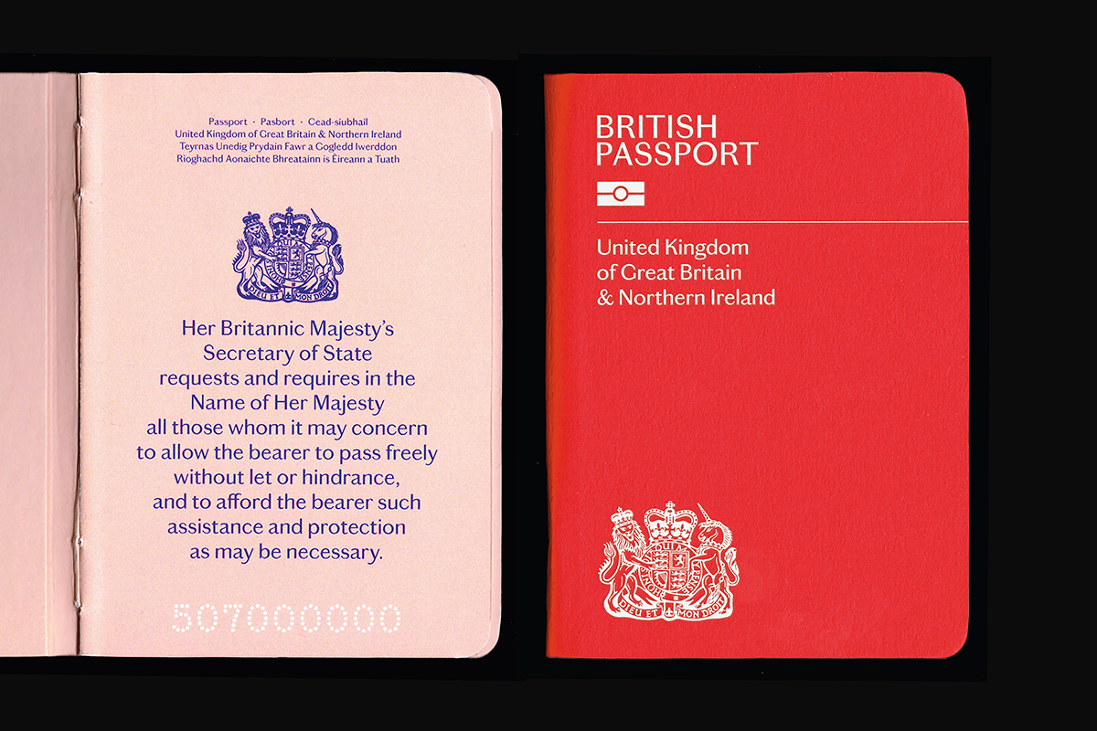
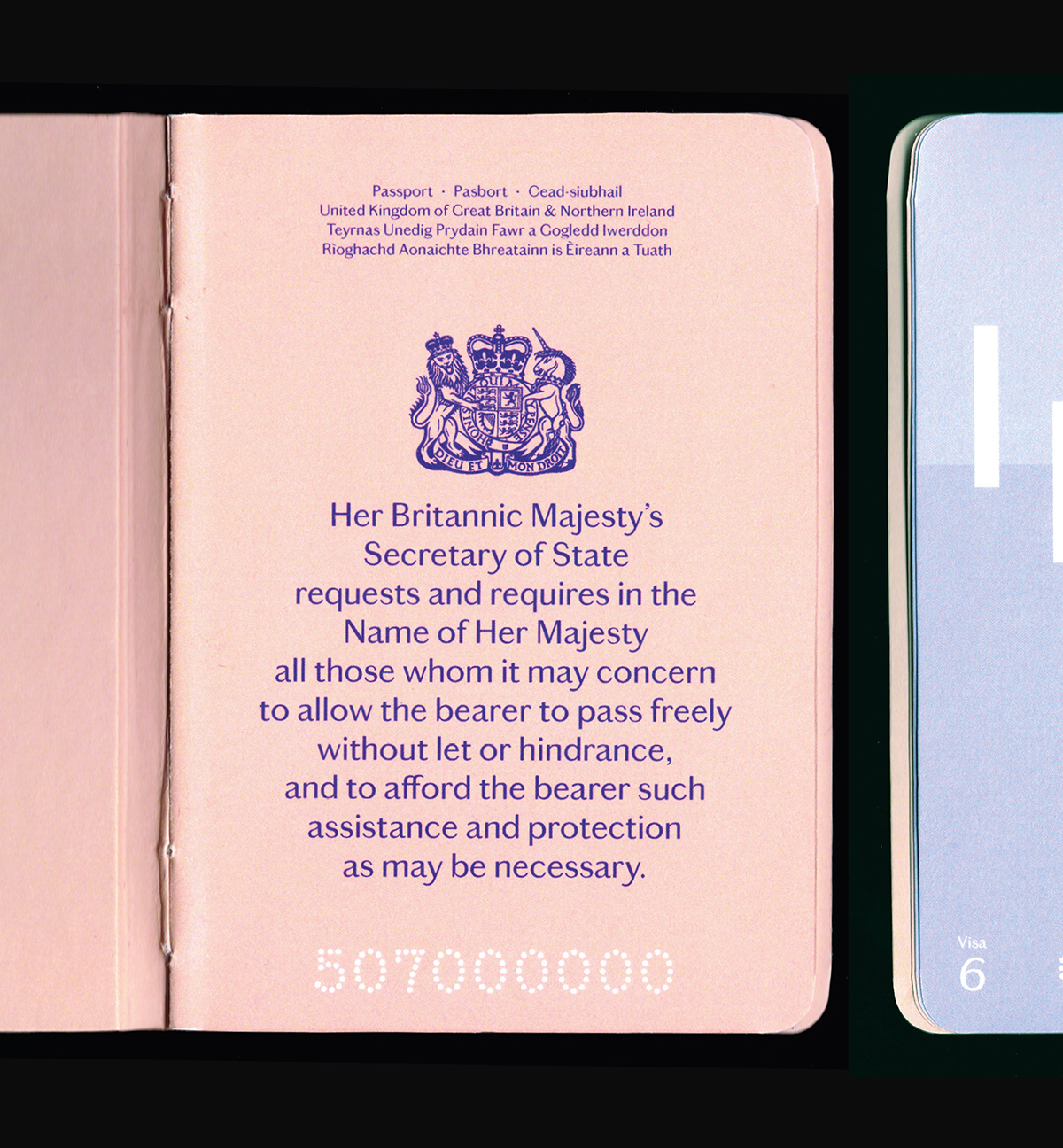
British Integration Passport
In response to Dezeen’s British passport design competition, I created a design with hand-drawn illustrations that put Britain in a positive light. Below are some of the pages from my design, which I hope to expand upon in the future.
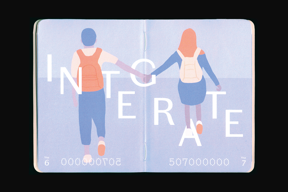
My goal was to look at scenes in Britain and use them to re-establish our identity positively. As a result, the theme for my design is Integration, with integrate defined as “bringing people or groups into equal participation”. Brexit has been extremely divisive so I didn’t want a divisive design, but I still wanted a strong message.
I’m specifically avoiding using the word “tolerance”, as the aim is to represent equality, and have integration celebrated, not just tolerated.
I’ve used Chiswick Sans Text throughout, a vernacular typeface which was inspired by lettering found around Britain. Alongside a colour palette that uses a combination of red, white and blue inks, my aim was to create a look that is distinctly British and also forward-thinking. The red cover is also a progression from previous colour covers.