

The Baffler redesign (2016)
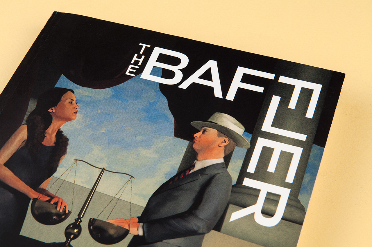
Pentagram partner Eddie Opara and his team invite you all to the typefest that is the late 2016 redesign of American magazine The Baffler. A modified Graphik serves as entrée and logotype, enveloping a complex system of types and moods.
The designers worked with the editorial team to reorganize and rename the departments, including Salvos for essays and non-fiction reporting, Outbursts for opinion pieces, and the self-explanatory Poems, Art and Stories. These content types are shuffled throughout the publication, rather than grouped in specific sections. Instead, typography is the organizing element, with a diversity of typefaces used to signal different kinds of content. The various fonts are used in combination to provide a distinct voice for each category, an approach that reflects the magazine’s wide-ranging viewpoints and borderline-unruly personality.
The myriad typefaces include Stanley for essays and non-fiction reporting related to the issue theme, Domaine Sans for opinion, and Euclid for art pieces like poetry and stories. Graphik is employed for elements of the Baffler identity, such as the editor’s letter, page numbers and other identifying information. Text appears in Lyon, Euclid or Domaine Sans, depending on the content. Other fonts that play a role are Post Grotesk and Knockout. […]Opara and his team created comprehensive guidelines for the identity and a style guide for the art direction of the magazine, which has been brilliantly implemented by The Baffler’s new art director, Lindsay Ballant, in the first issue of the relaunch.
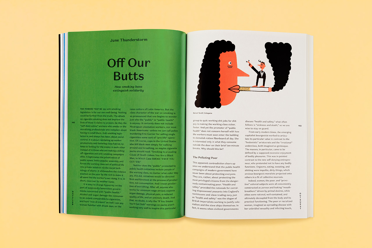
Ballant also assigned and art directed all of the illustrations shown here.
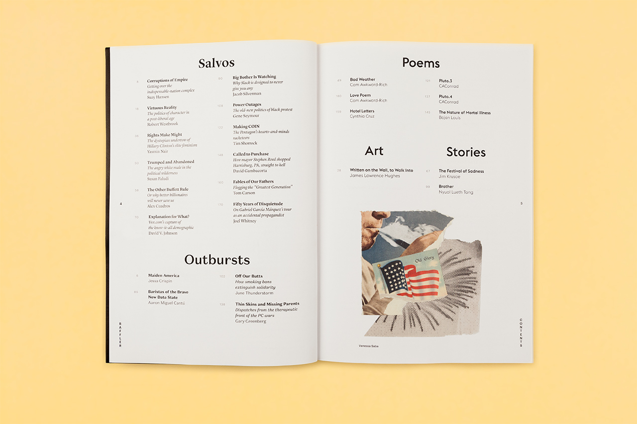
Table of contents. Various typefaces are used to differentiate sections and subject matter.
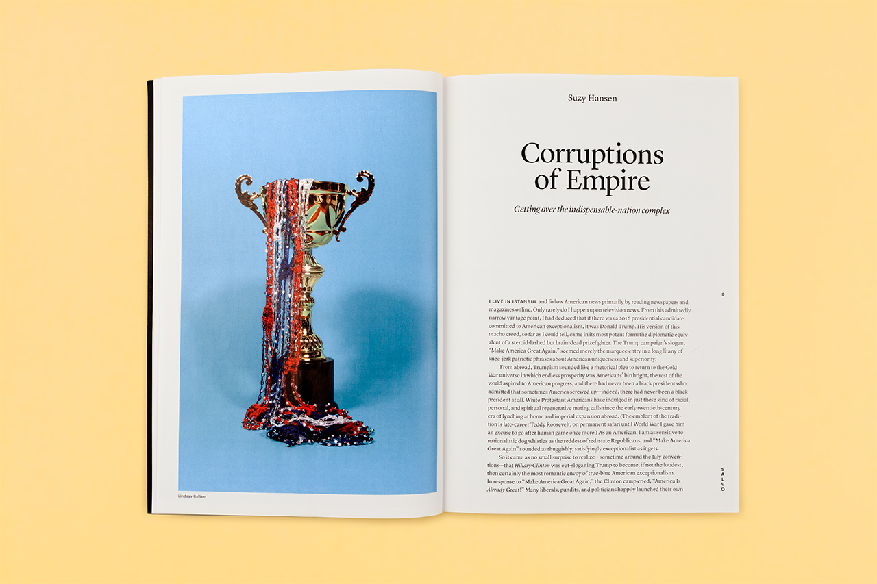
Opening spread of an essay by Suzy Hansen in the Salvos section. Photograph by Lindsay Ballant. Heading in Lyon Display.
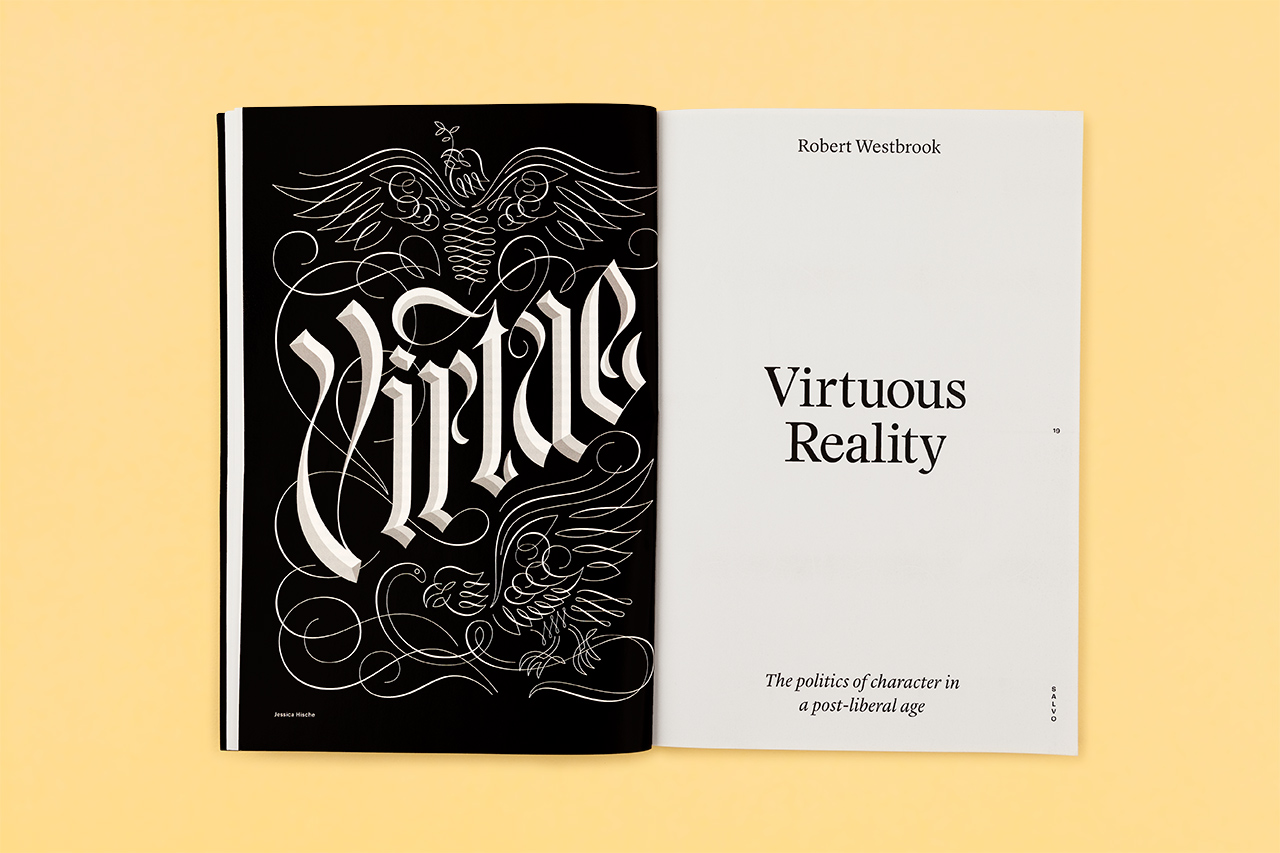
Opening spread of an essay by Robert Westbrook. Lettering by Jessica Hische.
Opening spread of an opinion piece, featuring Domaine Sans

Short stories appear on sky blue pages.
The magazine’s grid has been redesigned for greater flexibility.

Poetry appears on yellow pages.

Type size can be blown up to grab a reader’s attention.

Opening spread of an article by David Gambacorta. Photo-illustration by Lindsay Ballant.

Opening spread of an article by Joel Whitney. Illustration by Jon Han.


")


")


")


")


