
Man Repeller
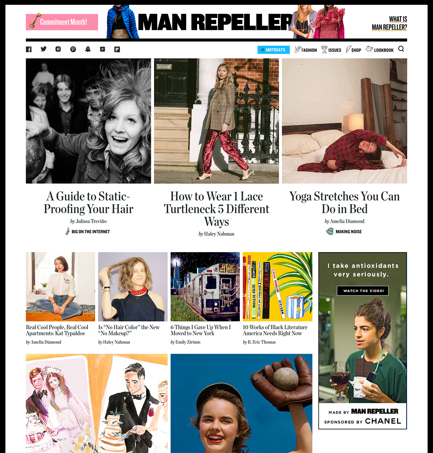
Man Repeller home
Founded in 2010 by Leandra Medine, Man Repeller covers style, feminism, culture, beauty, wellness, relationships and careers. For the 2017 redesign, we wanted to leverage the eclecticism that makes the brand great while elevating the overall site typography.
Previous versions of the site had used Hoefler & Co.’s Knockout as a defacto brand font, so early on we decided to combine its heft and impact with an equally weighty serif from the foundry, Chronicle.
We ended up using a few different weights of Chronicle Condensed for titles while relying on Chronicle Deck for the body copy. Knockout is interspersed throughout, acting as brand labeling as well as nifty type objects, such as a pullquote that becomes 3-dimensional as the user scrolls past.
The type application throughout the site is a little bit oversized, a little bit opinionated — just like Man Repeller itself.


Article with Portrait lead image
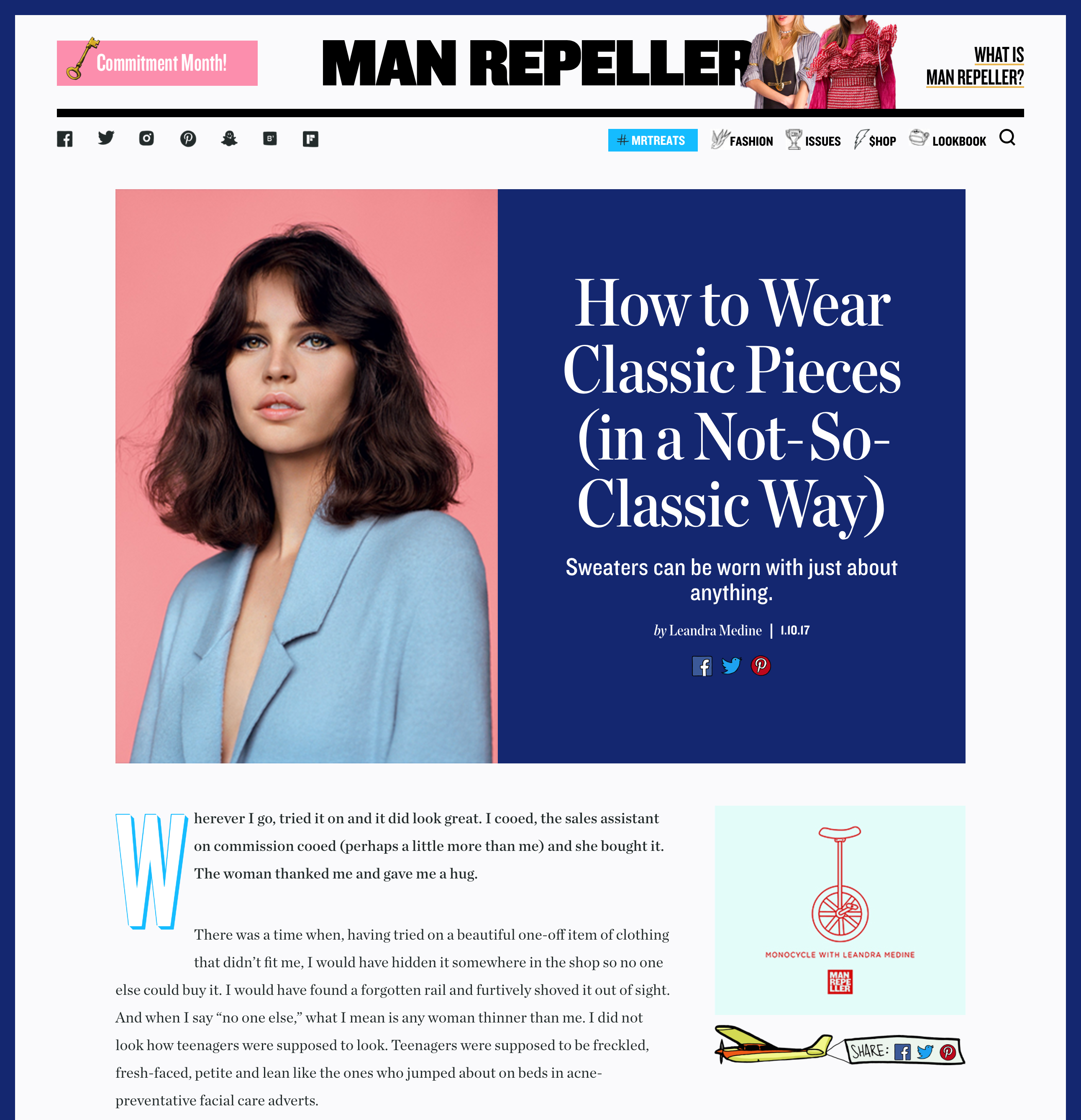
Feature Article Page
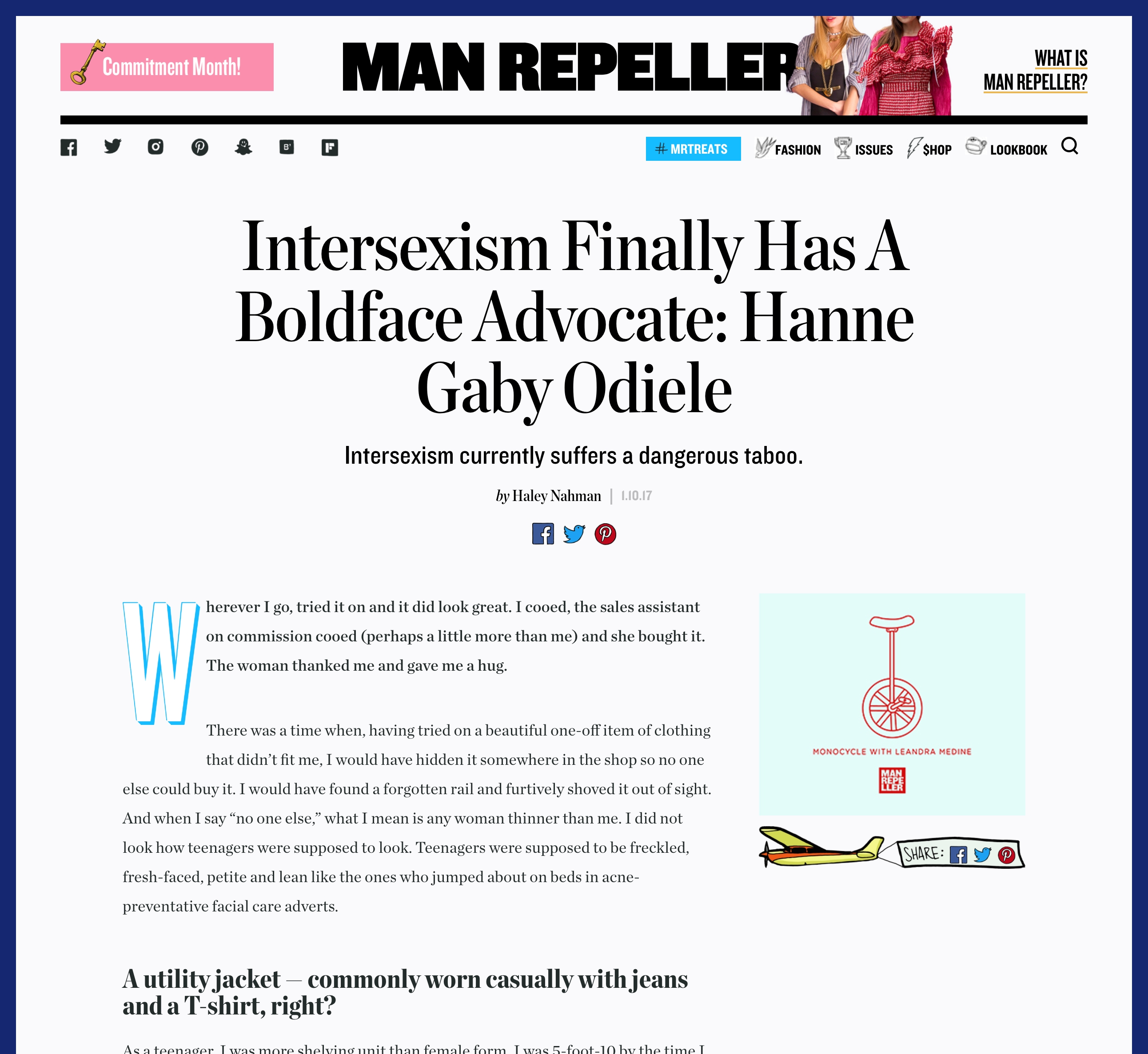
Example of large title/drop cap
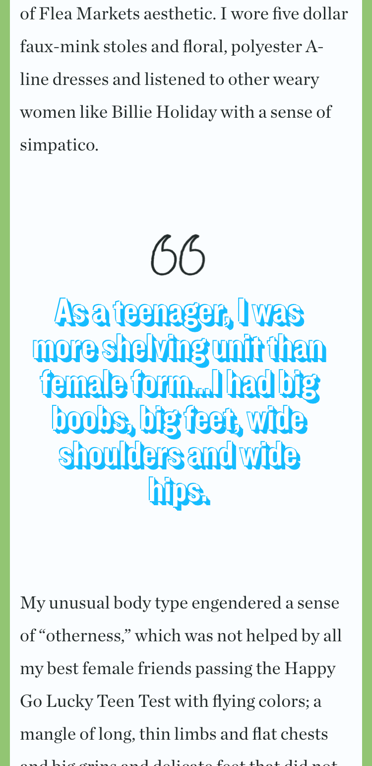
Example of scroll-triggered dimensional pullquote (mobile)


")


")


")


