
Sardegna identity
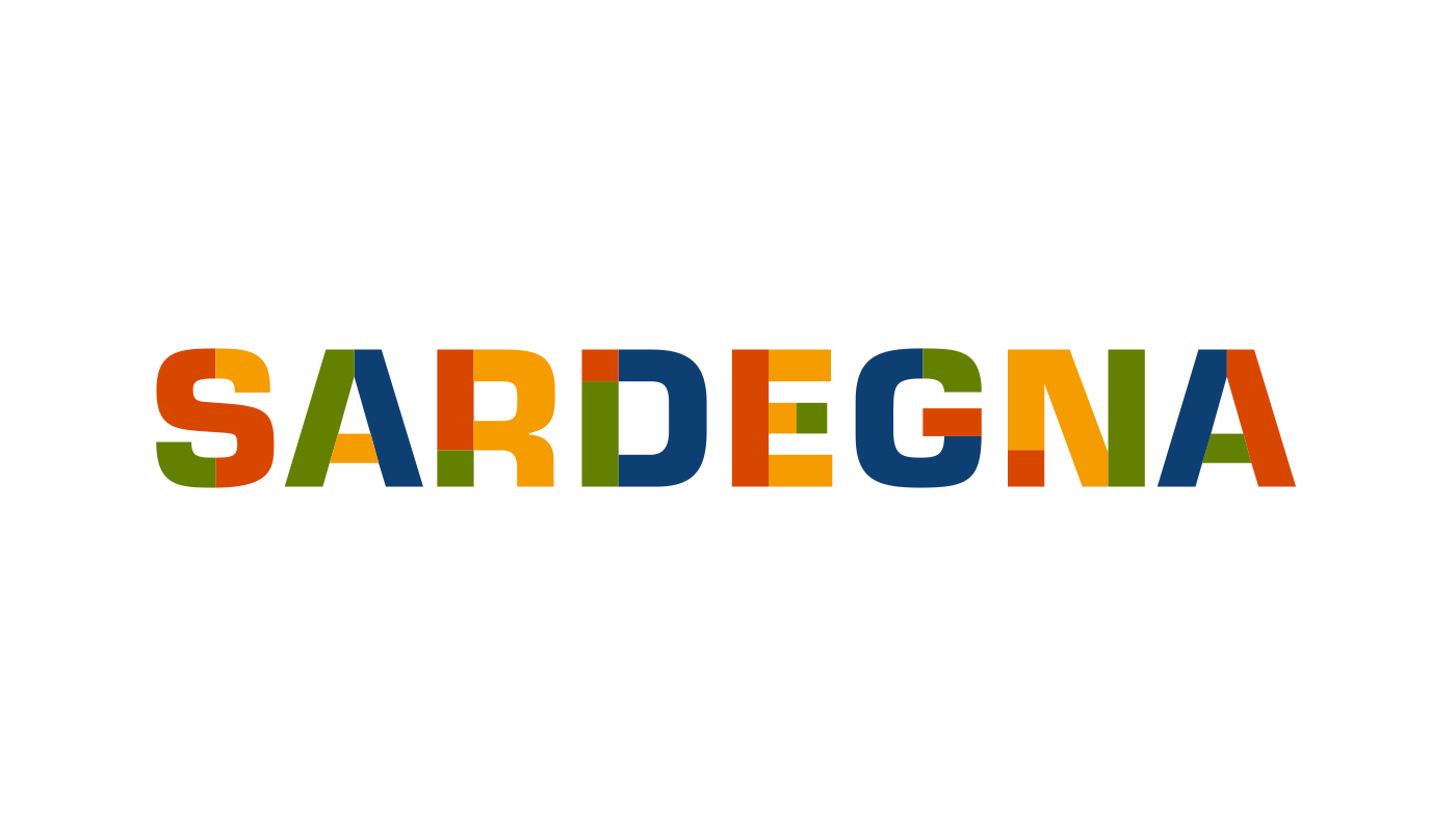
The current visual identity for the Italian region of Sardegna (English: Sardinia, Sardinian: Sardìgna) was developed in 2006 by Pentagram Berlin. The logotype is based on Eurostile Bold.
The colours in the letters are those used in the richly embroidered Sardinian costumes. The modern shapes of the letters combined with the patchwork of warm colours reflect the two sides of Sardinia: History and tradition on one hand, and modernity and openness on the other. Pentagram Partner Justus Oehler: “We wanted to create a symbol which would not depict sun and sea – like most of the other Mediterranean countries’ identities do, but which would look grown-up and confident, yet at the same time playful and warm. […] We have the green and red, the national colors of Italy, in every letter. Blue and yellow, the colors of the sea and the sun, alternate.” — Pentagram, Logolounge
Read more about the progress in Logolounge Vol. 4 and see preliminary steps including a unicase version in Eurostile Bold Extended, and all-caps and mixed case versions in Futura Bold.
In his thesis Da luogo a logo. Trasformazioni dell’identità visiva in Sardegna (Università di Cagliari, 2013/14), Stefano Asili shows some of the precursors of the identity, and criticizes the current logo:
[…] it can not be read in alphabets other than Latin, lacking an iconic part, and is thus penalized in international recognition […] Eurostile by Aldo Novarese evokes an olivettiane atmosphere and alludes to the industrial design of the 1960s which has nothing in common with Sardinia; it is interesting when used in color, but the black and white version is absolutely anodyne. In short, […] it is a very poor result from one of the greatest firms in worldwide branding. Today, the brand is “polluted” by declines that are far from in line with the original design that, though disappointing, still had the merit of great and obvious professionalism.
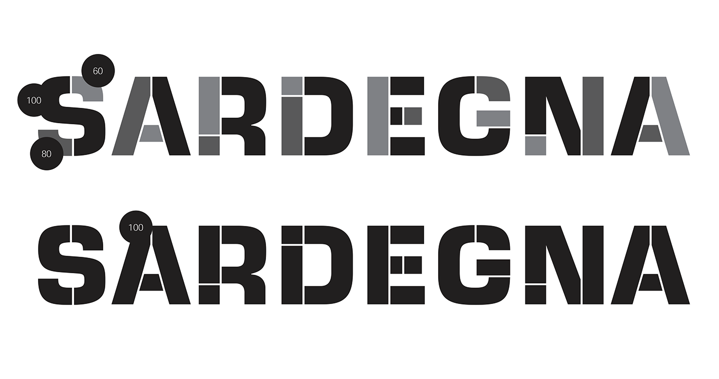
Detail from the identity manual (2007) showing greyscale and monochrome logo versions
The secondary faces used for the logo declinations are Bauer Bodoni and Frutiger Light.
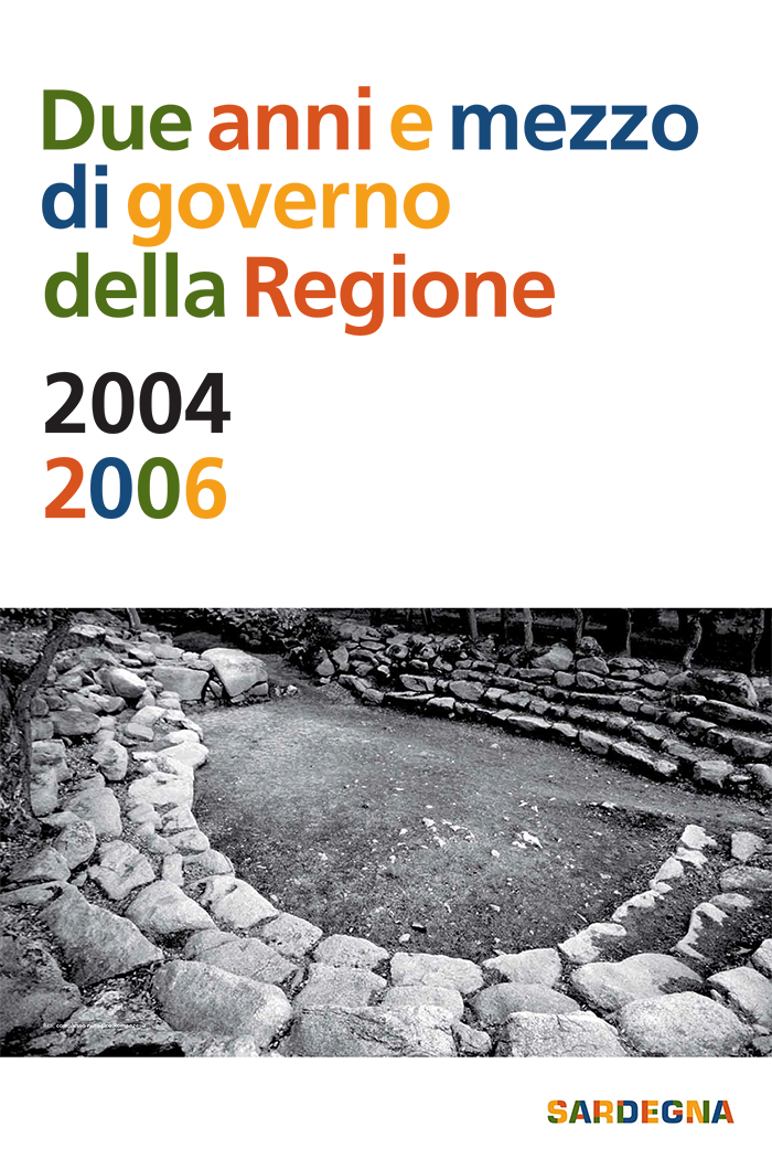
This governmental report was one of the first applications of the new identity. The four alternating colors of the logo are also applied to the title set in Frutiger. This feels a little overwhelming — the variegation here is not as refined. It also weakens the logo.
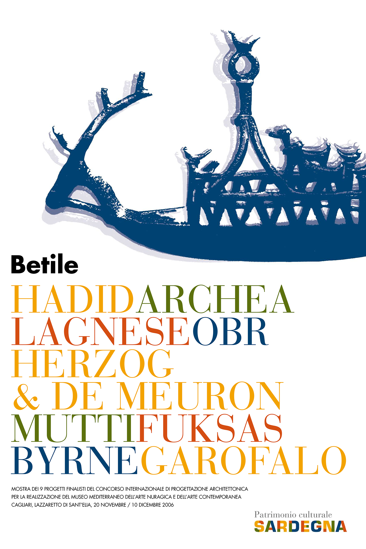
Leaflet for the presentation of the 9 finalists projects of the international architectural design competition for the establishment of the Mediterranean Museum Of Nuragical Art and Contemporary Art Cagliari, 2006. The names of the participants are set in caps from Bauer Bodoni, again echoing the four colors of the logo.
Bodoni here is paired with Futura, which is arguably a better counterpart than Frutiger. The long lines in all caps would have benefitted from some tracking, though.
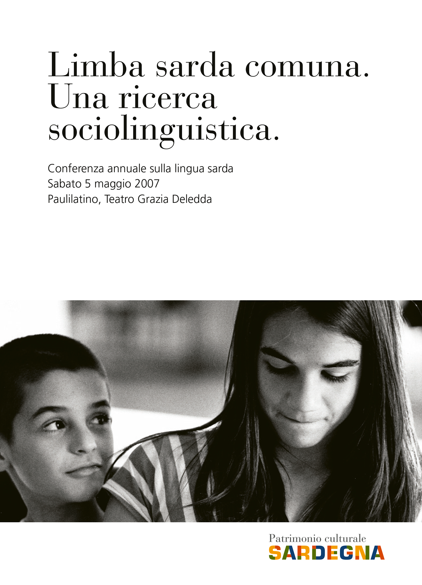
Invititation leaflet to a conference about the Sardinian language, 2007.

The website of SardegnaTurismo (2017) pairs the logo with Montserrat Bold and various styles of Work Sans.


")


1 Comment on “Sardegna identity”
They can create the Unicode multicolor version of that font now and use it in web and PS CC 2017.