
RANE Magazine
Contributed by Robin Rendle on Jul 22nd, 2012. Artwork published in
.
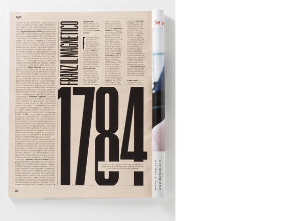
RANE is a section of IL Magazine, designed to have a separate tone from the rest of the magazine. As described on MagSpreads:
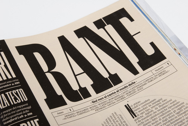
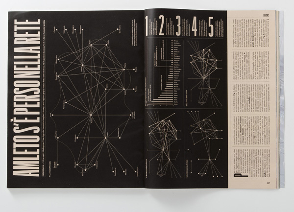
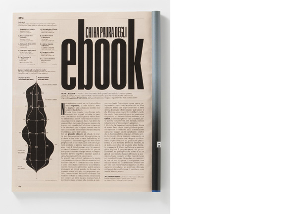
The first and foremost inspirations for the project were some futurist magazines like Lacerba and Dinamo Futurista: the name RANE comes from a quote of a medieval poetry work (called L’acerba) from Cecco d’ascoli, which was used by the magazine Lacerba as a sort of payoff (the whole line goes as “Qui non si canta al modo delle rane”). Starting from there, we tried to elaborate a more modern language, incorporating infographics and visual storytelling to accompany the articles content or to build a parallel-yet-related story along them.
Christian Schwartz drew the custom namplate as seen above.


")


")


2 Comments on “RANE Magazine”
Where is Graphik in use? I’m only seeing Tiempos and Founders Grotesk.
The headline face is a new extra condensed width of Graphik not yet shown on Commercial Type’s site.