

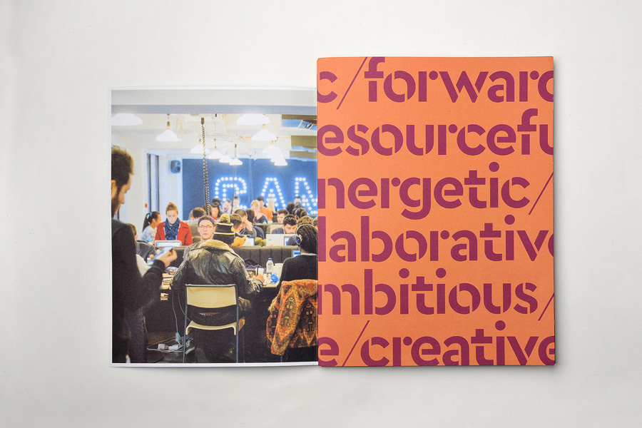
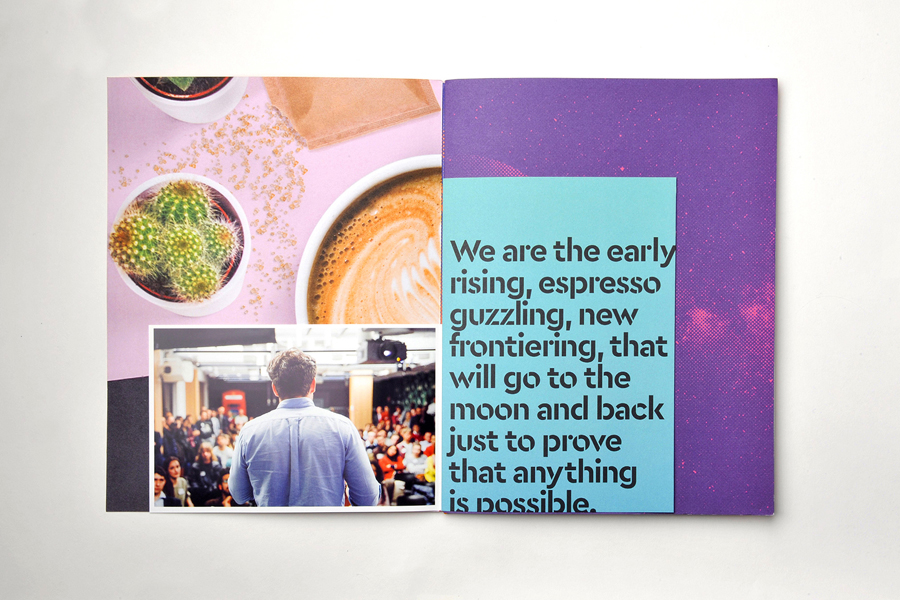
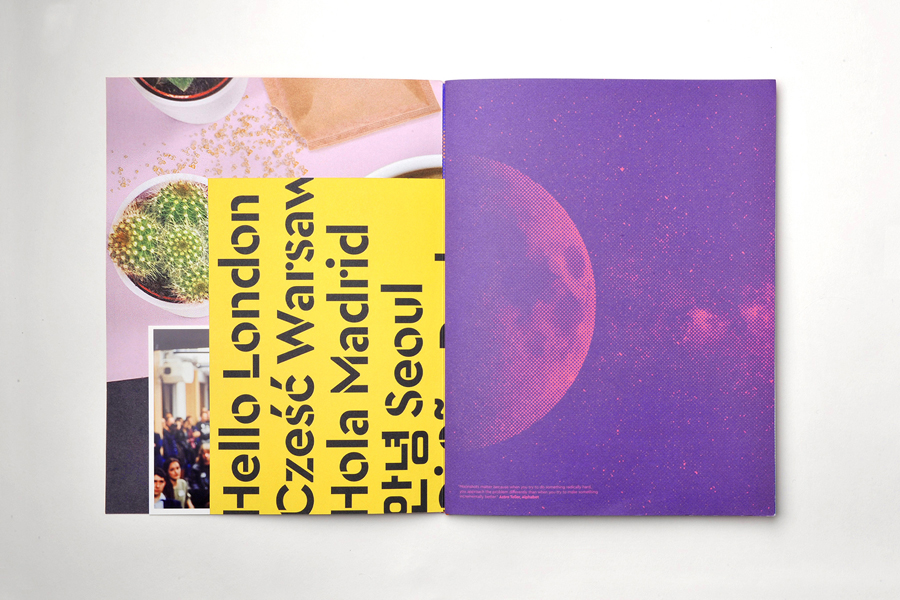
Campus by Google
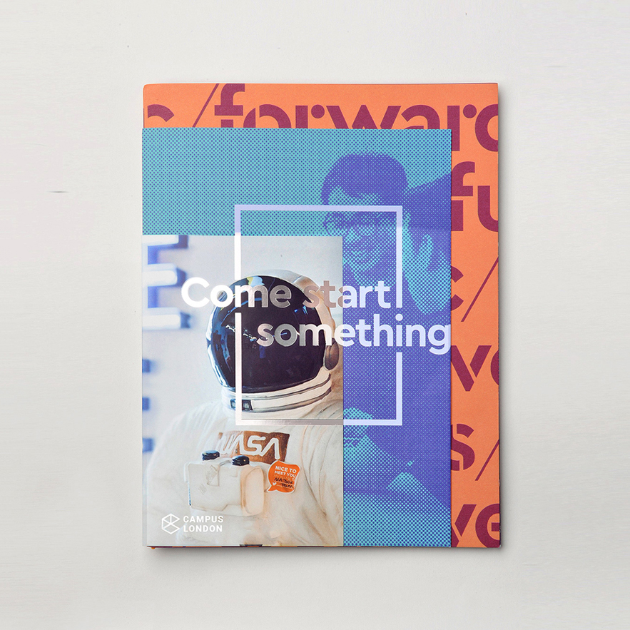
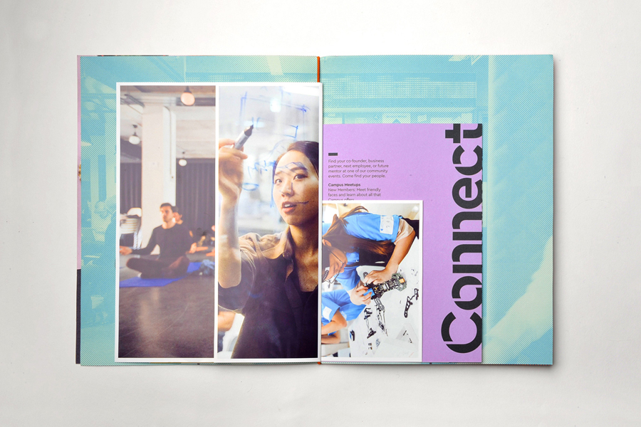
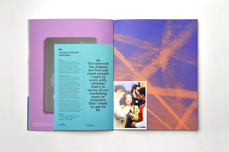
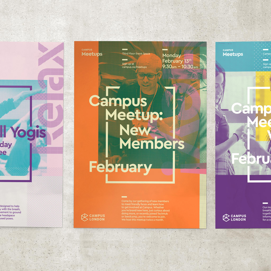
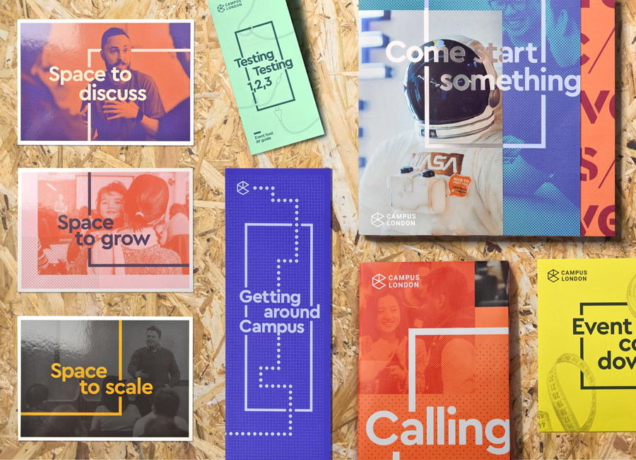
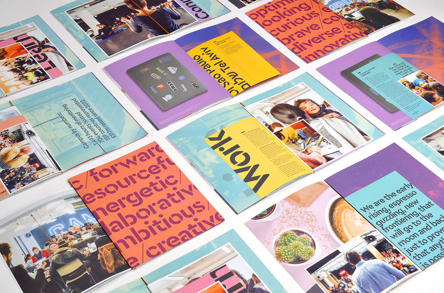
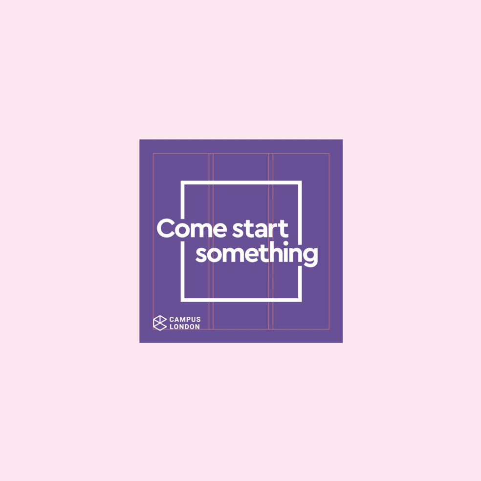
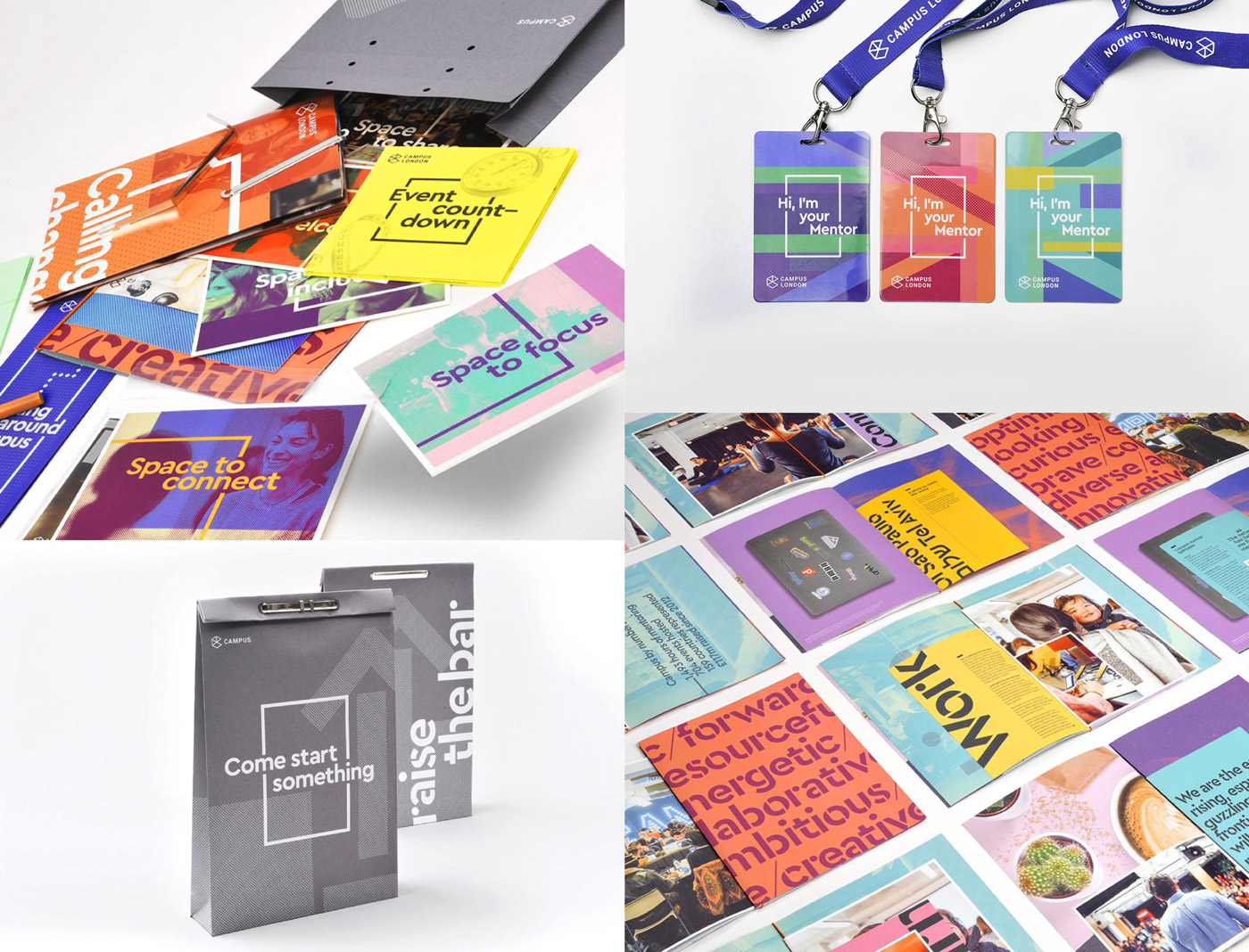
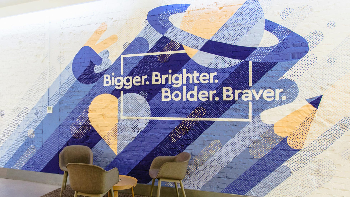
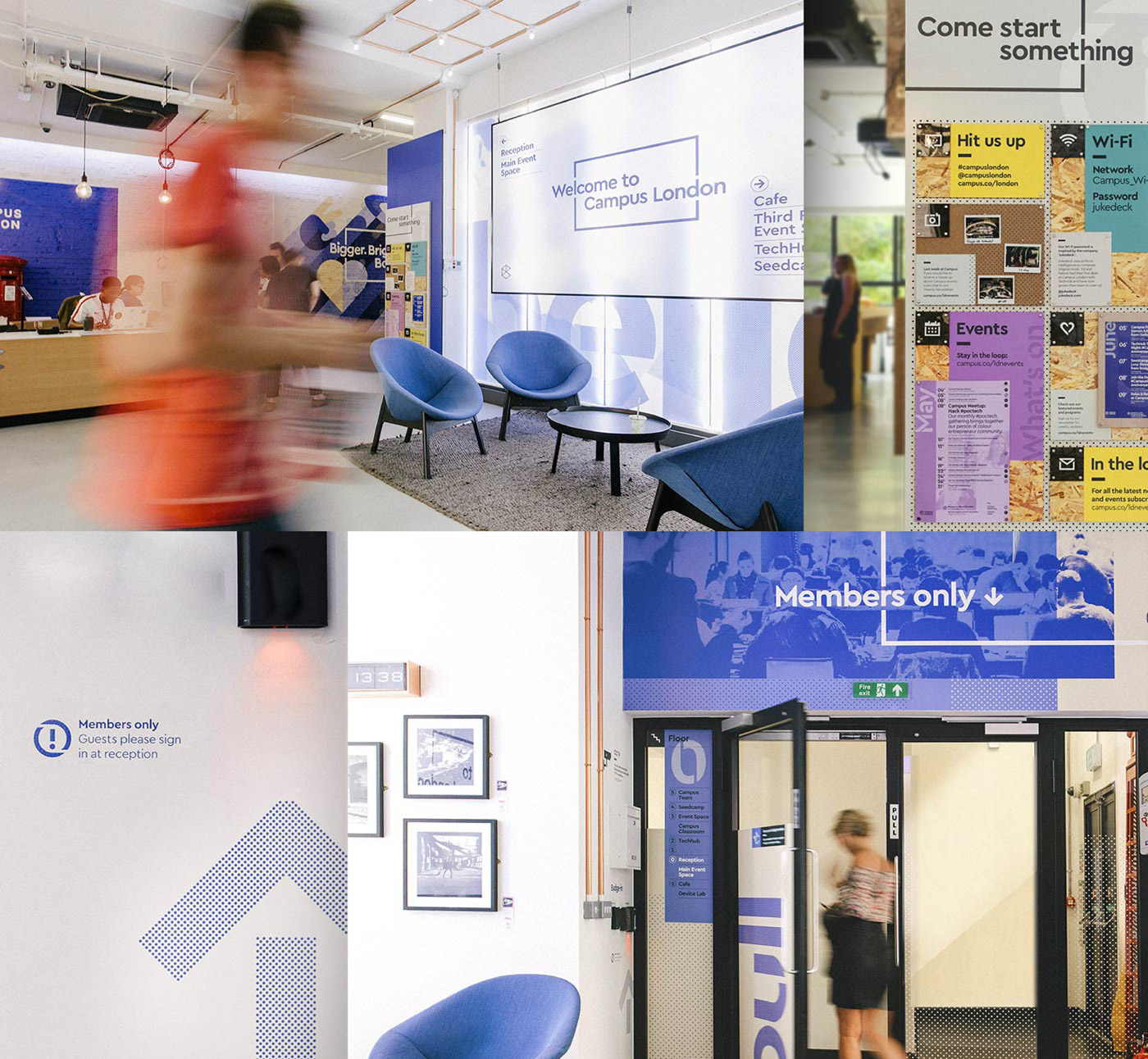
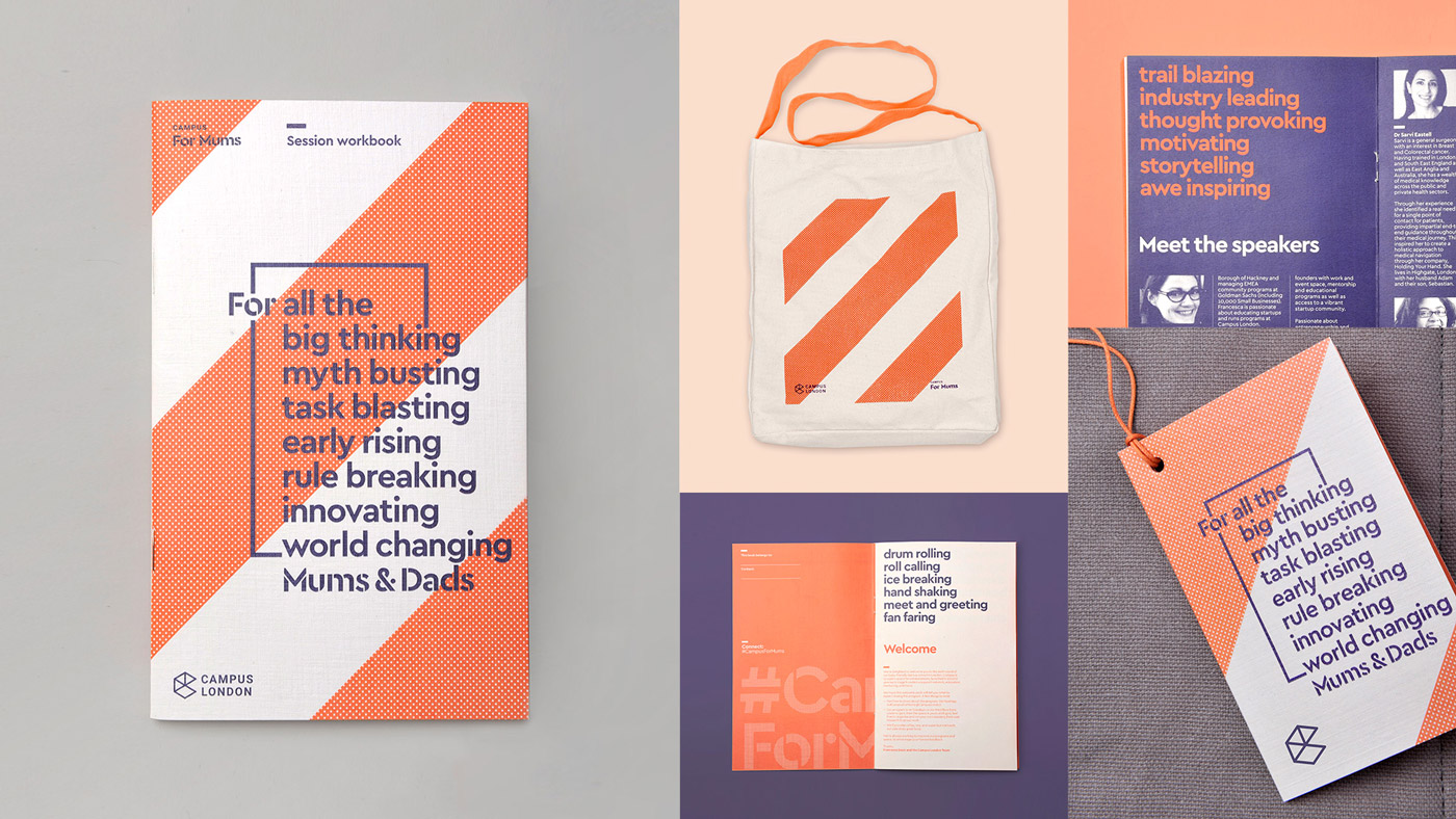
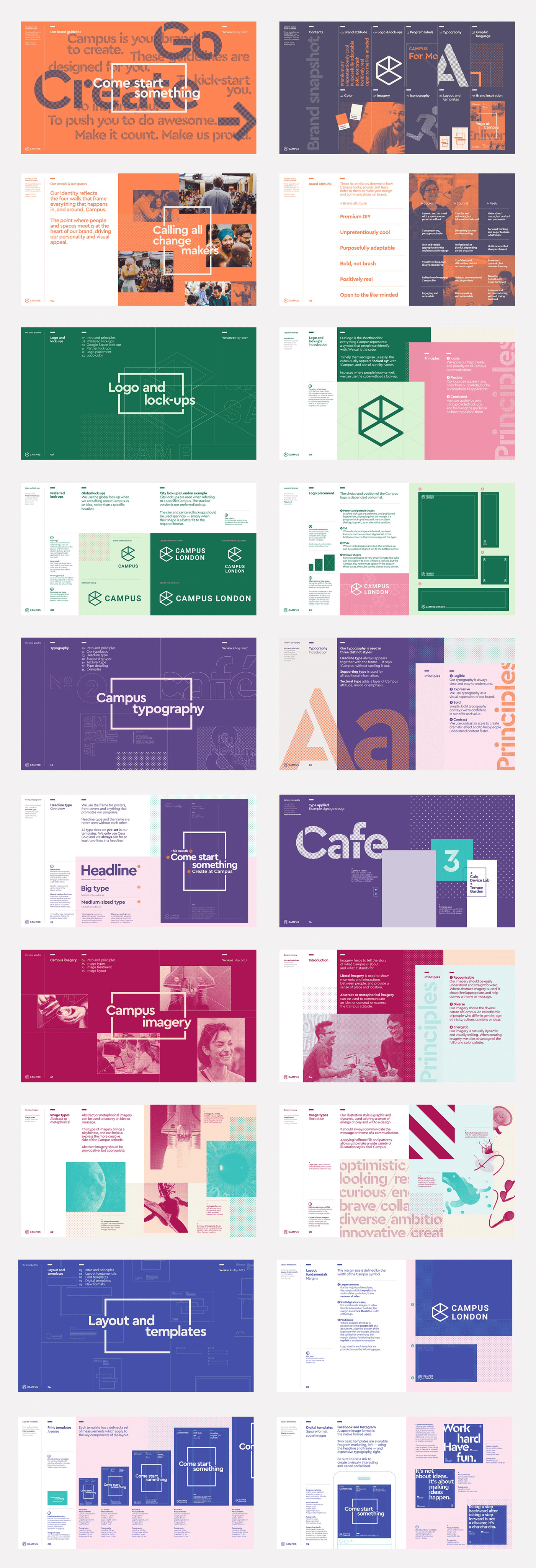
Campus is Google’s network of co-working and event spaces. These are located in London, Madrid, Warsaw, São Paulo, Seoul, and Tel Aviv. Campus is described by MultiAdaptor, the design studio behind its recent rebranding, as being positioned slightly away from the main Google brand. The studio’s brand identity design for Campus reflects this. It also captures and expresses the startup spirit and energy of the entrepreneurs and founders, employees and investors, who make up the Campus community through a DIY aesthetic of words, images and colour. This approach intends to be democratic in nature and invite participation.
The mix of halftone effect, the tinting and cropping of images, the running of words off the edge of pages, different sheet sizes, the use of full bleed, the absence of free space, construction paper colour, collage-like compositions in the intersection of pages and stencil cut letters of Cera Stencil Pro establish a sense of creative play, an industriousness, youthfulness and energy.
Read more about this project on BP&O.


![From Brand New: “The logo hasn’t changed much. Originally designed by Portland, OR-based Instrument, the logo was made of an isometric cube forming an abstract “C” and a serious sans serif [Roboto]. The new version changes the shades of gray for a wireframe approach.”](https://assets.fontsinuse.com/static/use-media-items/57/56094/full-1960x1152/598d7e95/19-1_Campus_BeforeAfter_1960.png)
From Brand New: “The logo hasn’t changed much. Originally designed by Portland, OR-based Instrument, the logo was made of an isometric cube forming an abstract “C” and a serious sans serif [Roboto]. The new version changes the shades of gray for a wireframe approach.”


")


 film poster")


