
PopCap Games
PopCap Games, Inc. is a video game developer and publisher based in Seattle. A subsidiary of Electronic Arts, it is best known for their puzzle games, including the Bejeweled series of tile-matching games, the pachinko-like Peggle and the tower defense game Plants vs. Zombies. [Wikipedia]
While the games each have their own visual identity, the PopCap brand needed an all-encompassing corporate typeface that echoes some of the playfulness without being too expressive itself. It had to be more readable than the game logo faces and at the same time provide the display qualities required for advertising and website headings. The designers found a match in Omnes. Set in primary colors and ocassionally accentuated with shading and glow effects, the resilient sans serif perfectly blends with the various cartoonish characters.
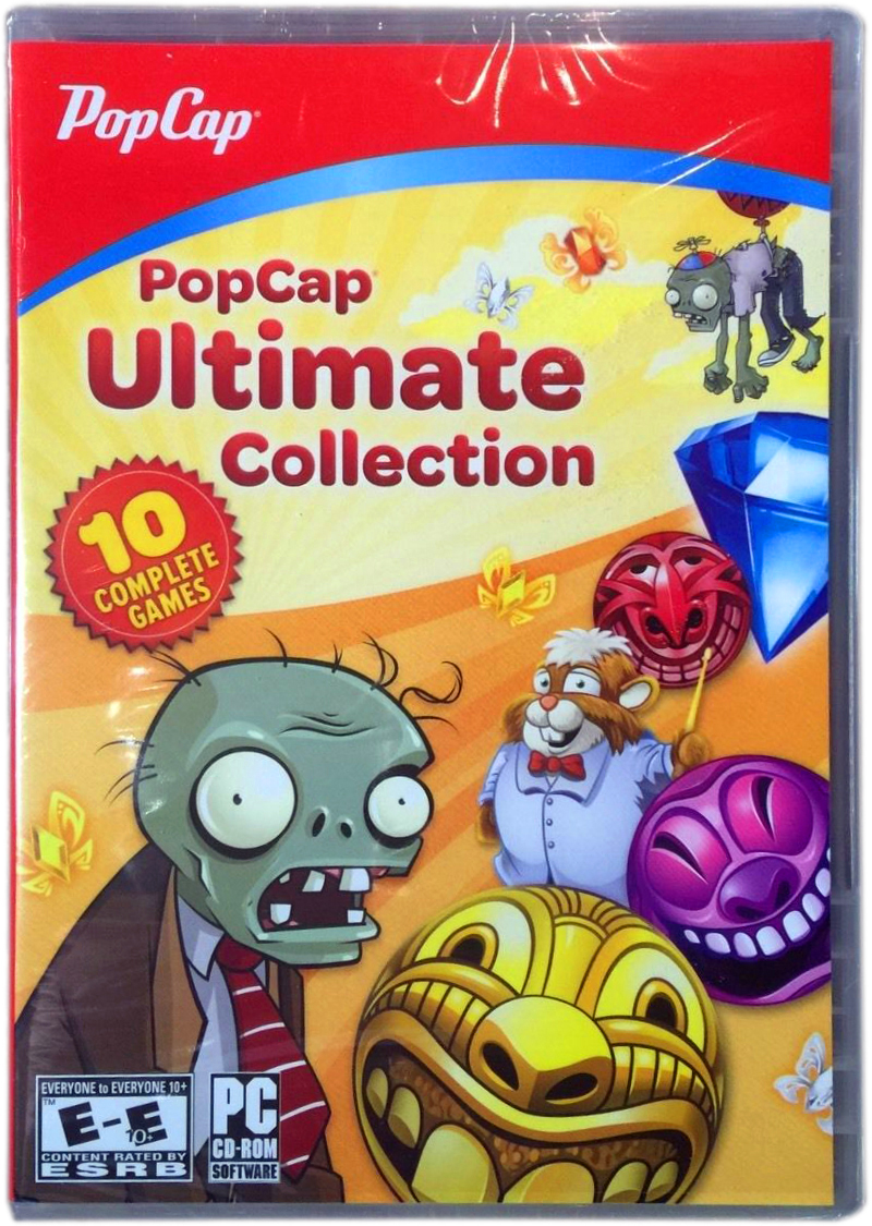
The PopCap logo is rendered in a customized Deftone Stylus.
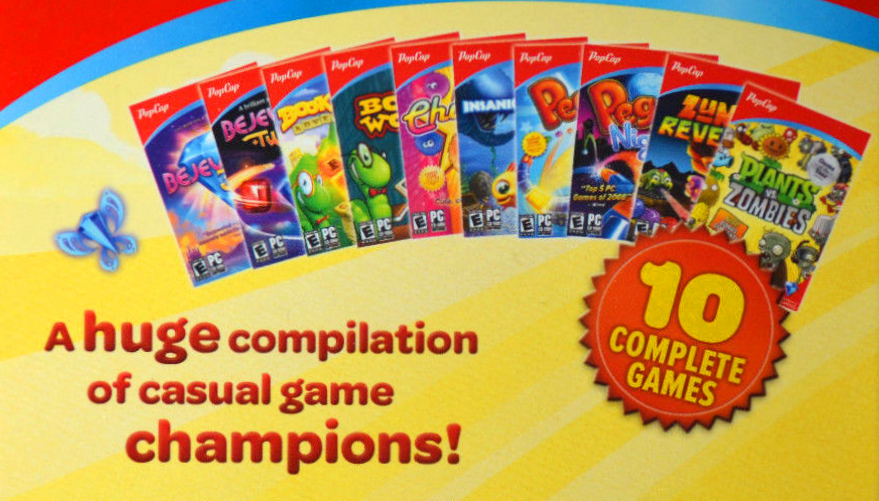
The vigorous Omnes Bold on the back cover of a games collection, loudly addressing potential customers. The type is arranged in staggered lines that are further animated by changing sizes. It received a 3D/shadow treatment that echoes similar effects in the game logos. The eye-catcher on the right shows the number ‘10’ set in Omnes Black, featuring its whimsical ‘1’.
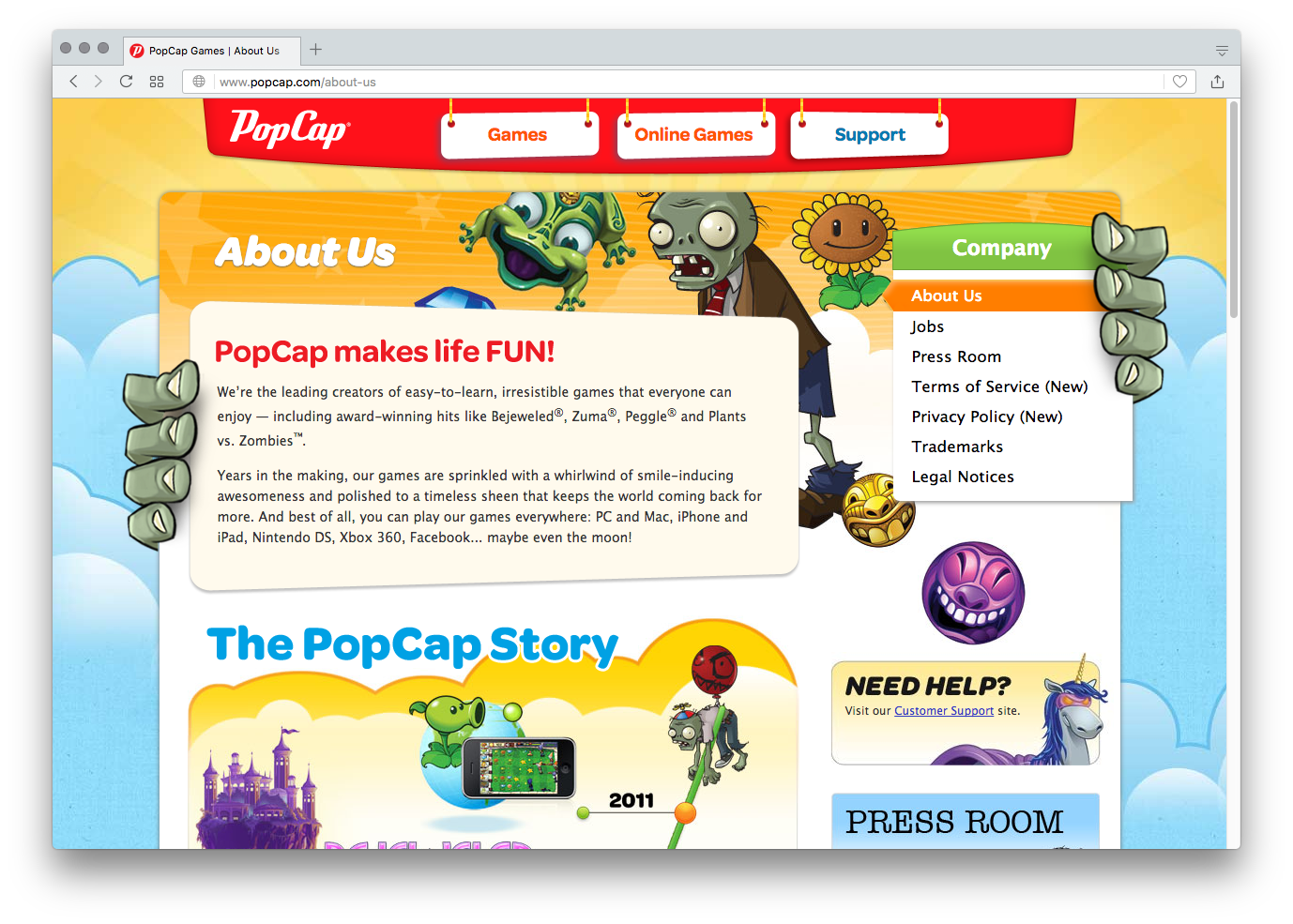
Top menu and headings on the PopCap website are set in a number of styles from the Omnes family, including Medium, Bold, and Bold Italic.
The website sections are divided by headings in Omnes Bold, set white against blue, in ribbon-like boxes.
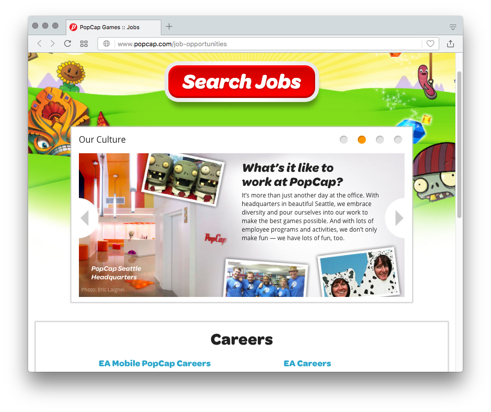
On the page about job opportunities, the typography changes to a more active tone, with Omnes Bold Italic.

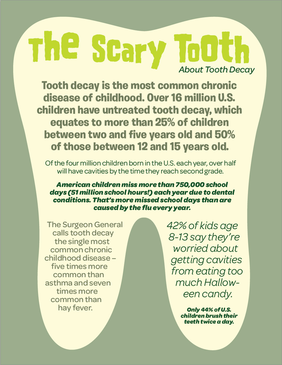
“Stop Zombie Mouth” was a joint effort by the American Dental Association and Plants vs. Zombies from PopCap Games to raise awareness for oral health among kids. This Halloween poster with infographics and the “Scary Tooth” fact sheet shown below combine Omnes – here also in lighter weights – with Burbank and the Plants vs. Zombies typeface, House of Terror.


")


