

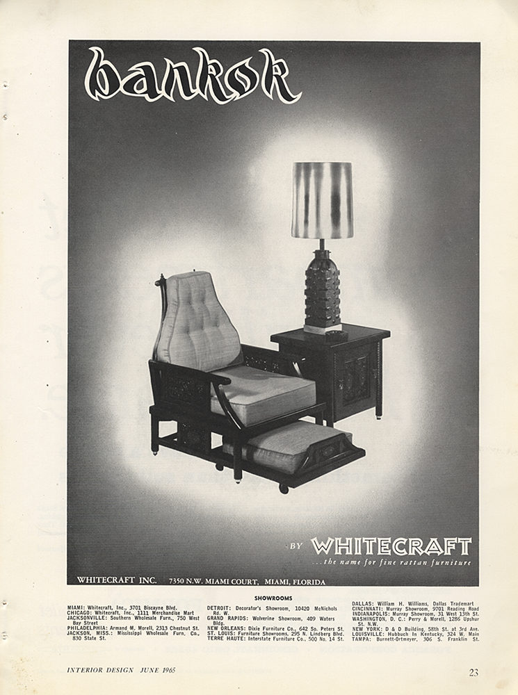
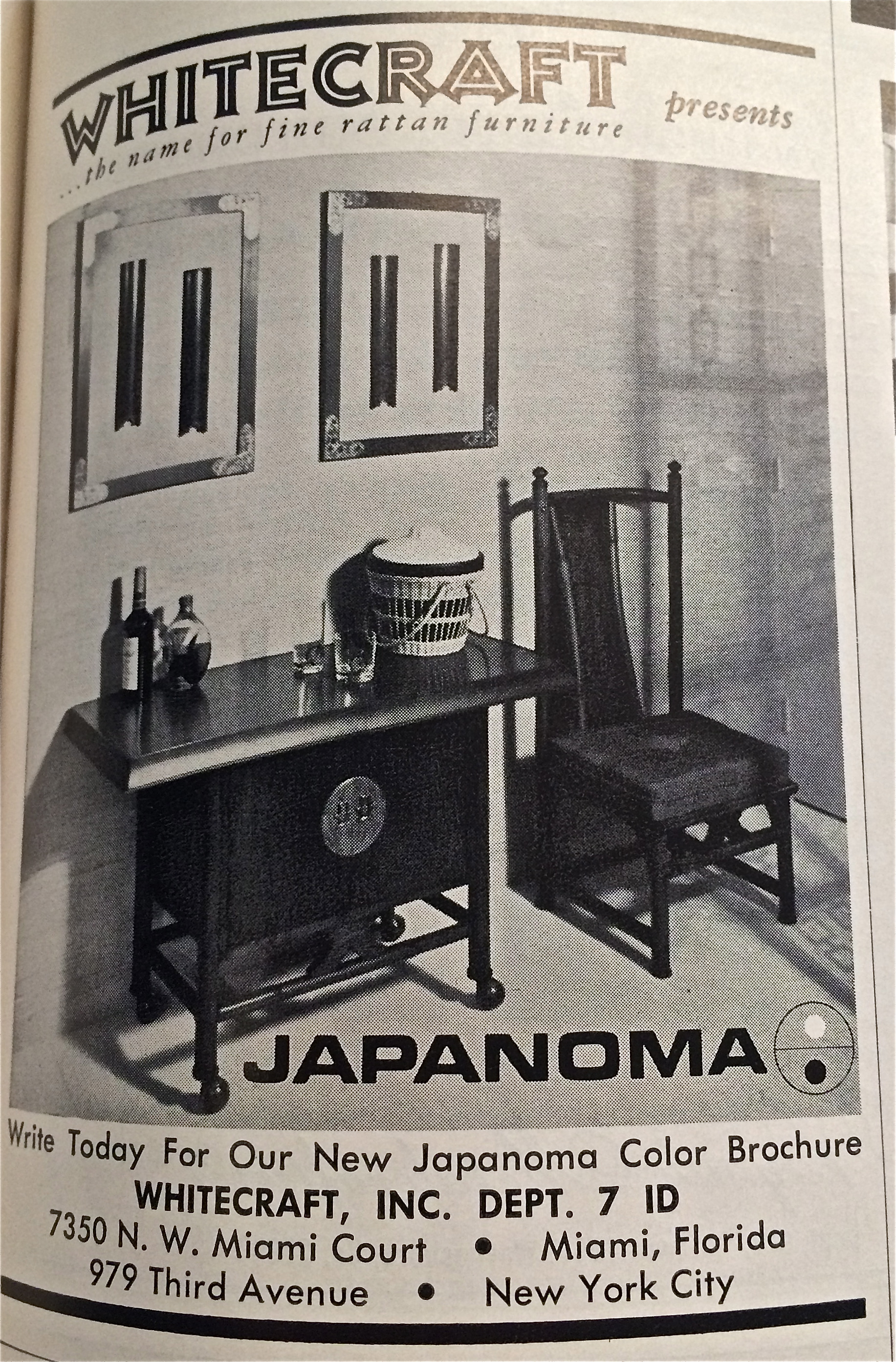
Whitecraft, Inc. logo and ads
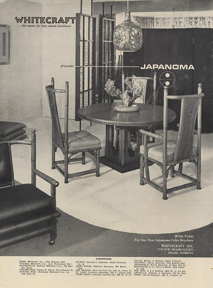
Whitecraft, Inc. was a U. S. manufacturer of rattan furniture with several stereotypical “exotic” lines, such as Bankok [sic!], Maya, and Japanoma. The logos for the first two featured lettering that attempted to mimic the writing styles of those cultures, while the latter references Japan using a typeface of Italian origin: Eurostile. Perhaps the modern, flat lines of Eurostile were meant to reflect the silhouettes of their Japanese-inspired furniture. The whole series is a typical demonstration of mid-century American exoticism – and the name of the company doesn’t help. Or, as John Hodgman puts it:
A lot of cultural problems being worked out here. Interior Design Magazine, 1966.
The Whitecraft logo is set in Kreß-Versalien, but this East German face was probably available to Western designers under a different name in the 1960s, see the typeface bio.


")


 by Anthony Burgess (Aleph, 2019)")


")


