Ghost Box Records #01–20 (2004–2014)
Julian House wraps his music in a world of pseudo nostalgia, freak folk, and hauntology, conjuring a British modernism that never quite existed.
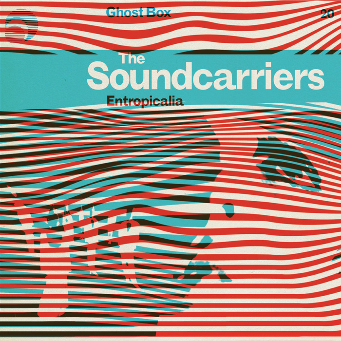
Entropicalia by The Soundcarriers (GBX020, 2014)
Myself and my friend Jim Jupp had been making music, independently and together for a while, and also obsessing over the same things — the cosmic horror of Machen, Lovecraft, the Radiophonic Workshop, weird folk and the occult. We realised that we wanted to put our music out, but also create our own world where we could play with all these reference points. Starting our own label was the only way to do it. — Julian House, from Ghosts of My Life: Writings on Depression, Hauntology and Lost Futures by Mark Fisher (Zer0 Books, 2014)
Torchbearers of hauntology, chief conjurers of memories never had, musician Jim Jupp and graphic designer Julian House launched Ghost Box Records in 2004. Recalling specters of an esoteric British modernism, the duo has been responsible for releasing multiple albums from groups such as Belbury Poly, The Focus Group, and the Advisory Circle. To quote the brilliant and sadly late Mark Fisher:
Off-kilter bucolic, drenched in an over-exposed post-psyche-delic sun, Ghost Box recordings are uneasy listening to the letter. If nostalgia famously means ‘homesickness’, then Ghost Box sound is about unhomesickness, about the uncanny spectres entering the domestic environment through the cathode ray tube. At one level, the Ghost Box is television itself; or a television that has disappeared, itself become a ghost, a conduit to the Other Side, now only remembered by those of a certain age. — Mark Fisher, Ghosts of My Life
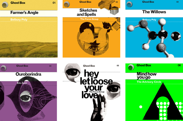
Ghost Box 01–06: These first issues prepared the ground for the series. Already here, the elements don’t adhere to a strict template, in regard to size, position, and alignment. Eyes are a recurring motif.
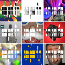
Julian House has managed to crystalize all these emotions brilliantly in a now rich library of album covers. Taking the shape of the series, a typically modernist idea in itself, the basic Ghost Box album applies a repeating typographic template superimposed on a colored background, complemented by isolated imagery. Preferring the intractable MT Grotesque over something like Helvetica is essential in achieving this very precise version of British (un)nostalgia. Back covers and booklets are set in Clarendon (Bitstream’s cut).
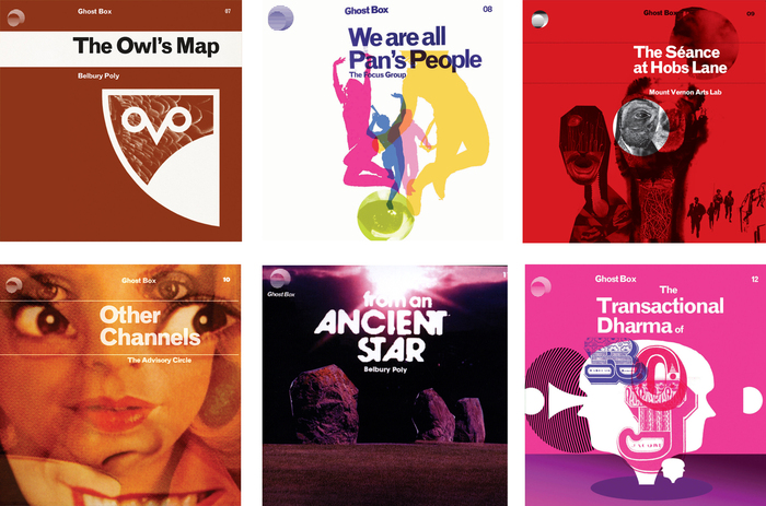
Ghost Box 07–12: The cover for Belbury Poly’s From an Ancient Star deviates from the established MT Grotesque and shows a corroded ITC Avant Garde Gothic, with its iconic alternates (‘A’) and ligatures (‘NT’, ‘ST’). The Transactional Dharma of Roj combines decorated caps from Romantiques No. 2 AKA Carnival and Jean Midolle’s Alphabet Lapidaire Monstre.
At their best, Ghost Box conjure a past that never was. Their artwork fuses the look of comprehensive school text books and public service manuals with allusions to weird fiction, a fusion that has more to do with the compressions and conflations of dreamwork than with memory. House himself talks of ‘a strange dream of a school textbook’. The implicit demand for such a space in Ghost Box inevitably reminds us that the period since 1979 in Britain has seen the gradual but remorseless destruction of the very concept of the public. At the same time, Ghost Box also remind us that the people who worked in the Radiophonic Workshop were effectively public servants, that they were employed to produce a weird public space — a public space very different from the bureaucratic dreariness invoked by neoliberal propaganda. — Mark Fisher, Ghosts of My Life
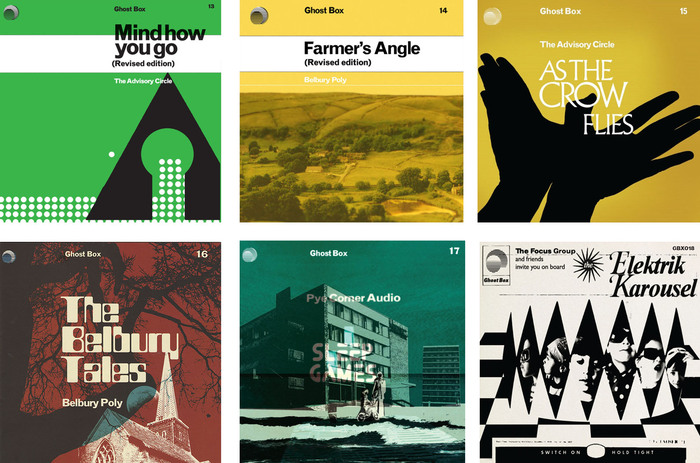
Ghost Box 13–18: Apart from the revised editions, the series is now truly eclectic in its type choices and arrangements, featuring caps from a light Albertus (As The Crow Flies); a widened version of the (retro)futuristic Letraset Countdown (The Belbury Tales); Tomorrow People, another reference to British 1970s science fiction (Sleep Games); or a phototype-like variant of Times Bold Italic, complete with swash caps and irregular exposure (The Elektrik Karousel).

Assorted back covers, featuring Clarendon.
This article shows the first 20 Ghost Box LPs. As the series progresses, House started to break further and further from the template, exploring new nostalgias.

Empty Avenues by John Foxx and The Belbury Circle (GBX 019) uses center-aligned Gill Sans, with effects of overexposure.
Formats
- Branding/Identity (4725)
- Album Art (2587)
Topics
- Music (3862)
Designers/Agencies
- Julian House (3)
Tagged with
- Ghost Box (2)
- hauntology (1)
- faux vintage (107)
- retro (81)
- vinyl records (2227)
- compact discs (CDs) (210)
- colorful/multicolored (776)
- series (666)
- back covers (927)
- The Focus Group (1)
- The Advisory Circle (1)
- Belbury Poly (1)
- Modernist (71)
- eyes (85)
- electronic music (325)
- The Soundcarriers (1)
- 1970s style (125)
- 1960s style (55)
- eroded/weathered type (125)
- blur effect (60)
Artwork location
- United Kingdom (2121)
- London (1192)















4 Comments on “Ghost Box Records #01–20 (2004–2014)”
Very nice! Thank you, Love.
(What it is with light Albertus and crows?)
OMG yes! Taking tradition for a new spin is always what I love.
Some really inspiring modern artwork.
The cover of As The Crow Flies is a reference to the opening credits of the Granada TV adaptation of The Owl Service (1969):
www.johncoulthart.com/feuil…