

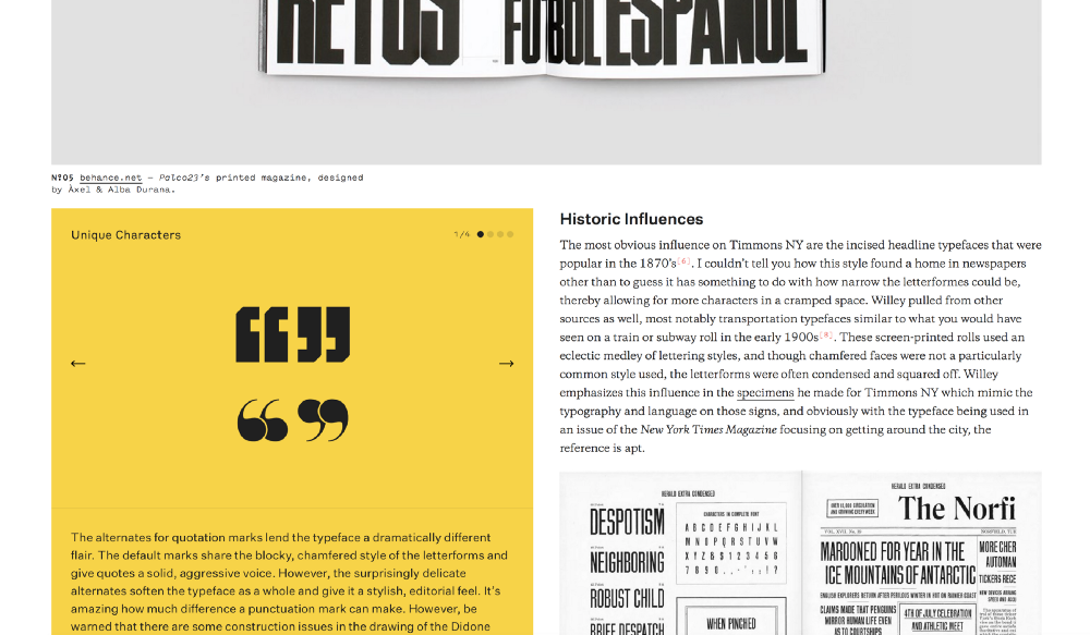
Font Review Journal (2017)

When the superb typographer Bethany Heck does something new, you’d better be paying attention. The Font Review Journal is an online publication that does exactly that, presenting reviews of typefaces. New or old, they all get a lavish treatment with custom type specimens, great editorial design and even better writing. The lack of greater written discussion and critique on contemporary type always suprised me, so it’s amazing to finally see someone stepping up.
For the complete loaddown on the Journal, you should read Heck’s super detailed Medium post (where I also stole the pictures from). But for this post, here is what she had to say about the choice of type:
There was never any question in my mind that the body text would be set in Galaxie Copernicus. It’s rare that I do a web project without it, and it has such a clean, even visual grey. It gives a scholastic tone without being overly formal and I love the eccentric italics. Pitch Sans was quickly chosen as the tertiary face for labeling and captions, and serves as the “narrator voice” of the site. A monospace font allowed me to have captions in the main columns of text that are clearly different from the body copy without having to dramatically change their color, size, or add adorning elements like rules which I thought would be distracting. I adore Pitch and was delighted to use the Sans version, which keeps the same generous proportions of the original while losing the serifs and the ball terminals. The result is a wide-set monospace font with a robust set of weights that is crisp and clean but still has tons of character.
Styrene was the next epiphany, and was chosen while picking a typeface for the “Font Review Journal Specimen” heading on each column of the specimens. Once you see Styrene’s “J” in use, it’s hard to turn it down. The font is unique and noticable without being distracting, and it didn’t hurt that it plays very nicely with the final typeface, Untitled Sans. Untitled Sans is a “plain” grotesque that’s meant to have as little personality as possible, which seems fitting for a website about reviewing other typefaces. I’ve grown rather fond of it and see a lot of beauty in its restraint. It settles in against all the other typefaces effortlessly, and thus the type system is complete.


")


, <cite>Introducing Hedzoleh Soundz</cite> album art (1973)")


