
Blank Books — EP1 redesign
I adore anything @aaronsprinkle does, and his new band Blank Books has an awesome EP out. I love it so much I made my own packaging concepts for it and they are allllmost as rad as the album. blankbooksband.com/releases — @EephusLeague on Twitter
Bethany Heck is not only a top-notch writer on her Font Review Journal website, she’s also an incredible and passionate designer that carefully experiments with the typefaces that she reviews.
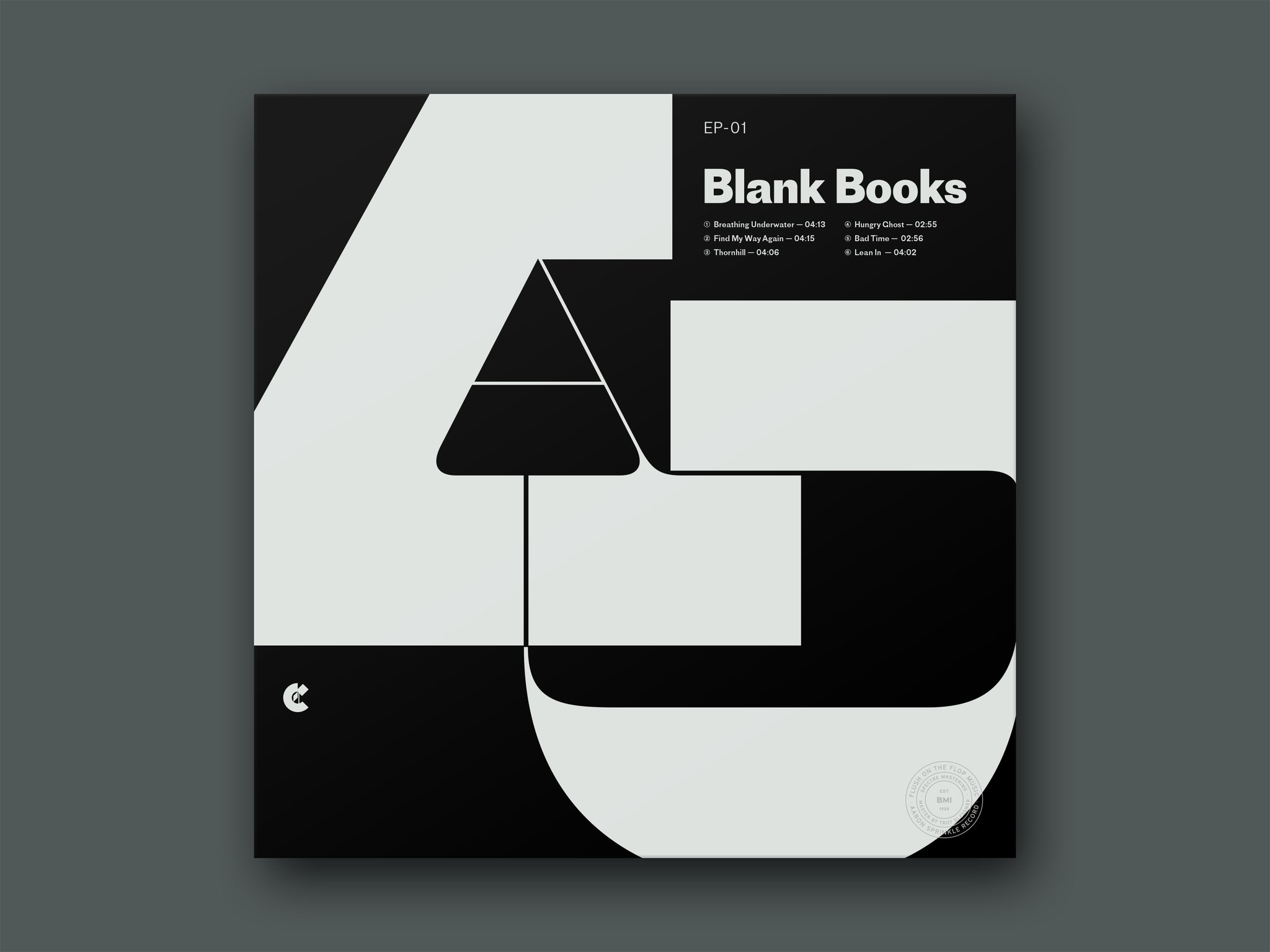
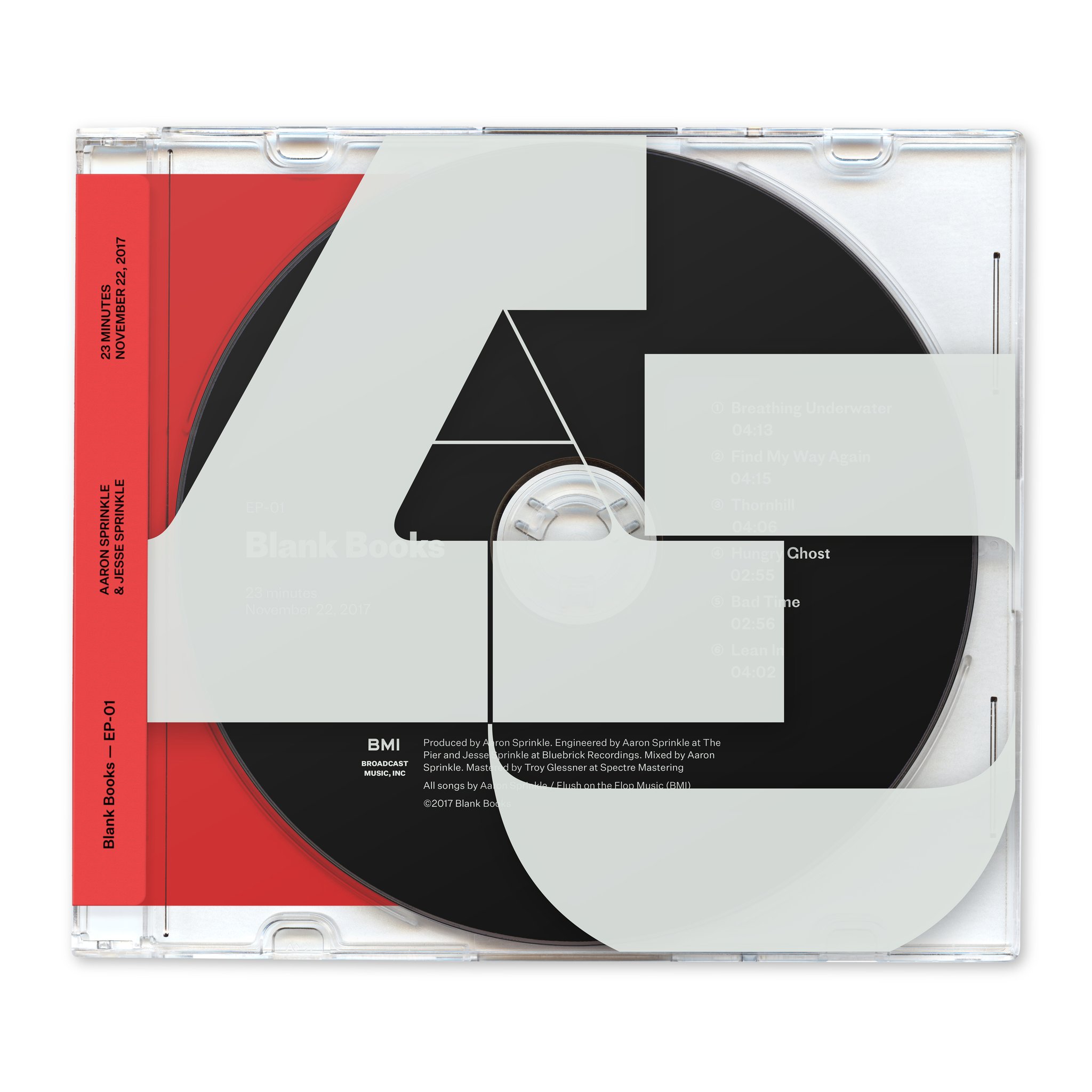
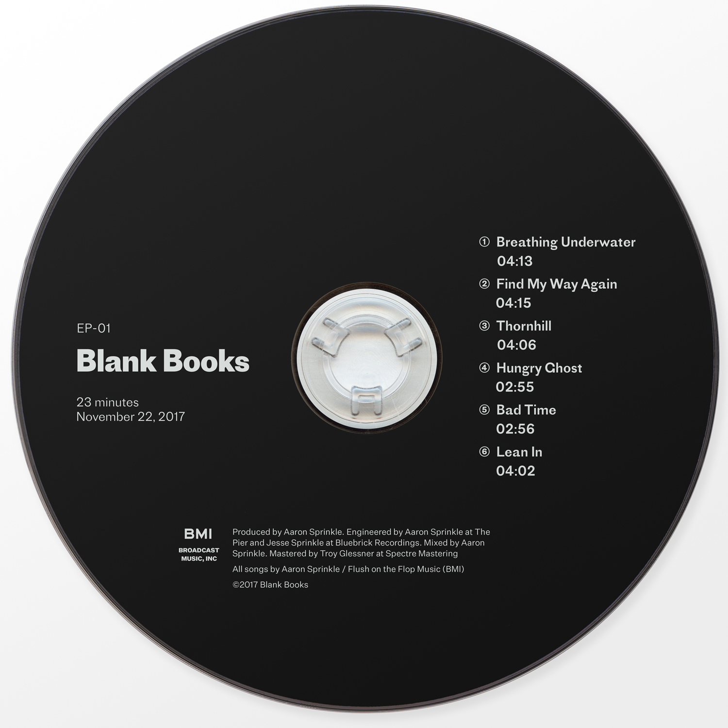
Maelstrom is the large yummy type, which I chose because it’s so good for large-scale because of its insane thick-to-thin contrast. You can use it large and it still lets air through because the strokes get so slender. Proto Grotesk is used on the CD itself and the vinyl concept, and I found it’s odd angularity and the AWESOME spur on the “a” were really nice compliments to the curves in Maelstrom. It’s got the same svelte lines against blocky slabs. I used Untitled Sans on the wrap sticker, because I wanted that to feel like a neutral, utilitarian addition to the “extra” of the rest of the design—an imposition necessary to share all the information necessary for the album instead of a flashy stylistic detail. [1]
Proto Grotesk has already been featured. Maelstrom & Untitled Sans will surely follow!


")


3 Comments on “Blank Books — EP1 redesign”
Thank you, Quentin! The Maelstrom and Untitled Sans reviews are in the works (Bastard too!). It’ll be a little while because there’s a backlog to get through first :)
The first big letter on the cover seems to be an “A”. What’s the second one?
It’s a (modified) ‘J’ — for Aaron & Jesse, I suppose.