
Thuisblijven is duurder by Jelmer de Boer
Contributed by Matthijs Sluiter on Jan 2nd, 2018. Artwork published in
December 2017
.
Source: www.thuisblijvenisduurder.com License: All Rights Reserved.
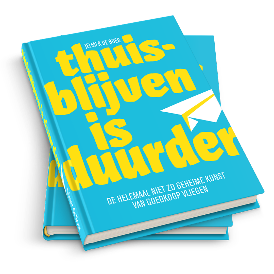
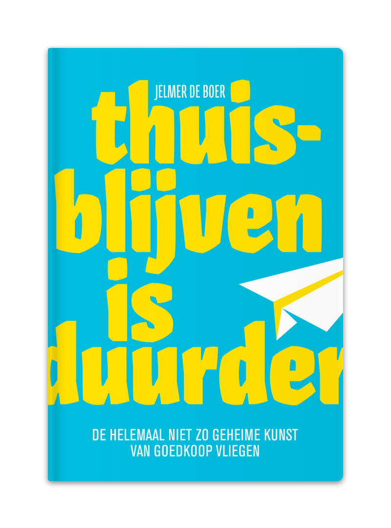
Thuisblijven Is Duurder (Staying at home is more expensive) is a book in which author Jelmer de Boer shares his self-gathered knowledge on how to travel the world at (almost) no expense. The title is set in Pilot, a font that suits the content in its look and in name.
Source: www.thuisblijvenisduurder.com License: All Rights Reserved.
Source: www.thuisblijvenisduurder.com License: All Rights Reserved.


1 Comment on “Thuisblijven is duurder by Jelmer de Boer”
Very nice! Aleksandra Samulenkova’s Pilot is among my favorite releases of the past year. I hope we get to see a lot more uses of it in 2018.
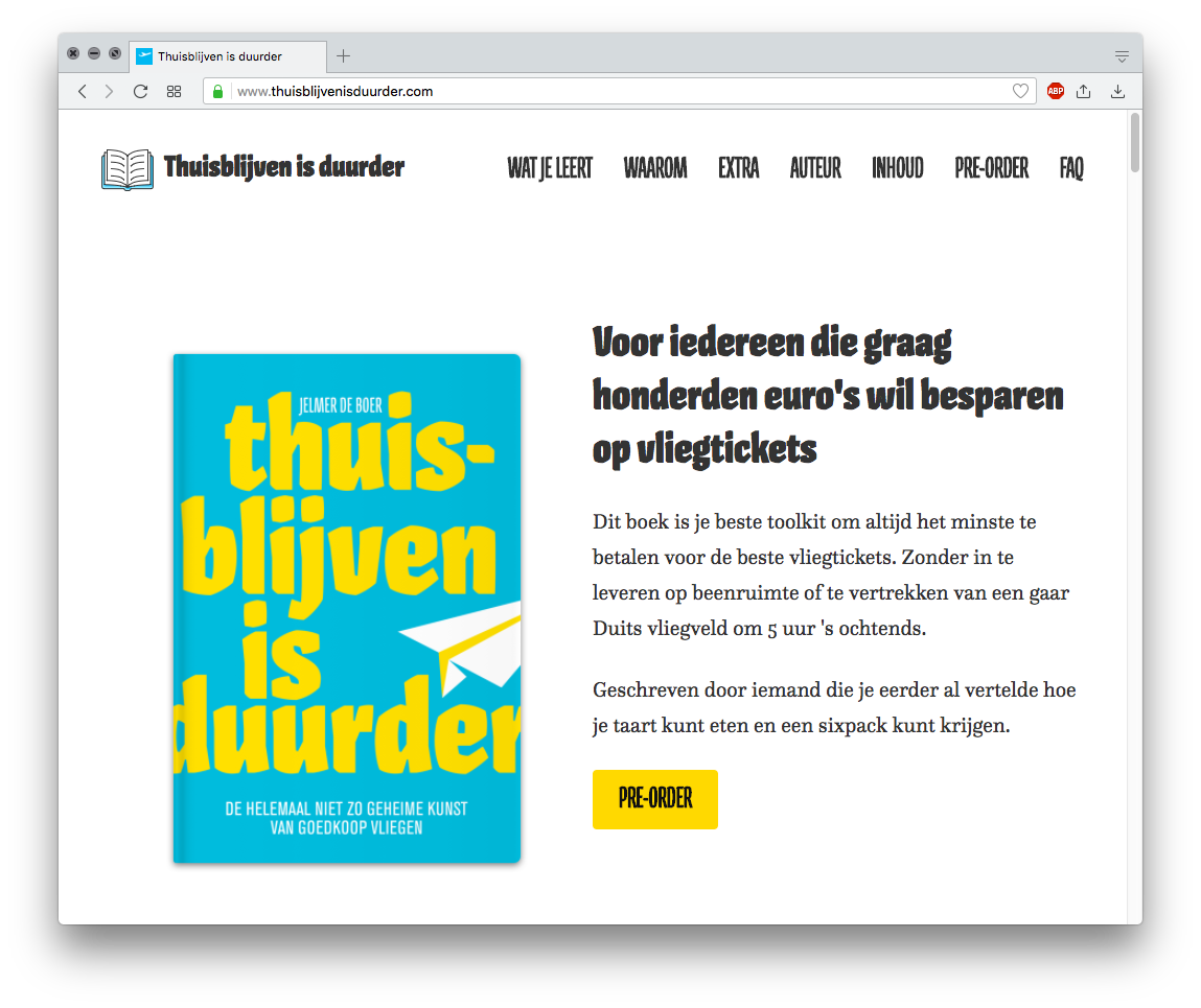
What I love about this one is the combination of big bold lowercase letters with minimal linespacing — note how the lines were carefully positioned so that stems in l/i/u and h/ij/u are aligned — and light capitals in a smaller size. The bright color combo adds to the appeal. Type that extends into (and beyond) the groove usually looks like an oversight. Not in this case: here the letters are cropped on both sides, making the type appear even larger. It’s not quite clear to me why a second (different but not really contrasting) typeface was introduced for the tagline. Props for using Pilot on the website, too! There, the typographic joy is slightly marred by the usual peeves: straight (AKA dumb) apostrophes, and faux-bolding (at least in some browsers).