
Baltimore Center Stage
Contributed by Gareth Hague on Feb 13th, 2018. Artwork published in
.

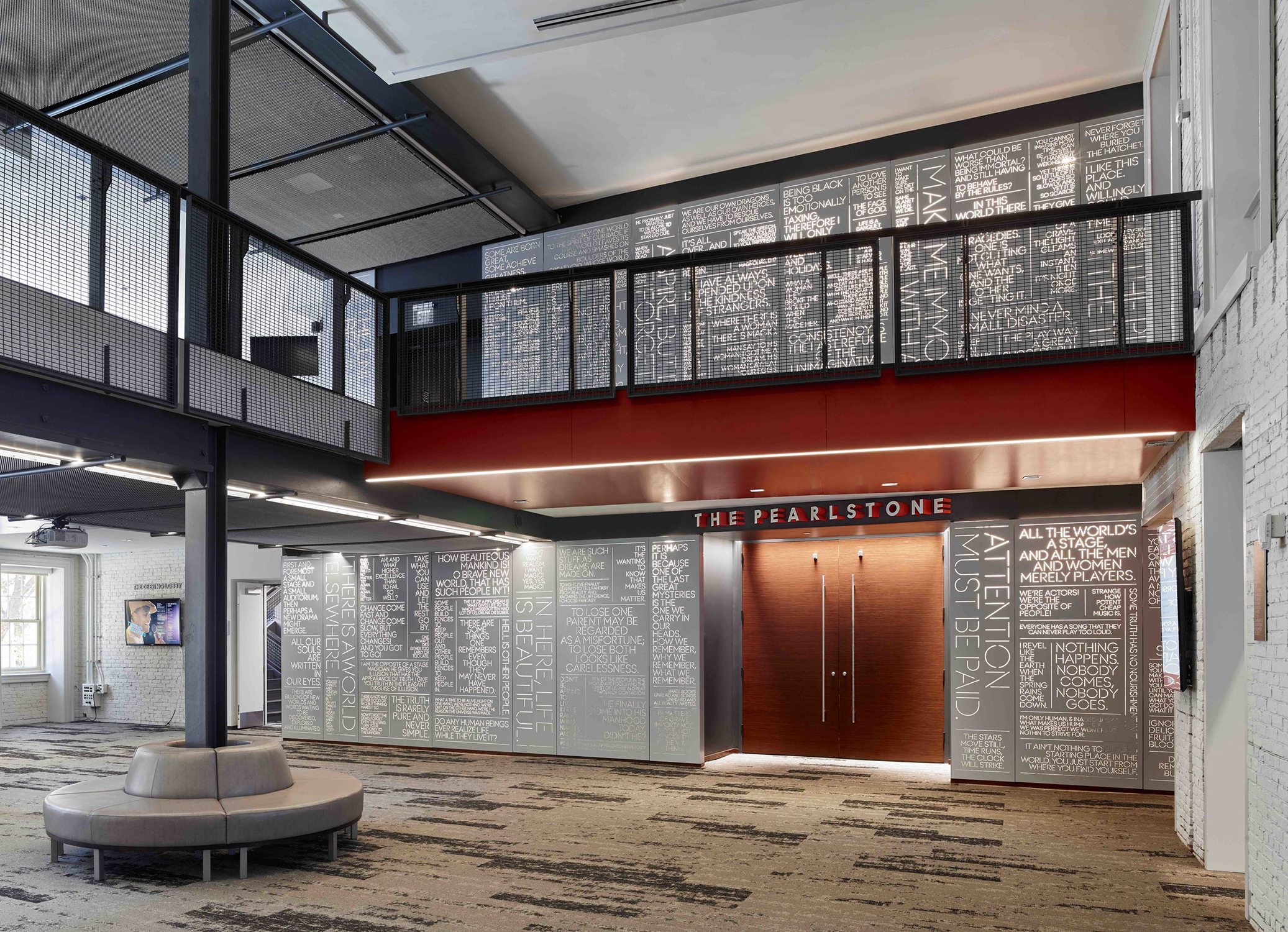
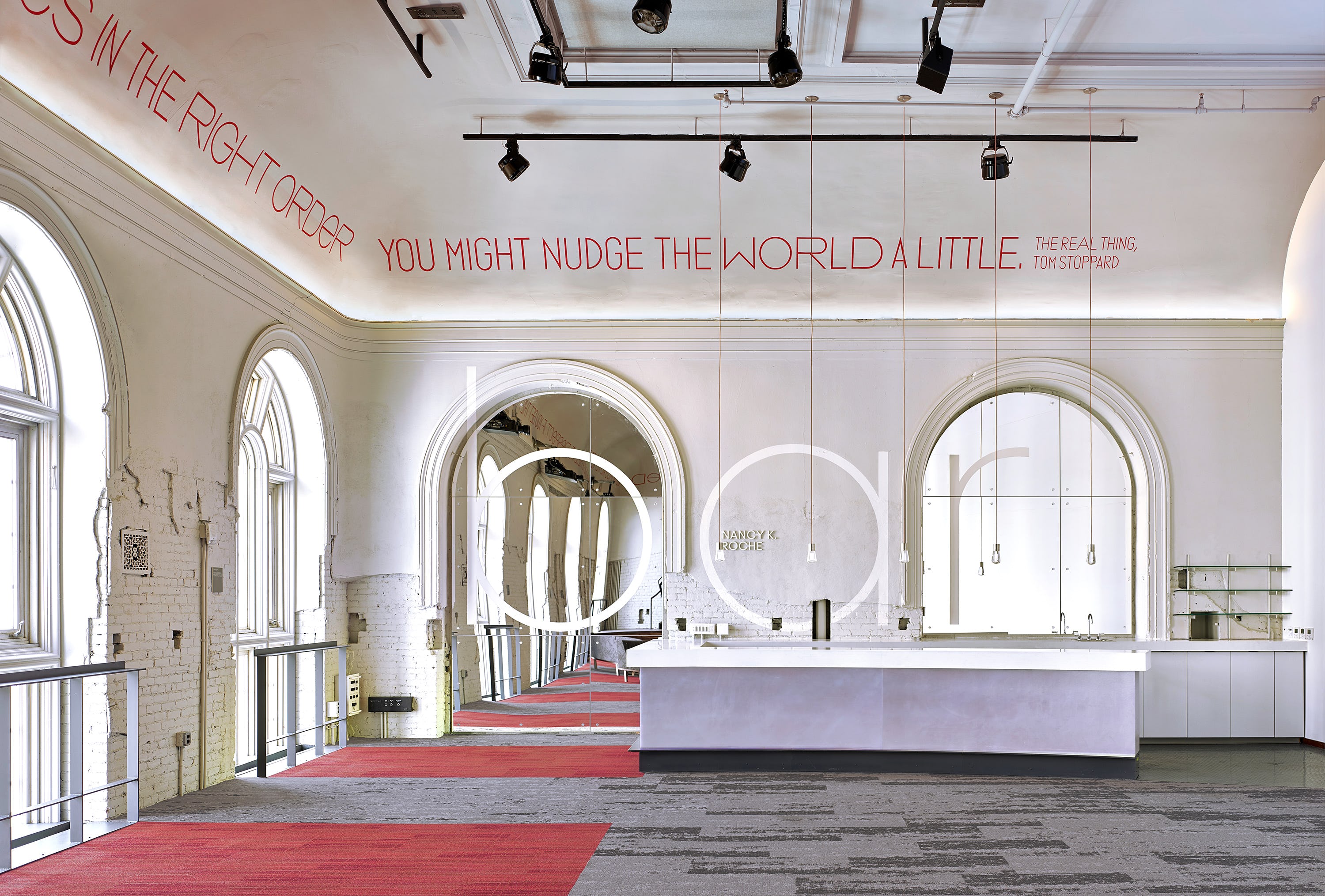
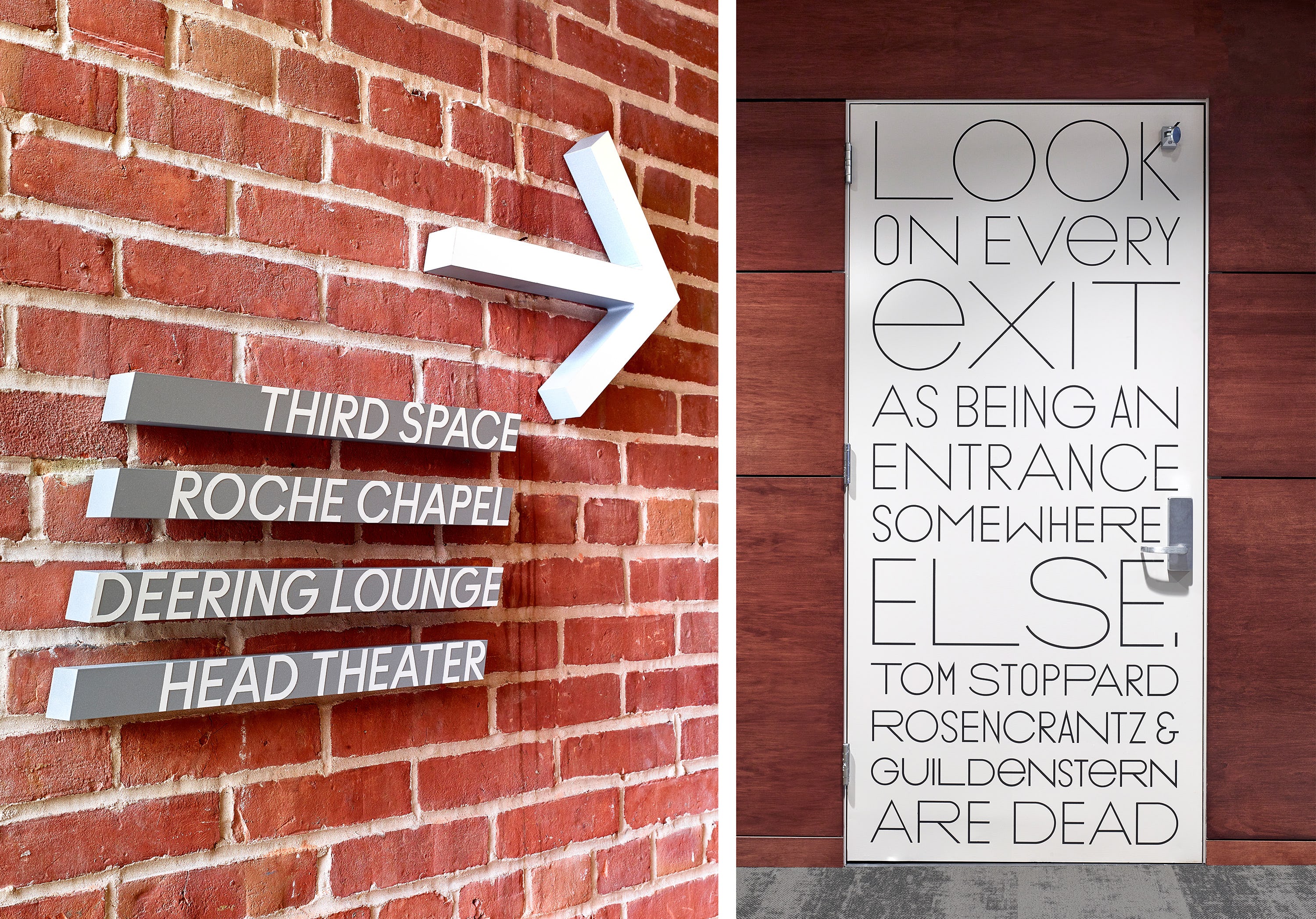
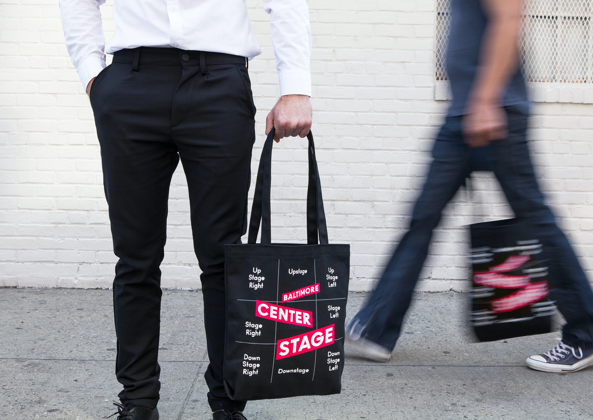
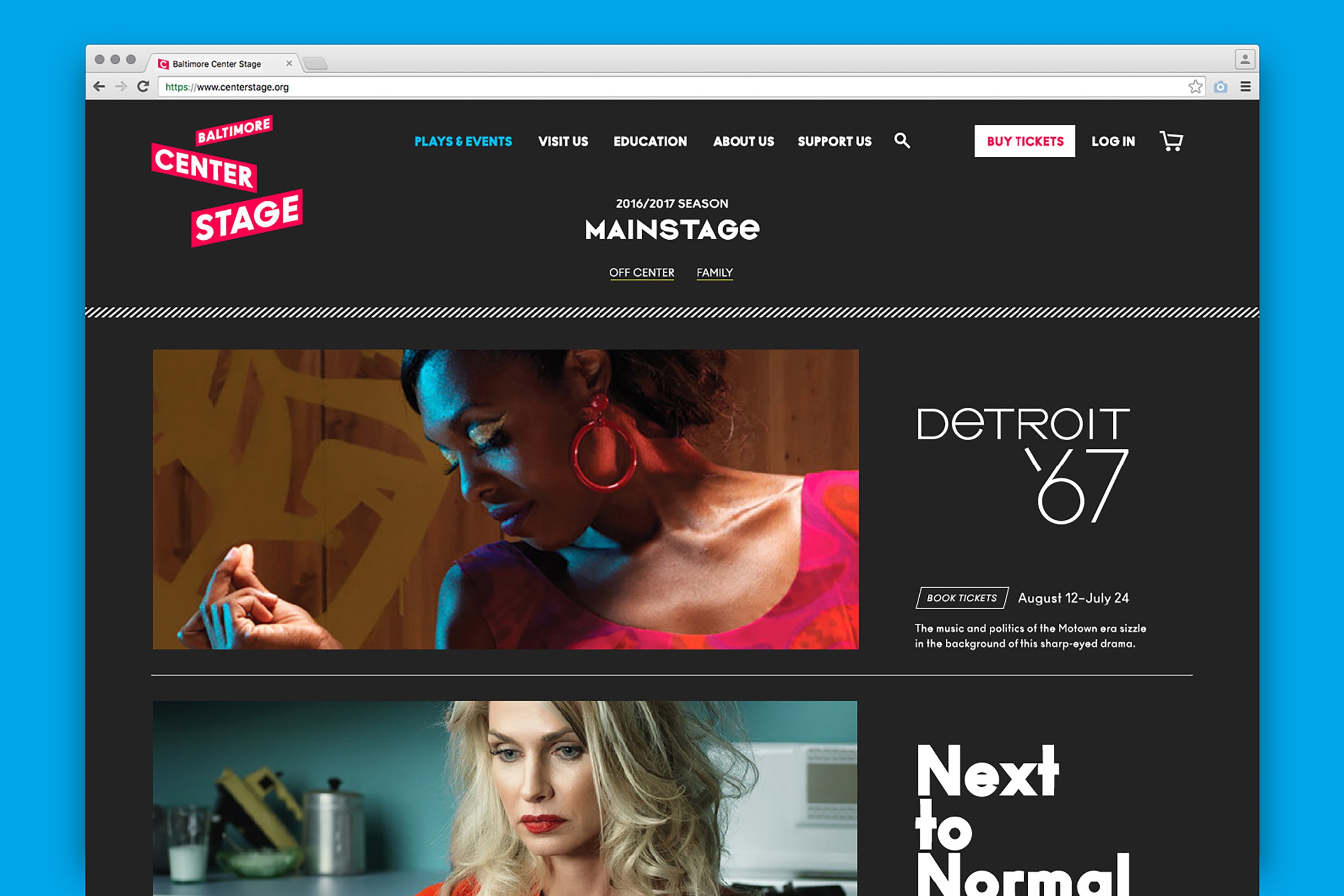
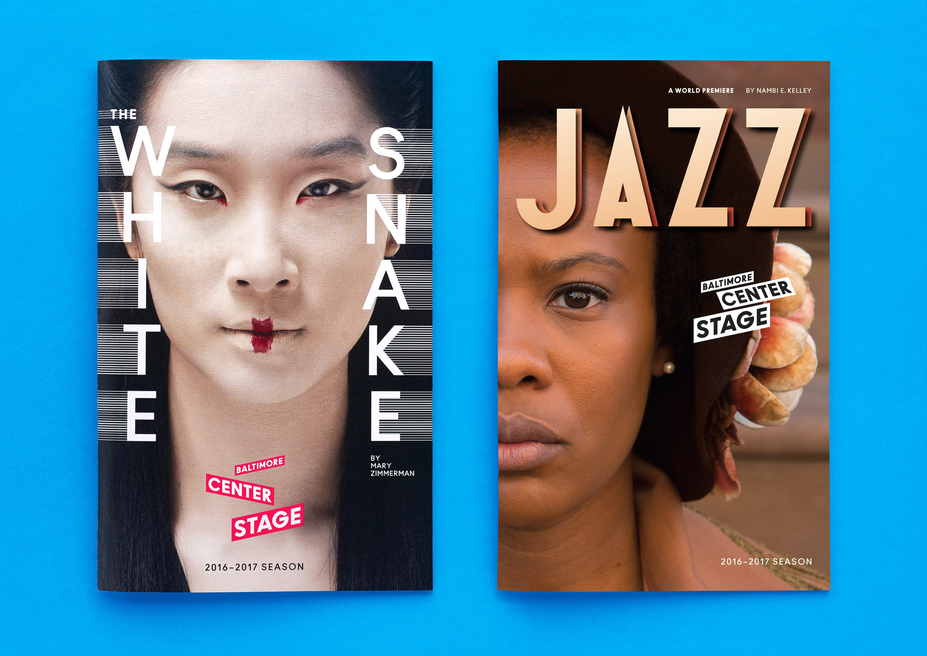
Baltimore Center Stage is one of the most prestigious regional performing arts companies in the U.S., a forefather of independent theater that presents innovative productions of classical and contemporary works. Concurrent with a major revitalization and renaming of the theater, Pentagram has designed a new brand identity, program of environmental graphics and website that captures the dynamic spirit of the institution and highlights its Baltimore roots.
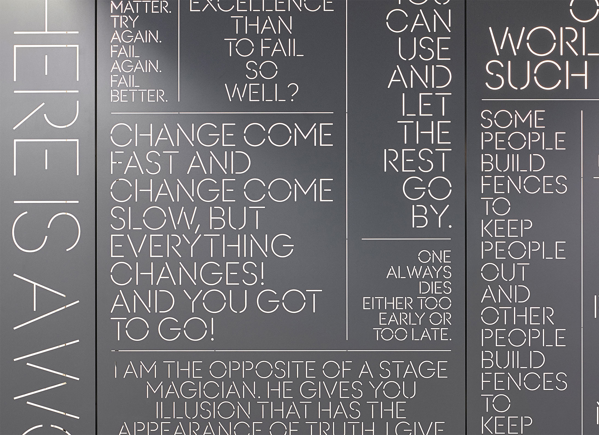
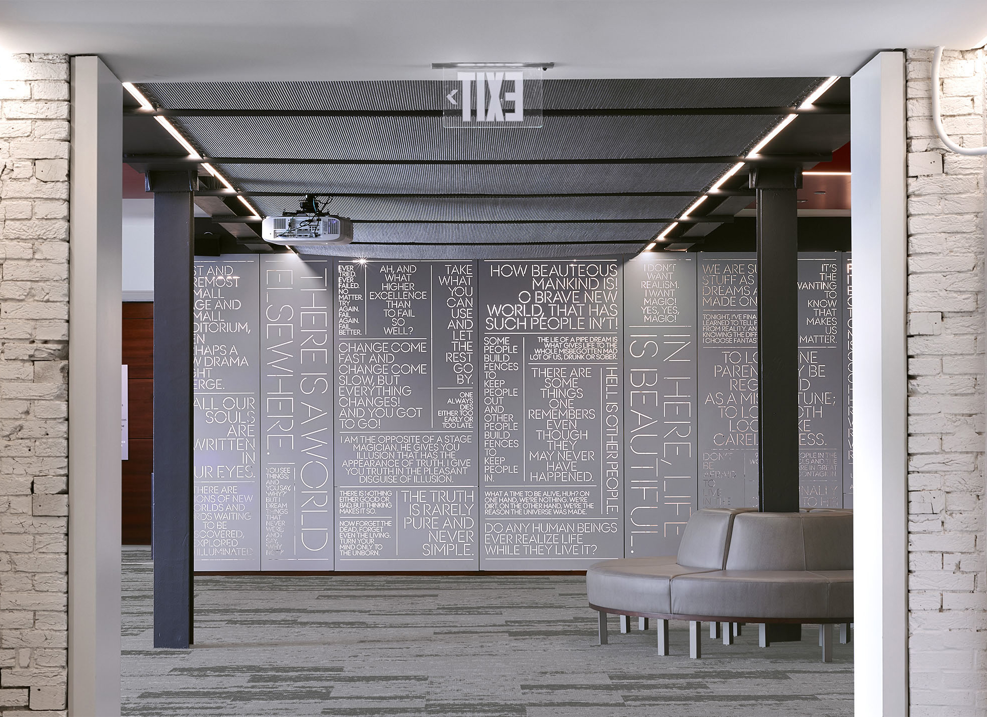
The logotype is set in Ano, a monoline sans serif with a wide-ranging family of fonts. The identity employs the entire suite of variations, using them as a flexible toolkit for various components of the branding and the individual productions.
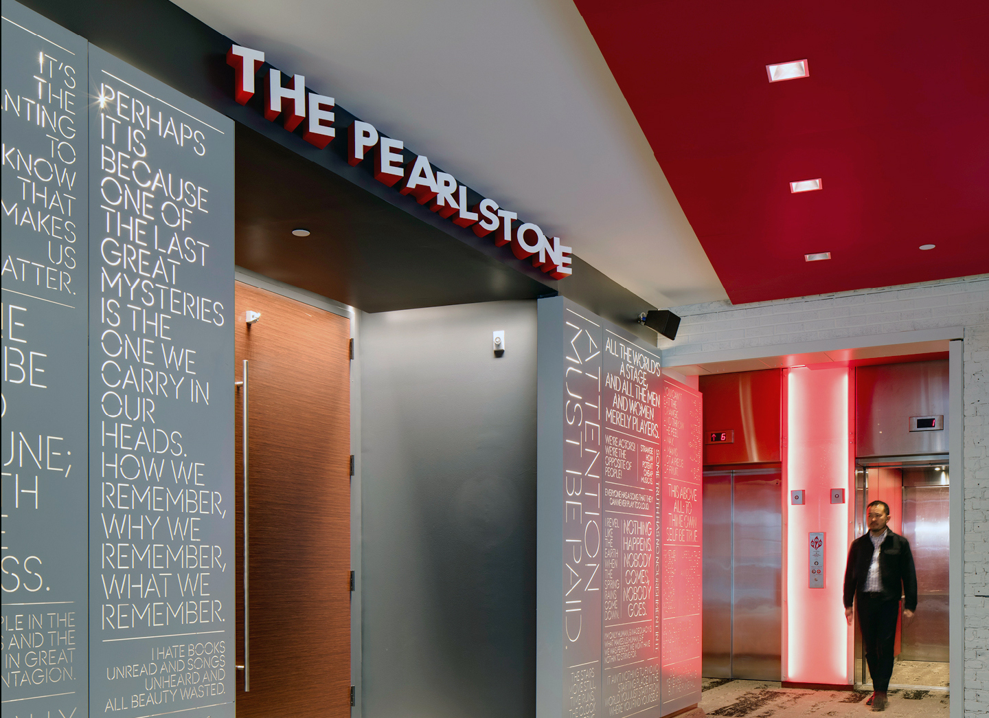

Source: www.pentagram.com License: All Rights Reserved.

Source: www.pentagram.com License: All Rights Reserved.

License: All Rights Reserved.
Source: www.pentagram.com License: All Rights Reserved.


")

")


")


3 Comments on “Baltimore Center Stage”
The spacing on the “PEARLST ONE” sign is unfortunate, but this whole program is otherwise really great.
In the first, angled, pic you mean?
That’s a result of the three dimensional effect no?
The spacing looks off when seen from either angle in the photos above. I don’t see why there’s so much space between T and O.