
Das verträumte Osterhäschen
Current status: “The Dreamy Easter Bunny”. Regular service will be resumed shortly.
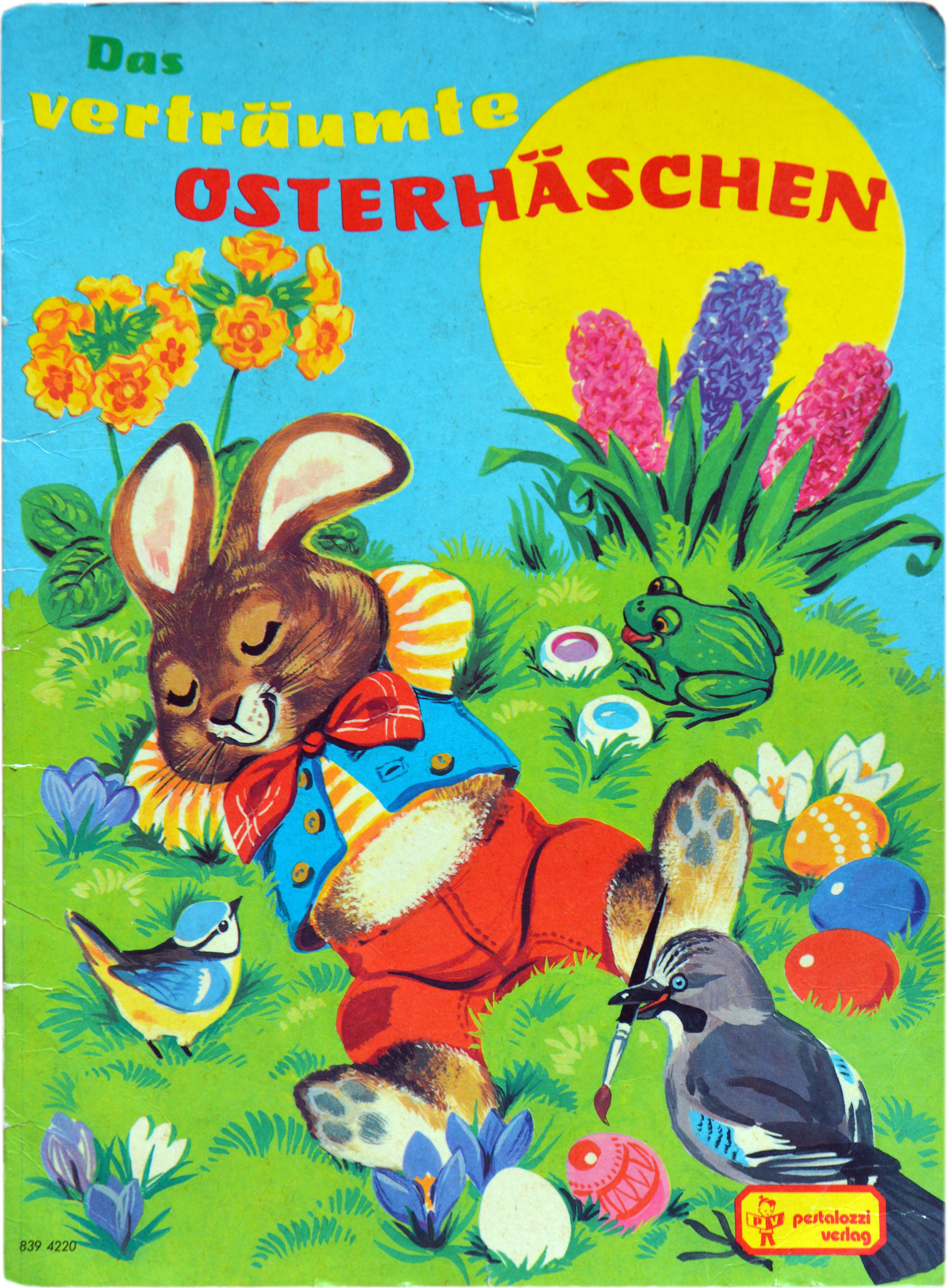
This A4 booklet with an illustrated Easter story for children was first published in 1974 by Pestalozzi-Verlag, Erlangen. The image shows the 9th edition from 1983.
The title typeface is Manessa by Georg Wilkens, set in three curved lines, with an alternate a/ä. Wilkens originally created the letterforms while working on a food packaging design. On the initiative of his schoolmate Günter Gerhard Lange, Manessa was made into a typeface and included in the Berthold Fototypes library in 1971. [Klingspor-Museum]
The oblique Tabarnak (Patrick Griffin, 2012) is a digital reinterpretation, or in Canada Type’s own and slightly bigheaded words, “an assessment and correction of an old concept by George [sic] Wilkens. The original idea was for a bold upright alphabet reminiscent of Oz Cooper’s work, but ornamented with some shocard/signage traits. That idea was radically redrawn and reinvented to become a simple 21st century font made to turn heads and induce a friendly rush.”


</cite>")


