

Hotel Monaco identity (2016)

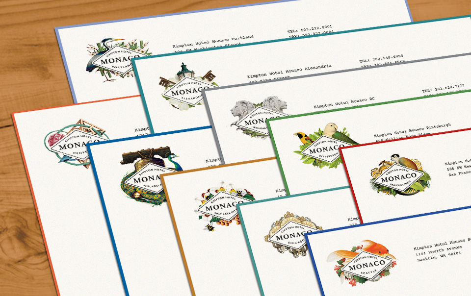
Kimpton’s Hotel Monaco has long been a bold brand collection unto itself, channeling the quirky world traveler who collects inspiration from design and localized experience wherever they go. When the Monaco brand architecture and identity required an overhaul for today’s boutique luxury guest, careful brand strategy was required. Where most Kimpton hotels exist as brands of one within the Kimpton family, the Monacos form a distinct “collection,” each with its own spirit aligned with the unmistakable Kimpton sensibility.
At the visual core of the Monaco brand identity is a consistent mark that unifies the brand’s intent; a core diamond motif logo echoes passport stamps or steamer trunk decals, delivers the name and location, and anchors Hotel Monaco’s story about the world traveler seeking an immersive, fanciful experience in each city.
Winner of a Gold award in the Graphis Letterhead Competition.
Designer: North Bryan
Creative Director: Kenn Fine
Art Director: Ashley Partrich


")


")


