
Die grüne Grenze – Isabel Fargo Cole, Edition Nautilus
Contributed by Florian Hardwig on Apr 24th, 2018. Artwork published in
September 2017
.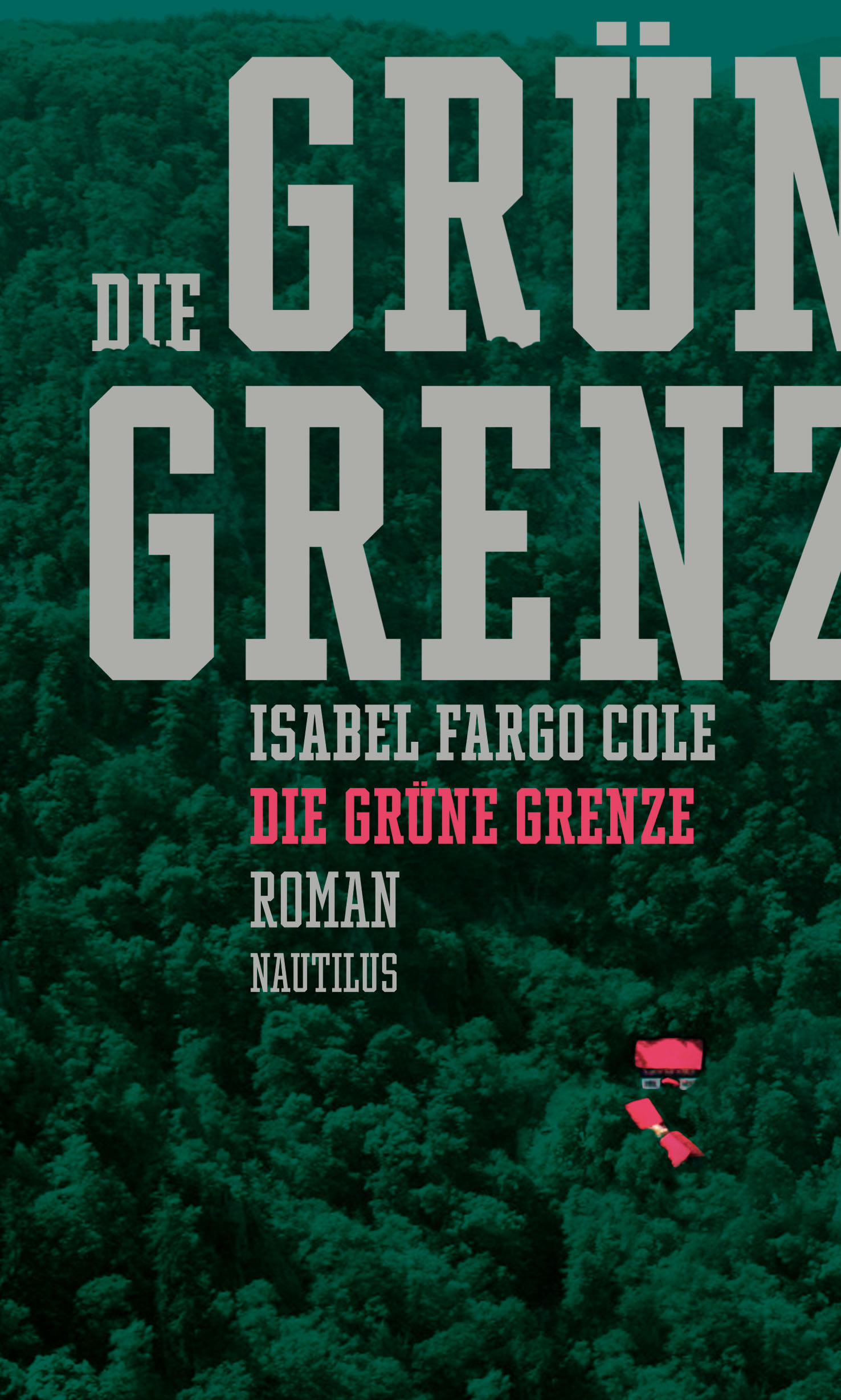
Die grüne Grenze (“The Green Border”, Edition Nautilus, 2017) uses Winner Compressed (sportsfonts, 2016).
For type designer Christoph Koeberlin, it’s the first time he spotted his creation in the wild. The Winner series is primarily intended for the use on sports jerseys and in other athletic contexts. The slab serif is a strong choice for Isabel Fargo Cole’s novel about the intra-German border, too. Winner appears in various sizes in Maja Bechert’s jacket design. It is additionally used for the title page and the section openings. The book interior is set in Adobe Garamond.

Title page
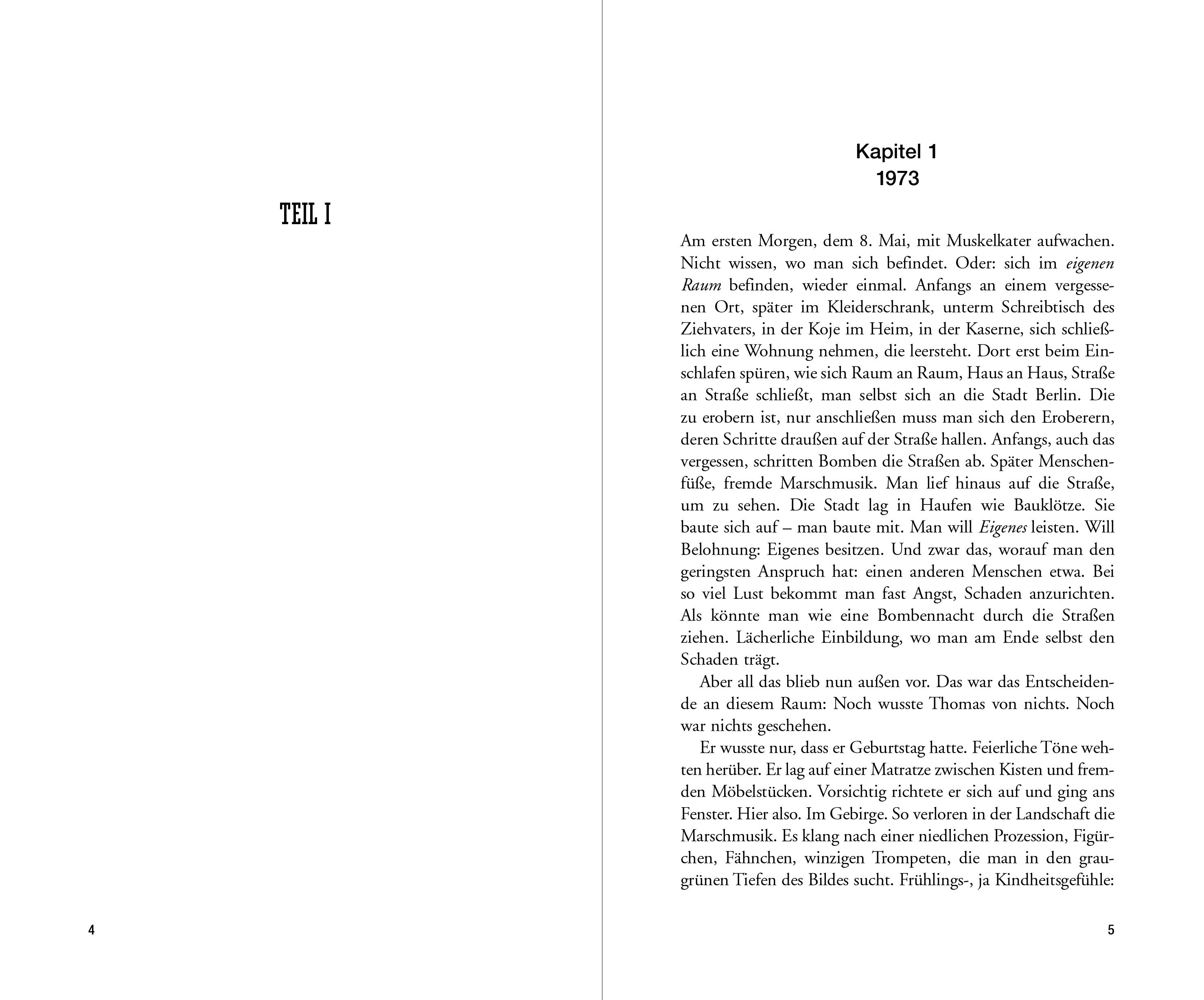
Section and chapter opening

Alternate version (unpublished)


")


