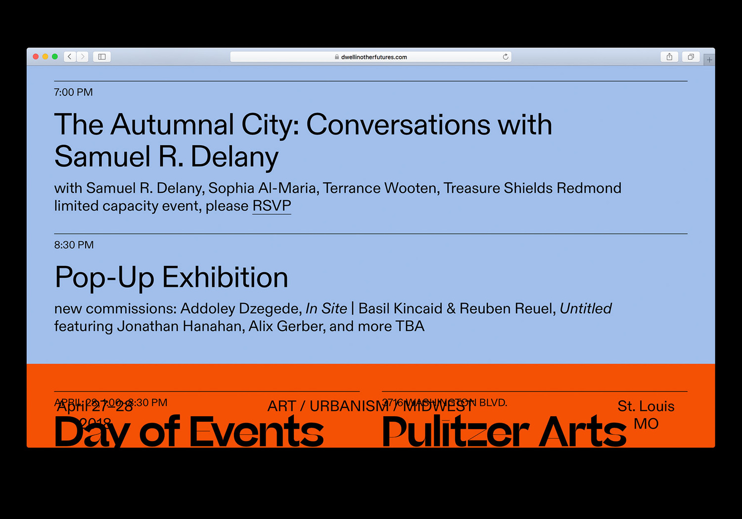
Dwell in Other Futures
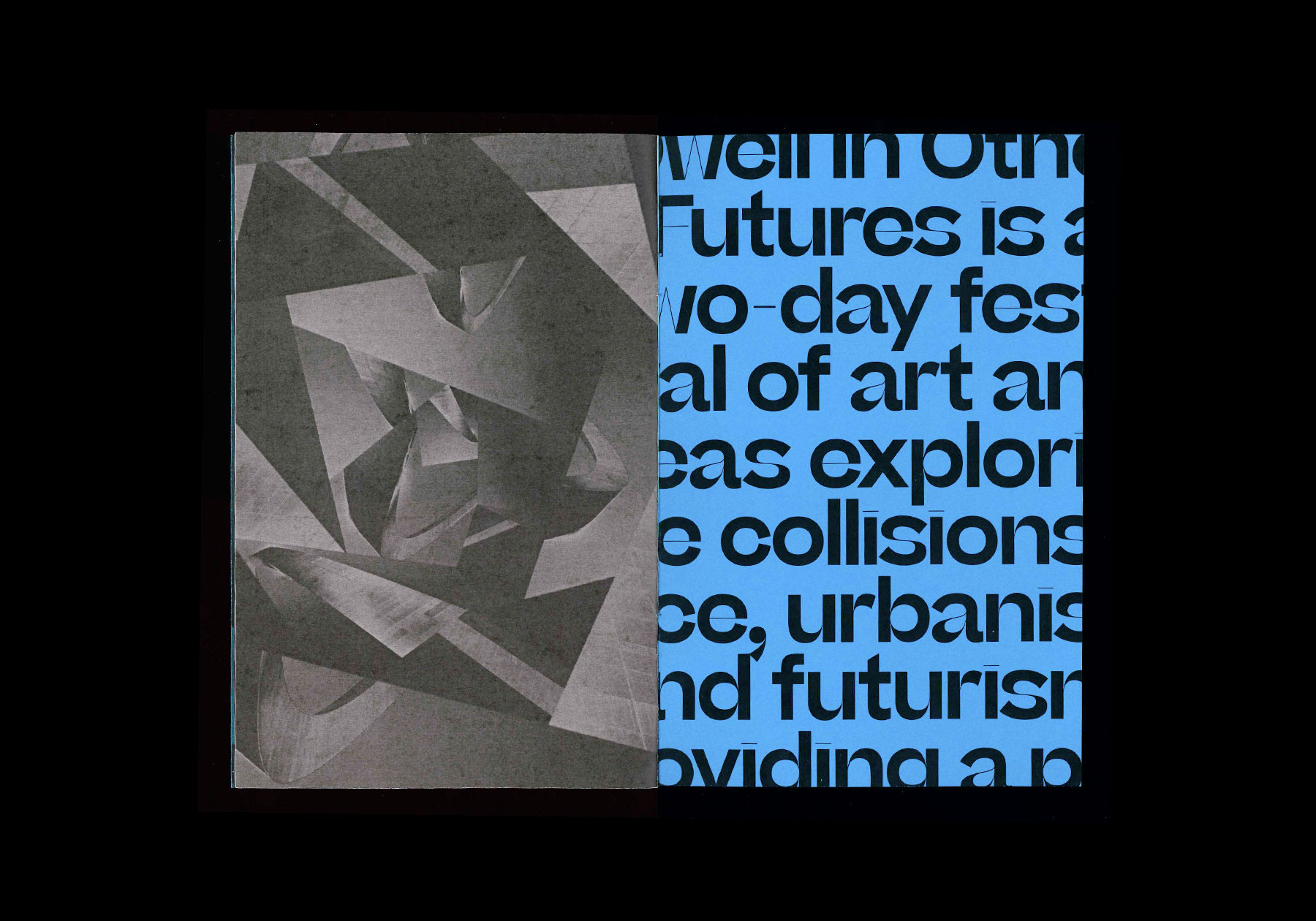
How do images of the future shape the city in the present? What competing futures are emerging in the urban fabric? Dwell in Other Futures is a two-day festival of art and ideas exploring the collisions of race, urbanism, and futurism, providing a platform for alternate visions of the St. Louis to come.
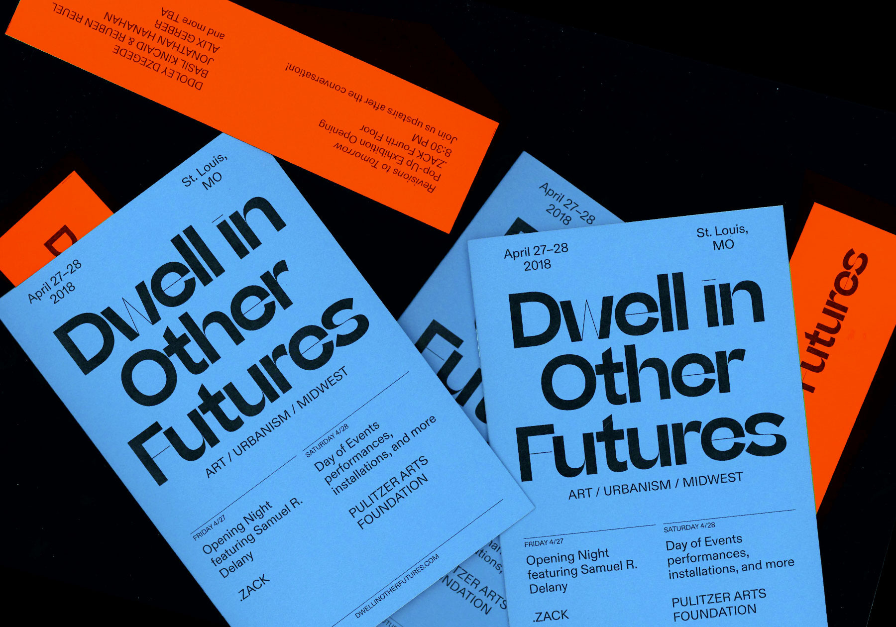
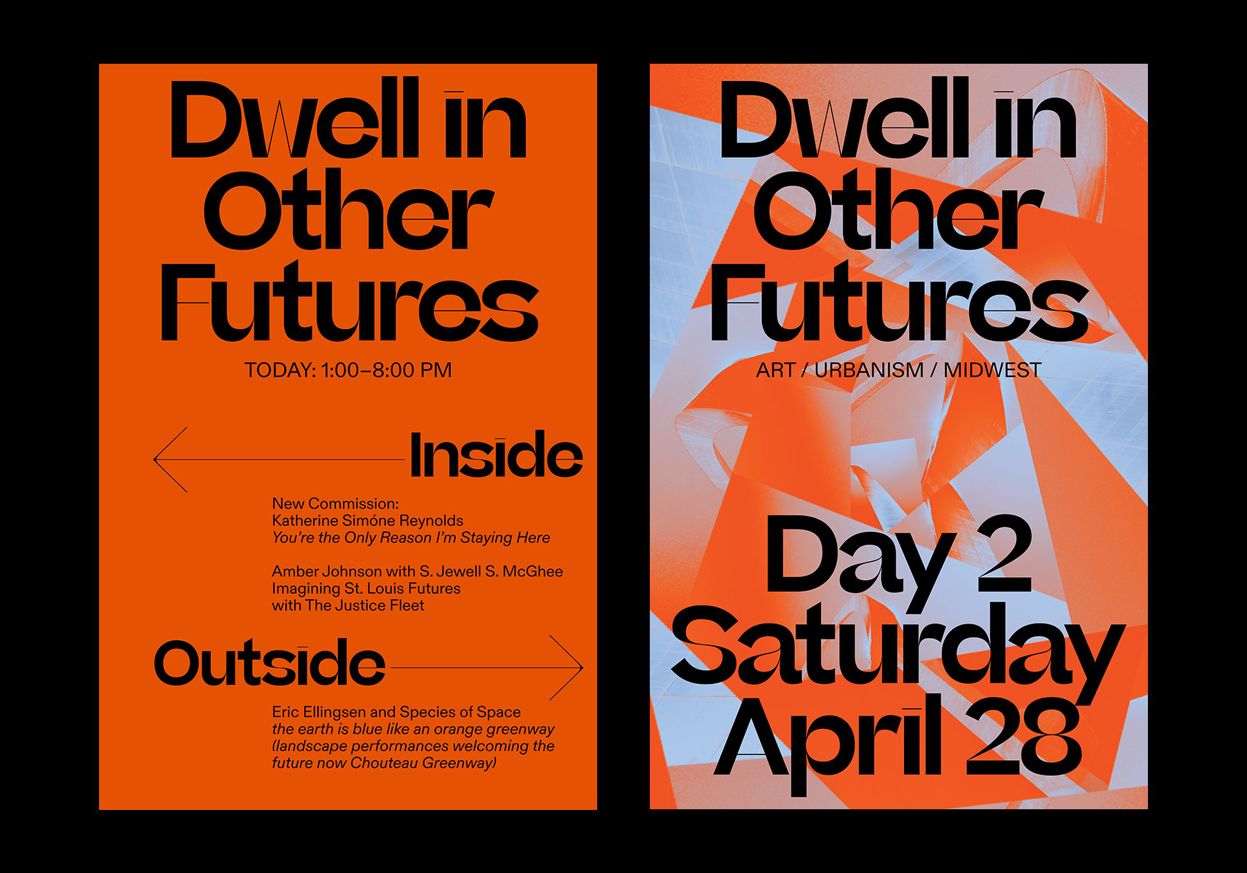
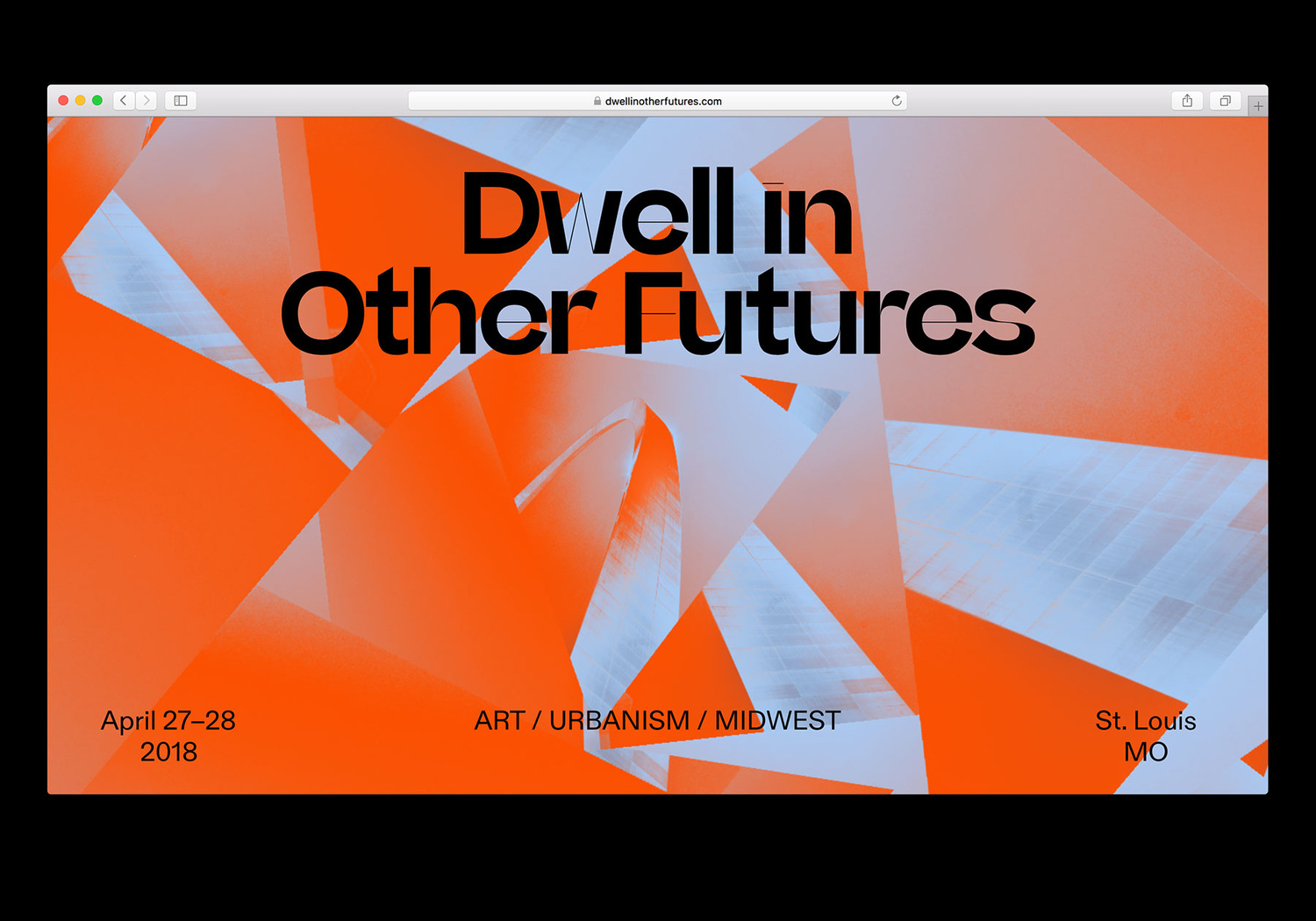
The identity, with its bold red and blue color scheme is primarily built on two typefaces and a single familiar image of St. Louis, distorted and recombined beyond recognition. Sharp Type’s Beatrice Display, to be released soon by Sharp Type, is a bold display font that started out as an exploration of ‘internal contrast’. Diatype by Dinamo is used for body copy and page navigation.
The festival website, which takes the distorted imagery and makes it interactive, is the primary application. Other materials produced for individual exhibits and performances include but are not limited to a booklet, bookmarks, exhibition posters, and signage.
More documentation on the designer’s website.