Philip Roth book jackets (1969–1975)
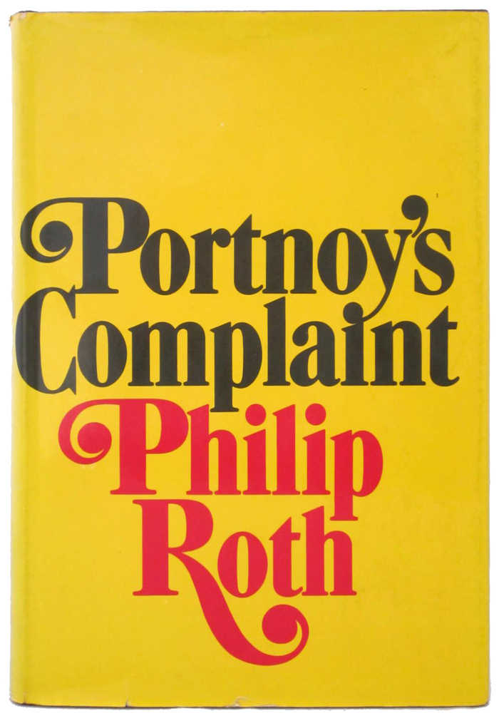
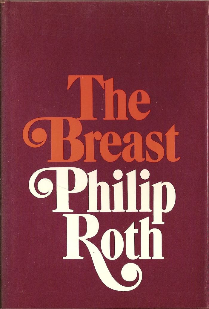
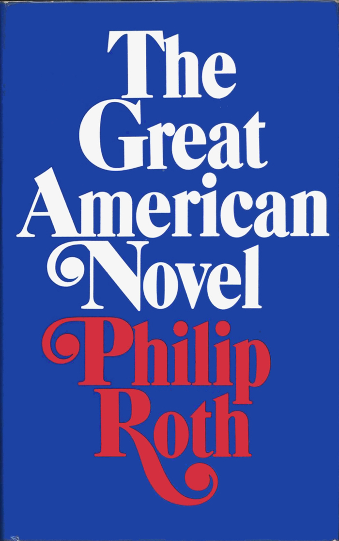
All of Philip Roth’s books published between 1969 and 1975 carry the same typographic signature. It consists of a bold condensed Caslon variant with swashes, set center-aligned, with the title and the author’s name separated by color.
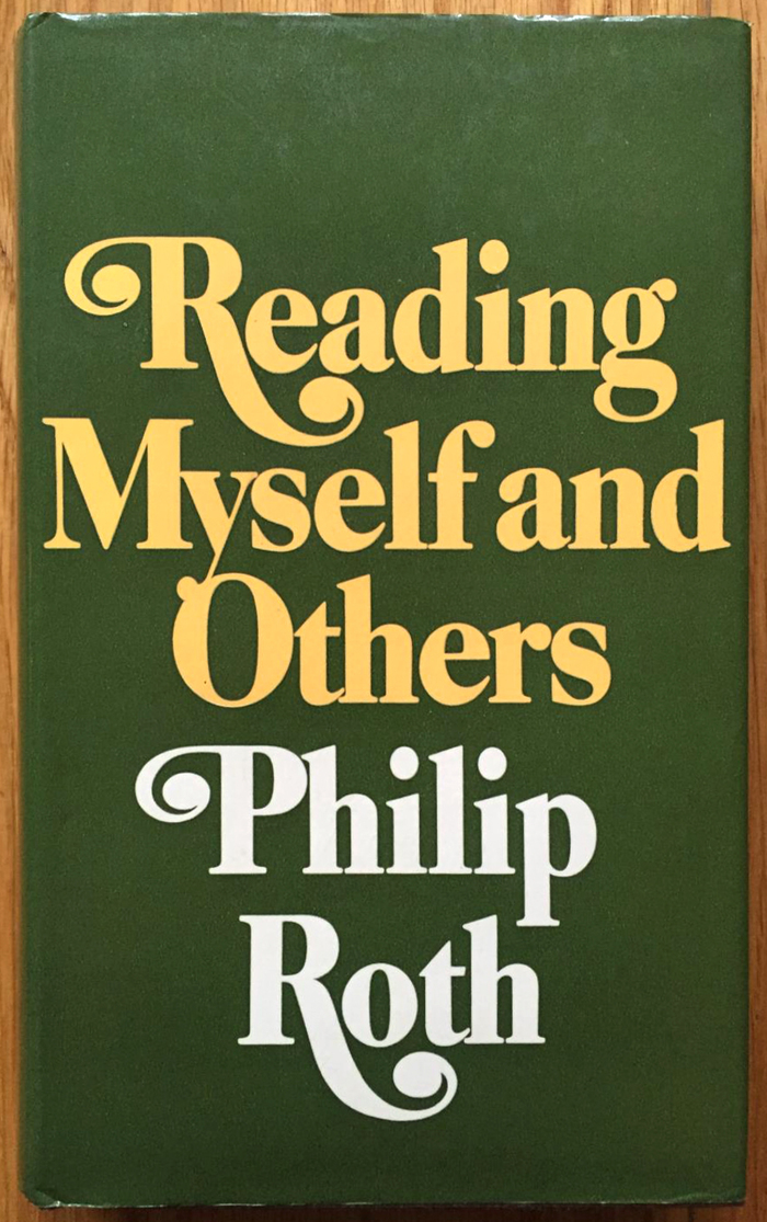
The first one in this series of hardcovers is the novel Portnoy’s Complaint, published by Random House in 1969. The jacket design is credited to Paul Bacon. Interestingly, this visual identity was maintained for subsequent books by other publishers, too, including UK editions by Jonathan Cape — it’s not the identity of the publisher, but really one of the author. Reading Myself and Others, an anthology of essays published by Farrar, Straus and Giroux in 1975, was the last in this specific design, but Roth continued to be associated with bold swashy Caslons.
The exact typeface has not been identified yet. A possible candidate is Caslon Contempo by Photo-Lettering, Inc. The sample in the One Line catalog from 1971 doesn’t show any swashes, but these might be custom additions. Some of the details appear to be customized anyway, see e.g. the two different forms for G in “Gang” and “Great”.
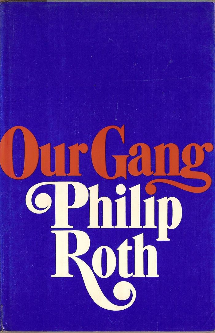
Our Gang, first US edition, Random House, 1971. Note the swash g that forms an interlinear ligature with the i below.
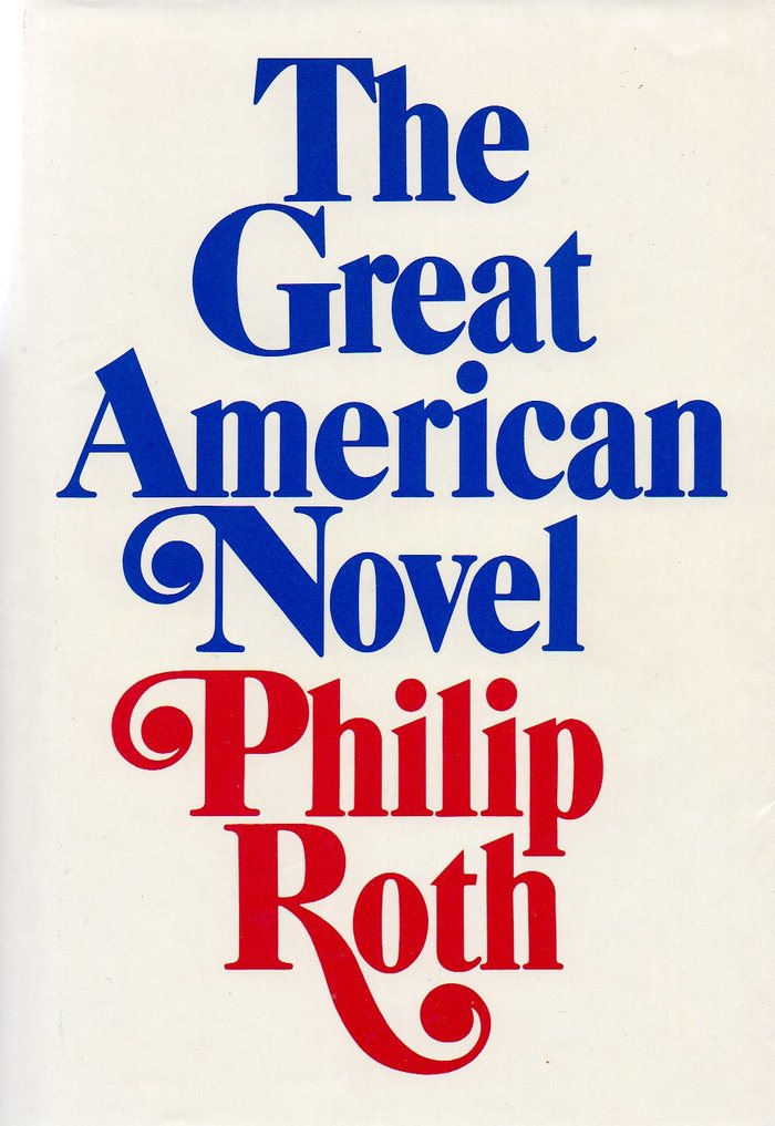
The Great American Novel, first US edition, Holt, Rinehart and Winston, 1973, in red, white, and blue. Mary M. Ahern is credited for the design (of the interior?).
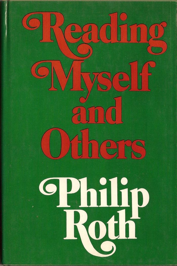
Reading Myself and Others, first US edition, Farrar, Straus and Giroux, 1975. The letterforms here are slightly different, with wider proportions, smaller caps, and longer ascenders. The swash ball terminals appear to be horizontally stretched.
Not included in this compilation is My Life as a Man, published by Holt, Rinehart and Winston (US) and Jonathan Cape (UK) in 1974 — it was featured in an earlier post by Stephen.
Typefaces
Formats
- Books (3973)
Topics
- Literature (1905)
Designers/Agencies
- Paul Bacon (16)
- Mary M. Ahern (1)
Tagged with
- Philip Roth (11)
- book jackets (522)
- book covers (3467)
- book series (347)
- swashes (427)
- center-aligned text (1160)
- one typeface (1316)
- uncertain typeface ID (160)
- Random House (40)
- Holt, Rinehart and Winston (6)
- Farrar, Straus and Giroux (25)
- 1970s (1106)
- Jonathan Cape (6)
- first editions (93)
- hardcovers (581)
- only type (884)
- novels (346)
- modified typeface (1138)
- red white and blue (145)
- stacked and interlocked (87)
- interlinear ligatures (62)
- iconic uses (88)
Artwork location
- United Kingdom (2121)
- United States (6342)
- London (1192)
- New York City (1703)



















1 Comment on “Philip Roth book jackets (1969–1975)”
See also the follow-up on the paperback covers by Bantam Books, featuring Benguiat Caslon.