
Park Francis
Contributed by Melody St. Regis on Jul 4th, 2018. Artwork published in
September 2017
.
Source: don.citarella.net License: All Rights Reserved.
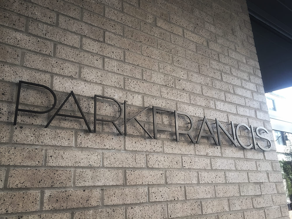
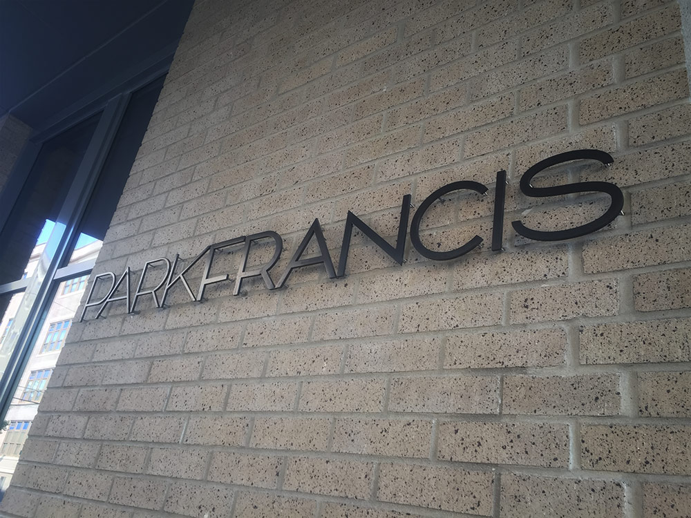
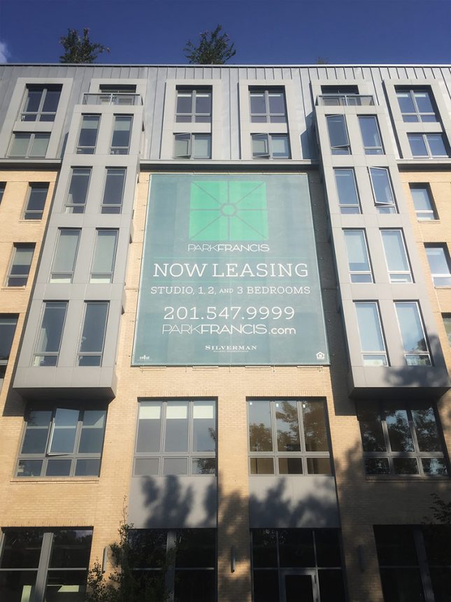
Don Citarella’s Citarella Gothic in use as a logo and for the Park Francis residential building in Jersey City, United States. From don.citarella.net:
As designers and typographers, it’s always heart-warming to see our work in use. Spotting my font family, Citarella Gothic, always makes me happy. This Sunday, I had the added enjoyment of seeing two weights of the typeface created in metal for the Park Francis in Hamilton Park, Jersey City. As far as I can tell, the logo and signage was created by Chris Rudloff of New World Group in Secaucus, New Jersey.
Source: don.citarella.net License: All Rights Reserved.
Source: don.citarella.net License: All Rights Reserved.


")


3 Comments on “Park Francis”
Congratulations, Chris! You made the most out of a font that has quite some issues. For anyone who’s looking for similar fonts of better drawing quality, I recommend Neutraface Display (note that its lowercase holds alternative “low-waisted” capitals) and, wider and with a lowercase, the recently released BF Bonn.
I love Neville Brody’s work. Neutraface seems to be all the rage nowadays. Just walk into a Trader Joe’s and you’ll see what I mean.
I just looked at the Citarella Gothic Regular glyph set and see some of the issues you’re talking about (though they don’t appear present in Ultralight or Bold), but I still think the personality and character is still quite lovely.
Hi Melody! Citarella Gothic sure has lots of personality, and it obviously has worked for the designer of ParkFrancis. I’m afraid I see shortcomings in all weights, though.
It’s not only about the misplaced accents in the Regular. Take a look at the transition from curves to straights, in letters like J or U — they’re not smooth. There is no optical correction for joints, see B or a in the Bold. Overshoots are handled inconsistently. Spacing is way too tight (in relation to the interior whitespace, and the word space), and unbalanced. There’s some heavy kerning on top, which shows when it’s missing (for pairs like Vo), or when it creates overlaps (OV). Some non-English glyphs like ð simply don’t work. Sorry!