
Diary of a Century – Jacques-Henri Lartigue
Contributed by Garrison Martin on Apr 3rd, 2019. Artwork published in
.
Source: www.manhattanrarebooks.com License: All Rights Reserved.
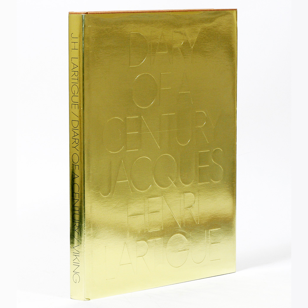
Dustjacket 1
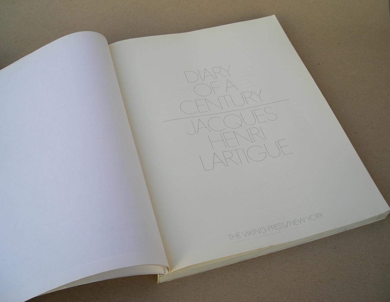
A very beautiful (and hard to photograph) cover for 1970's Diary of a Century by Jacques-Henri Lartigue probably featuring PLINC’s Futura Fineline [see comments] The book is a collection of some of the 20th Century’s greatest photography (up until that point). Edited and afterword by Richard Avedon. Designed by the legendary Bea Feitler. This foil version was the first run by Viking Press.

Source: www.abebooks.com License: All Rights Reserved.
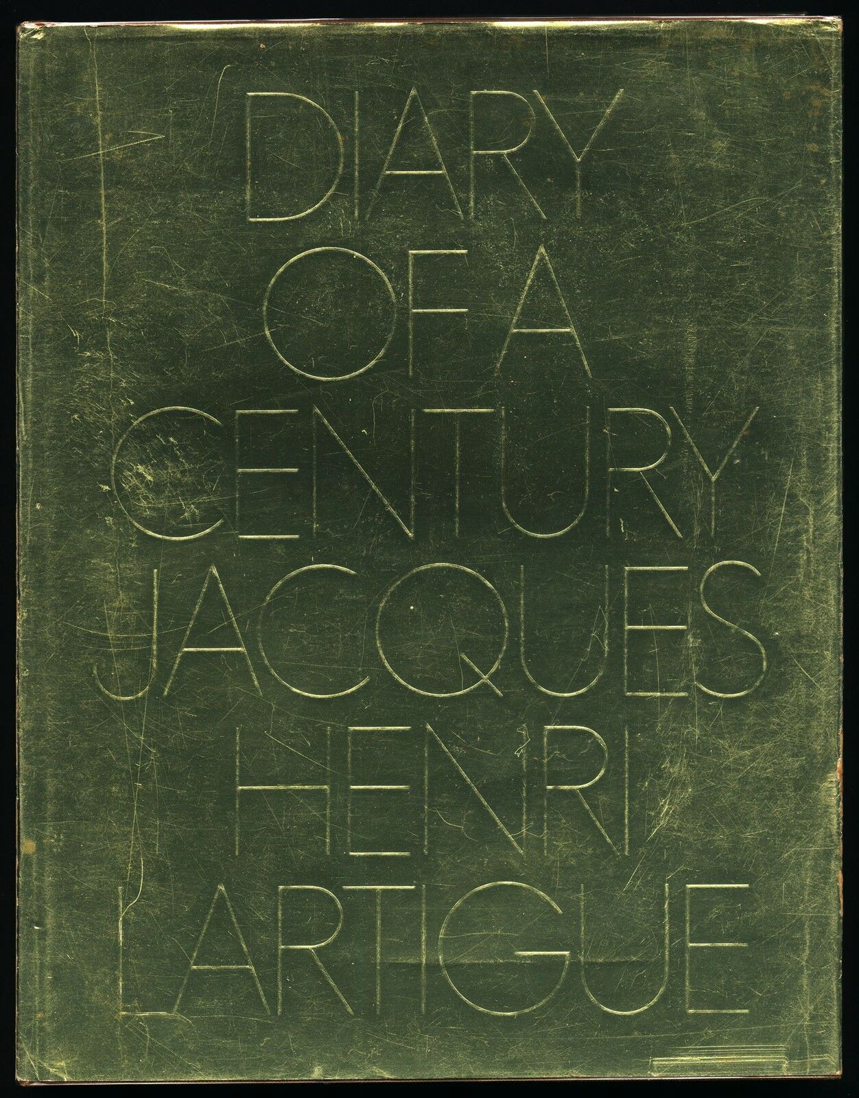
Dustjacket 2
Source: www.abebooks.co.uk License: All Rights Reserved.
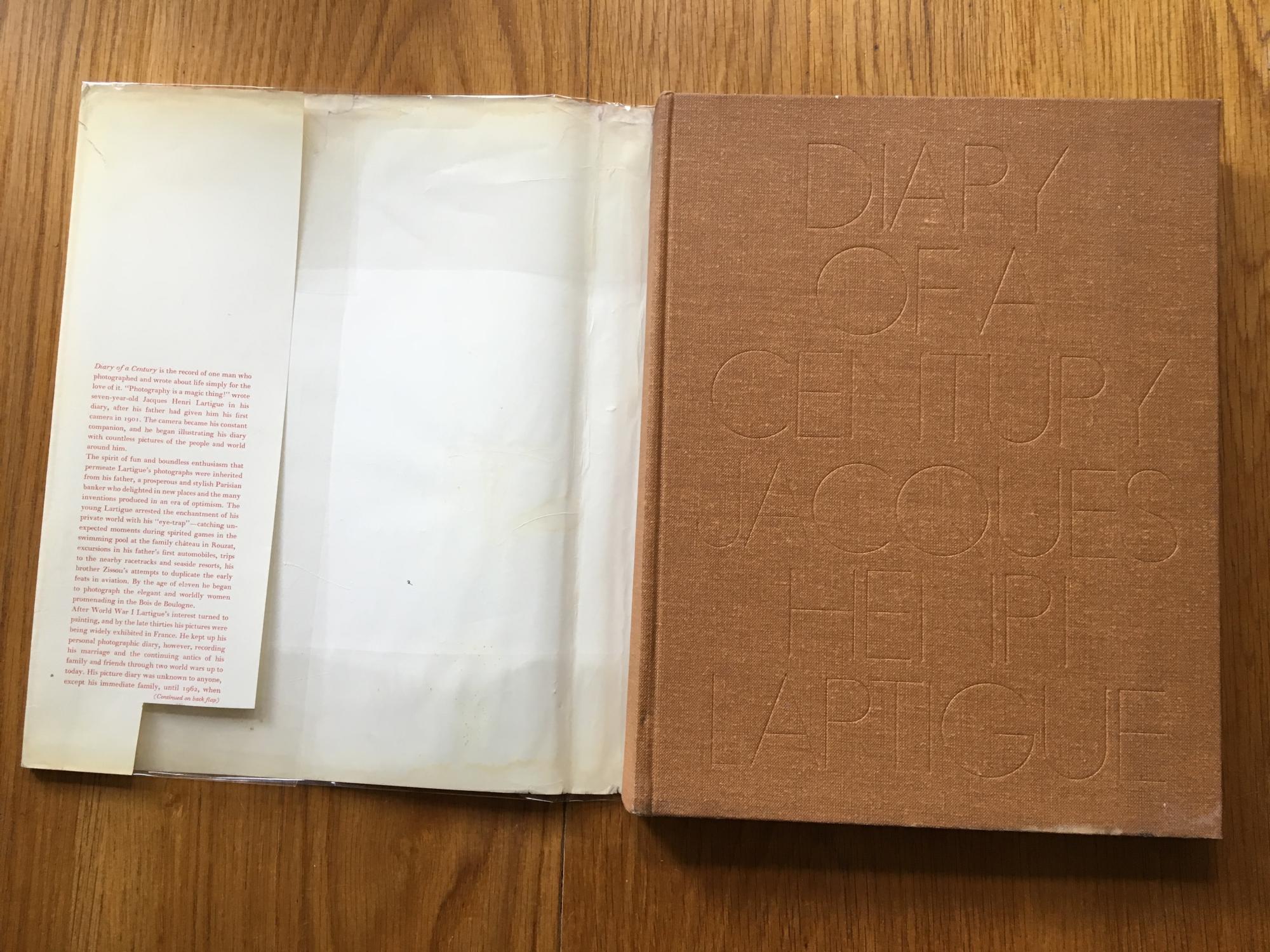
Without Dustjacket
Source: www.abebooks.com License: All Rights Reserved.
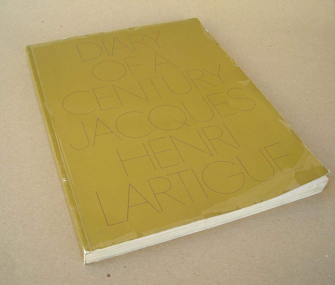
Paperback.
Source: www.abebooks.com License: All Rights Reserved.
Inside paperback.


")


")
")


")


")


 Conference")

5 Comments on “Diary of a Century – Jacques-Henri Lartigue”
Hi Garrison, I agree with you that this is not quite Genny. That Filmotype face has the right R, but its G is less round and has a smaller aperture, and the top and bottom of its S are too symmetrical. There were various phototype variants of Futura. Photo-Lettering, Inc’s Futura Fineline is a likely contender. Their One Line Manual of Styles shows the right R and S, and the time (sometime between 1965 and 1971) and place (NYC) look good, too.
Very nice detective work, Florian! This one bugged the heck out of me! Partly because this type is gorgeous and I was desperate to know its origin!
Futura Fineline sounds about right. Some definite Futura identifiers. So I’m guessing PLINC did their own Genny! Very cool!
Ah, maybe that’s what was used on this Kathy McCord album which I initially assumed to be Genny.
I think you’re right Stephen, turns out Shin Oka mentions Fineline on his Genny page.
Thanks for the pointer, Stephen. I’ve added the album cover.
Futura Fineline is shown in PLINC’s Alphabet Thesaurus Vol. 3 (1971) in four weights, from 0000 to 0.
Futura Fineline is not only lighter, but also different in some structural details: In real Futura, the legs of K and R start (almost) at the stem, and the counters of a or b are round.
I wonder what the lightest digital Futura is. URW has a Futura 1-line.