
Nick, global rebrand (2017)
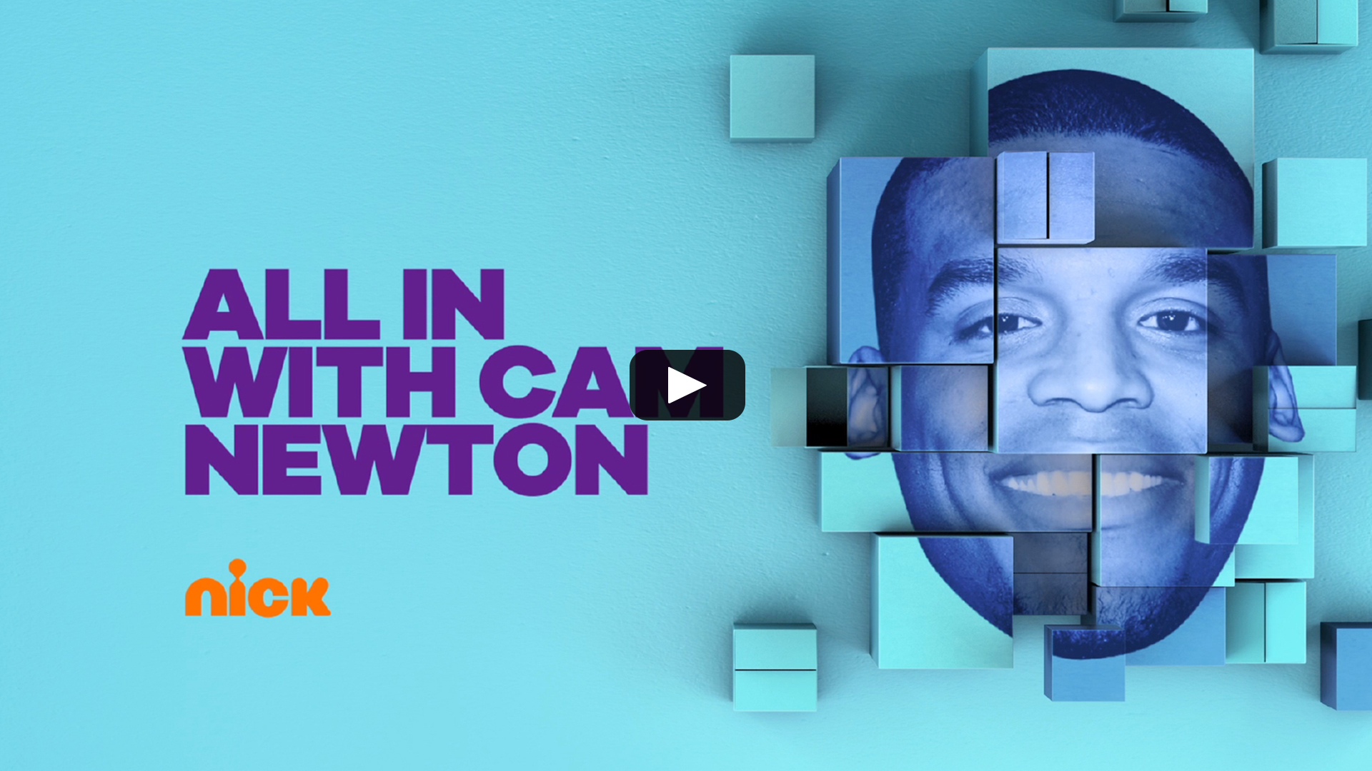
Nickelodeon AKA Nick rebranded in 2017 with the help of Argentinian design studio Superestudio. The rebrand utilizes René Bieder’s Galano Grotesque. Their case study describes it as a “Confident, no frills, modern sans-serif with some attitude”.
Built around the concept of “Kids First,” we developed the rebrand showcasing a diverse array of school-age children interacting with the world and characters of Nickelodeon in a playful and surreal mix of live-action and graphics. The project consisted of more than 250 deliverables, including bumpers, IDs, promo toolkits and graphic developments for social media and off-air use for the US channel, with updated elements for the international channels to follow. — Superestudio
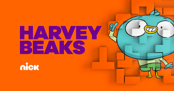
You know, that one show about a blue bird and his friends that got buried under all the territory SpongeBob and the Louds have taken for themselves.


US website


